Web & E-commerceView case Insides Design Studio
Insides Design Studio
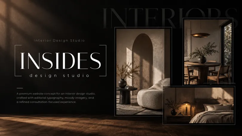
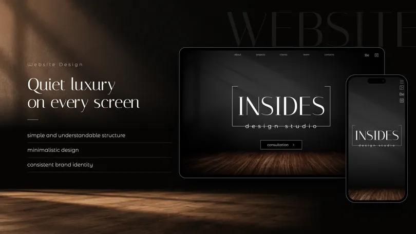
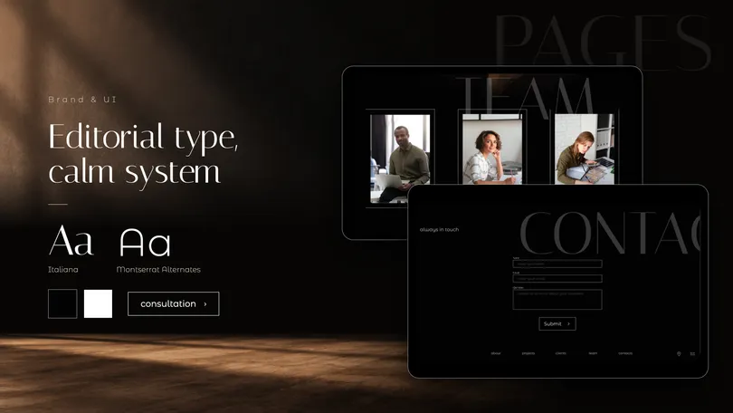
A portfolio website for an interior design studio, created to showcase projects, communicate the studio’s approach, and turn interest into consultation requests.

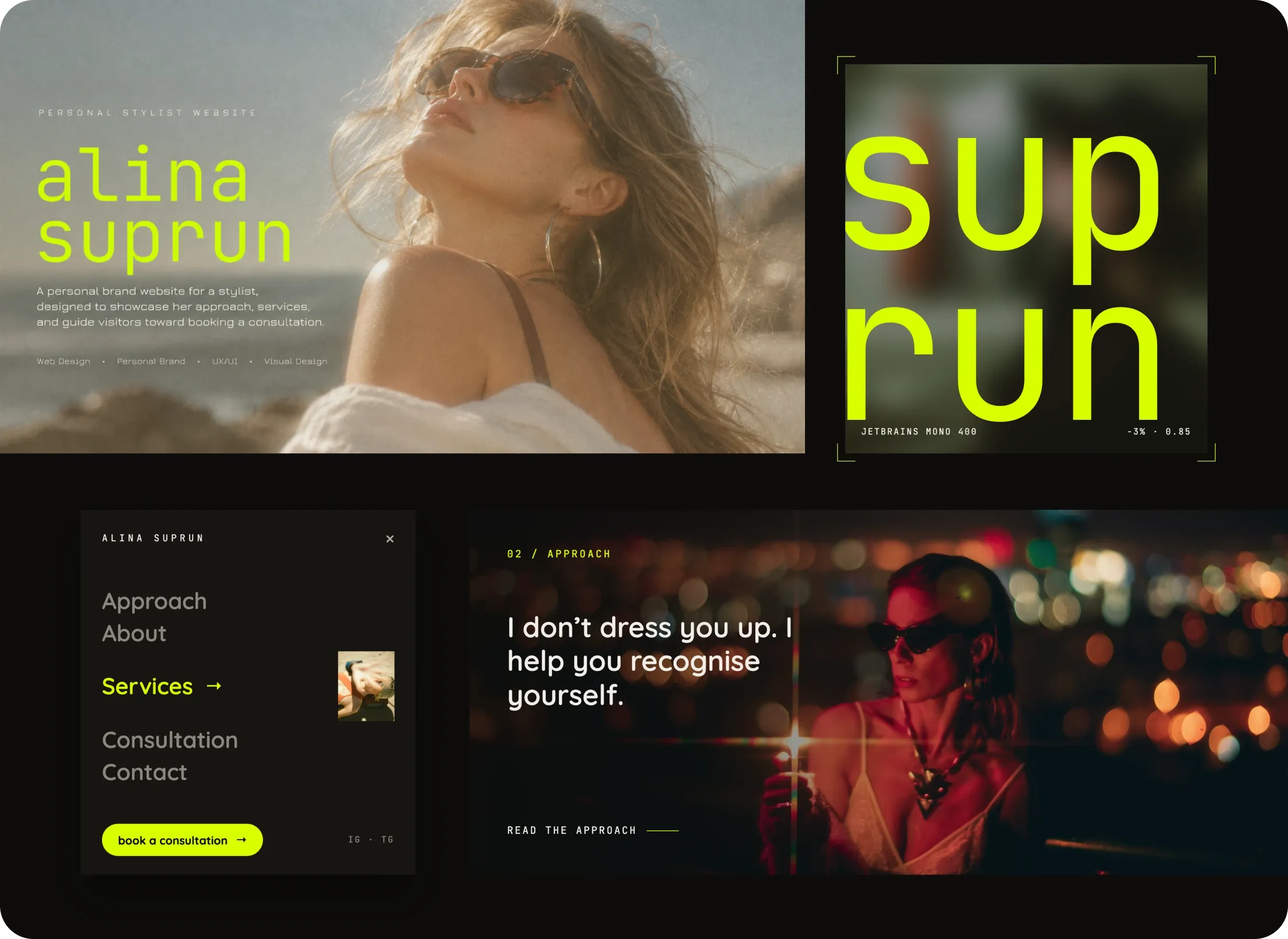
A personal brand website for a stylist, designed to showcase her approach, services, and guide visitors toward booking a consultation.
Building a digital identity around a personal point of view
For a personal stylist, the website is not simply a portfolio of outfits. It is often the first interaction with a potential client — and needs to communicate personality, taste, and approach before a conversation even begins.
My role was to shape the website experience and visual direction around Alina’s personal brand, creating a space that feels expressive and fashion-driven while remaining clear enough to explain her services and lead visitors toward consultation.
The goal was to create a website that feels like an extension of the stylist herself rather than a generic service website.
Turning personality into a clear digital experience
Personal stylist websites often fall into one of two extremes: highly expressive portfolios with little practical information, or service-focused pages that lose the personality behind the brand.
The challenge was to balance both.
The experience needed to:
The objective was not simply to make the website look fashionable, but to make the visual language support trust, positioning, and conversion.
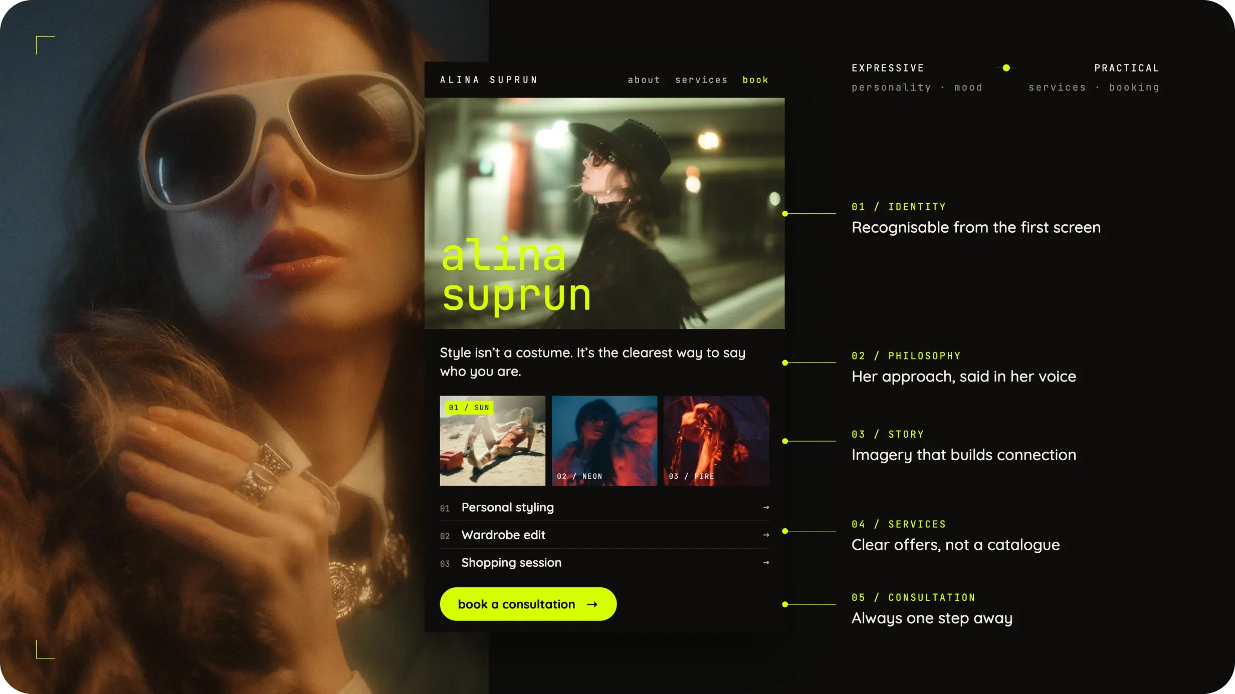
Designing a brand that feels editorial, personal, and slightly unexpected
The visual direction was built around contrast.
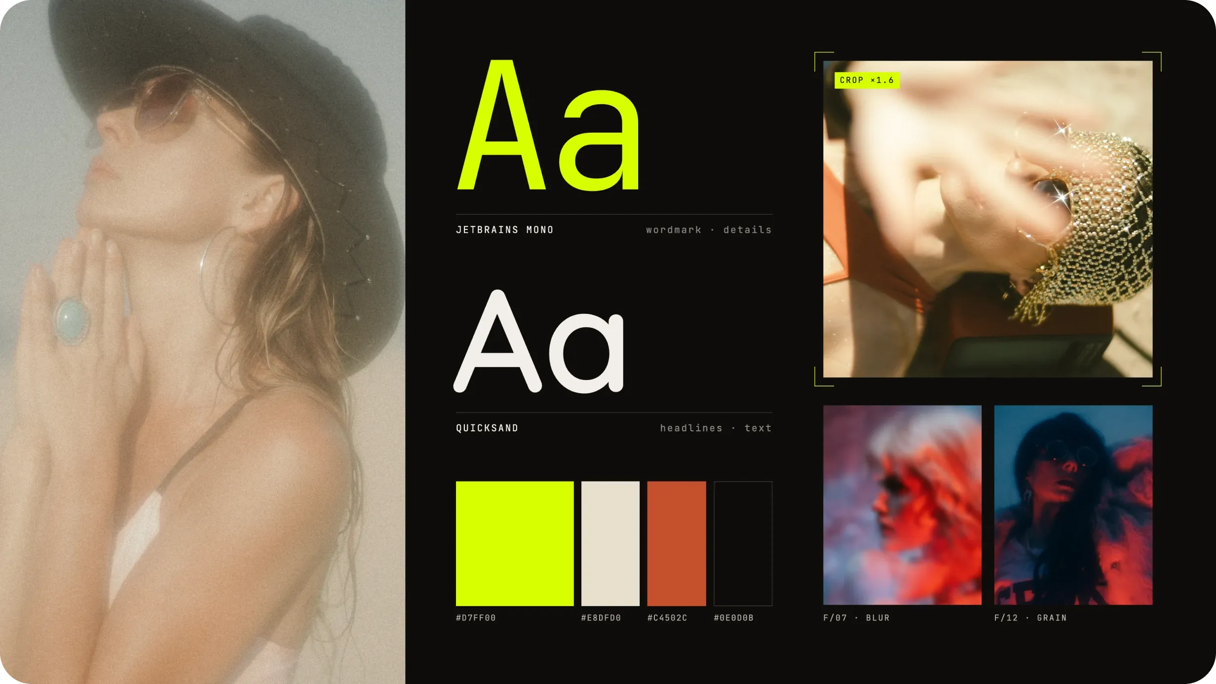
Soft, sun-washed photography creates an intimate and effortless feeling, while bold typography, digital lime accents, grain, and unconventional composition introduce a sharper contemporary layer.
Instead of relying on traditional luxury cues, I wanted the identity to feel more like an independent fashion editorial — expressive, slightly imperfect, and confident.
The visual system combines:
Analog photography — warmth, imperfection, personality
Neon lime accents — energy and contemporary fashion culture
Oversized typography — confidence and editorial hierarchy
Monospaced details — a more experimental, digital edge
Grain and blur — making the experience feel tactile rather than overly polished
Two moods. One identity.
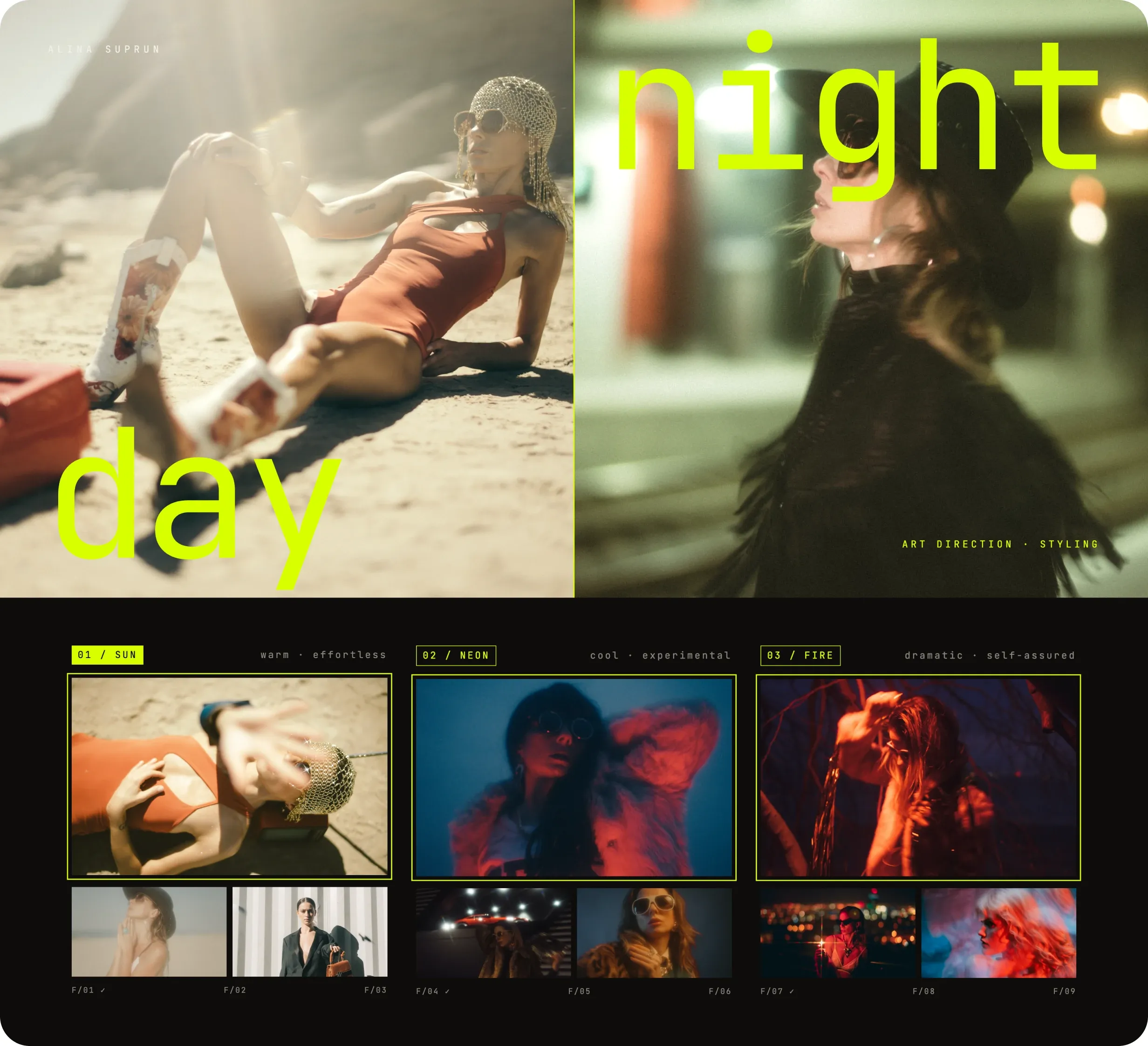
Style is rarely limited to a single visual language.
I explored the identity through two contrasting moods — Day and Night.
Day is warm, spontaneous, sun-faded, and effortless.
Night is sharper, more dramatic, experimental, and self-assured.
Together, they communicate a broader idea behind the personal brand: styling is not about fitting into one aesthetic, but about helping a person express different sides of themselves while remaining recognizable.
Every look tells a story.
Keeping the structure intentionally simple
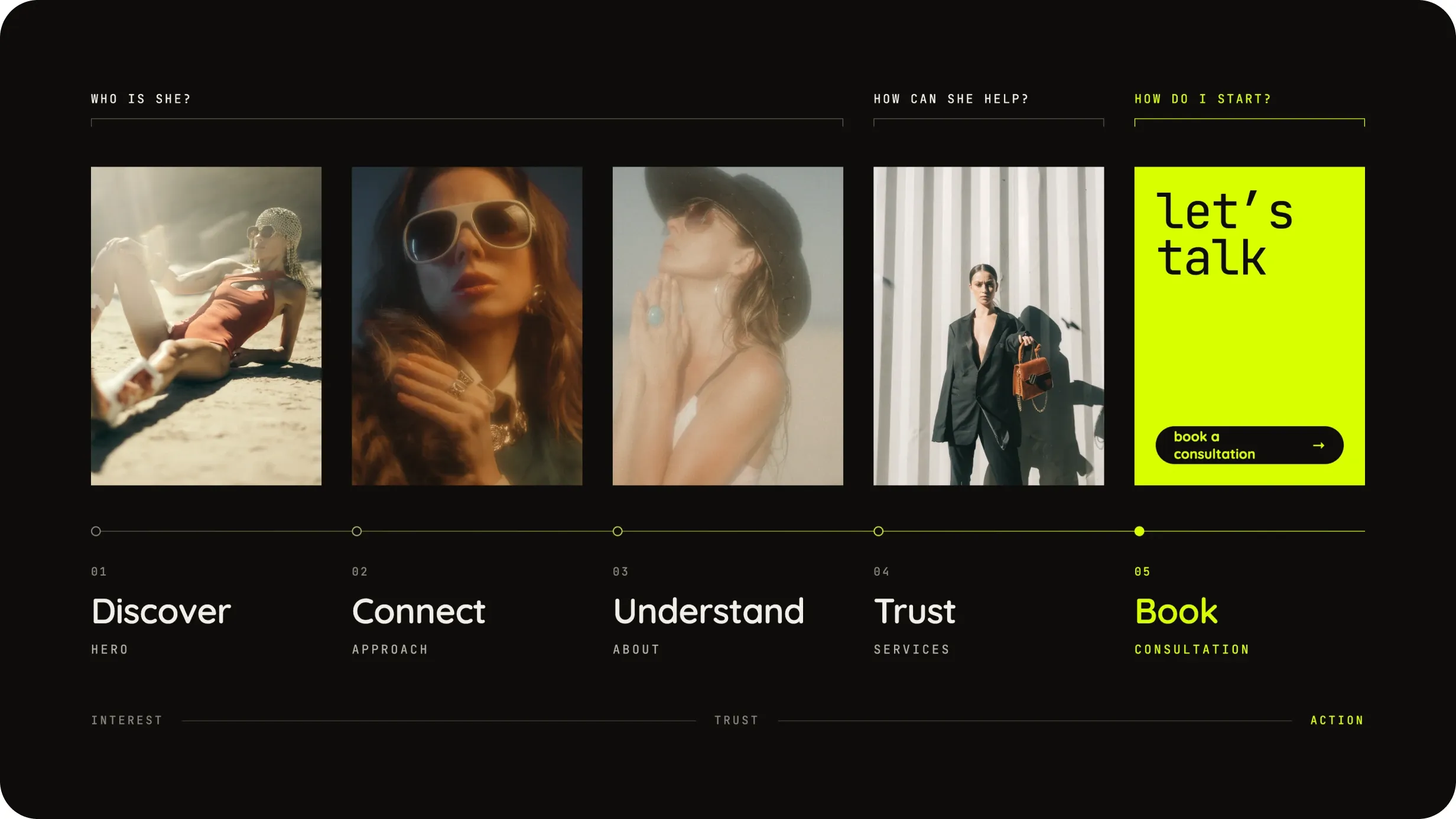
The website architecture was kept deliberately compact. Since the primary goal is to introduce the stylist and start a conversation, every section supports one of three questions:
Who is she?
Personality, philosophy, visual point of view.
How can she help me?
Approach, services, and styling formats.
How do I start?
Consultation and contact.
The main navigation therefore focuses on:
Approach → About → Services → Consultation → Contact
Rather than creating multiple layers of content, the experience is designed as a curated narrative that gradually moves the visitor from interest to trust to action.
Building the page as an editorial narrative
The homepage was designed less like a traditional landing page and more like an editorial story.
The opening screen immediately establishes the stylist’s visual identity, while the following sections gradually reveal her approach, personality, and services.
Large imagery remains central to the experience, with typography and UI elements acting as supporting layers rather than competing for attention.
This creates a browsing rhythm closer to a fashion publication while still preserving clear navigation and calls to action.
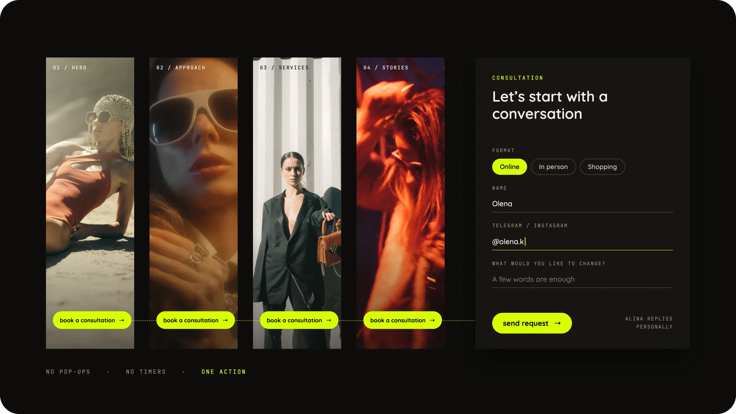
Turning inspiration into a clear next step
Because the website represents a personal service, the most important conversion is not a purchase — it is the beginning of a relationship.
The consultation therefore acts as the primary CTA across the experience.
Rather than introducing aggressive conversion patterns, I kept the action simple and consistent: visitors can explore the stylist’s world first and move toward consultation once they feel a connection with her approach.
This keeps the conversion flow aligned with the personal nature of the service.
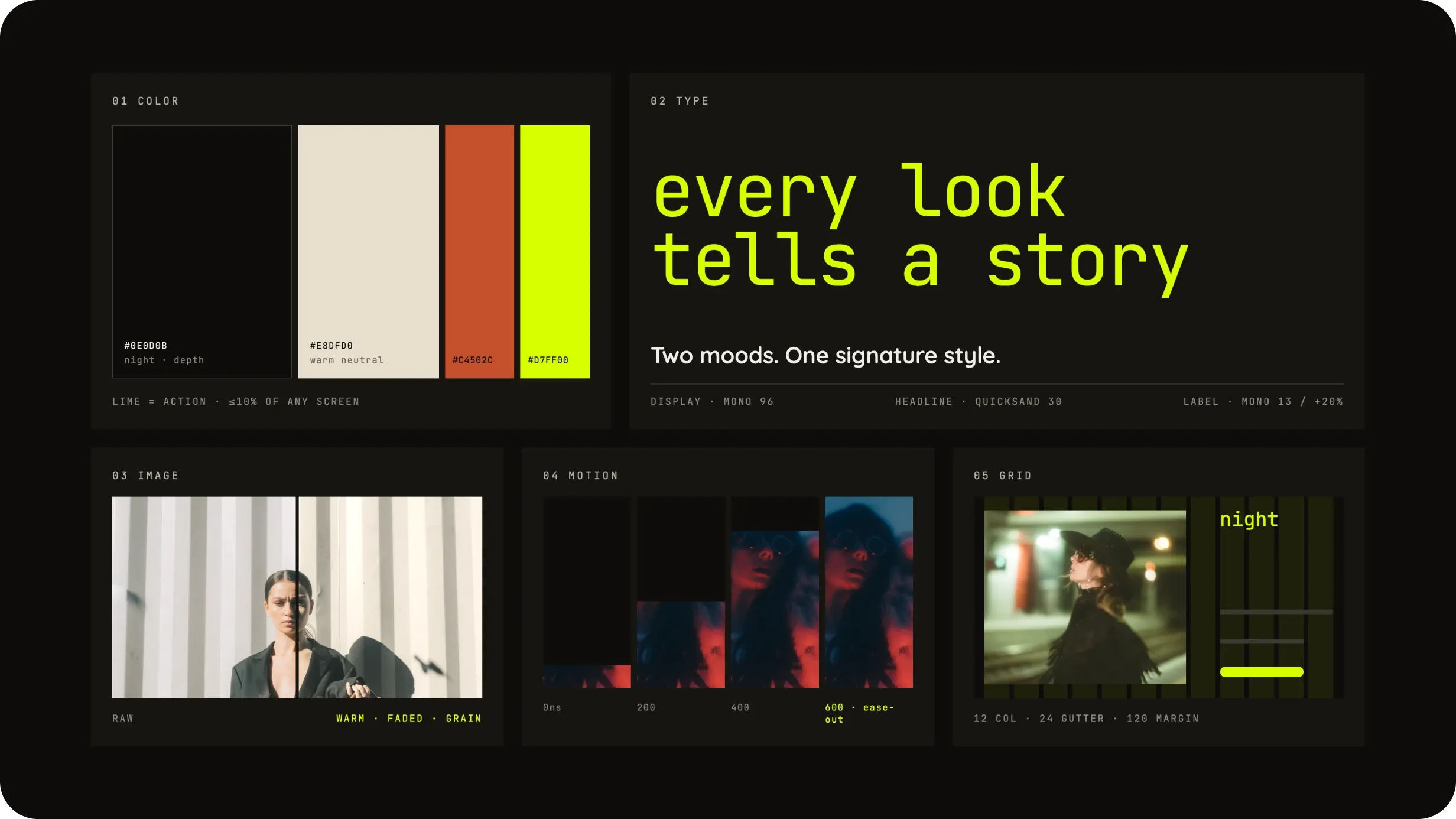
A flexible system behind an expressive interface
Although the visual direction is intentionally editorial, the interface is built around a small and reusable set of rules.
The system uses typography, spacing, image treatment, and a limited color palette to create consistency without making every section look identical.
The core visual language includes:
This allowed the experience to remain visually expressive while still feeling like one coherent product.
The concept establishes a distinct digital identity for the stylist that connects brand expression with a clear service journey.
Rather than separating visual storytelling from usability, the experience uses the same creative language to introduce the stylist, explain her approach, build trust, and lead visitors toward consultation.
The result is a personal brand experience that feels recognizable, expressive, and intentionally different from a traditional stylist portfolio.
This project reinforced how important it is to treat personal-brand websites as experiences rather than portfolios. The strongest direction emerged when visual identity, content, and conversion stopped being separate layers and began supporting the same story.
A portfolio website for an interior design studio, created to showcase projects, communicate the studio’s approach, and turn interest into consultation requests.