Website & Visual Identity for an Interior Design Studio
Role
UI/UX Designer
Platform
Responsive Web
Focus
Art Direction · Visual Design · Responsive UX
Context / Role
The studio needed a digital presence that could work both as a portfolio and as an introduction to its approach, services, and personality.
Because interior design is highly visual, the interface needed to support large-scale photography without competing with it.
My role was to create a clear website structure and a distinctive visual system that would let the projects remain the main focus while giving the studio a recognizable digital identity.
The Challenge
Creating a distinctive experience without competing with the work
The main challenge was balancing expressive visual direction with functional clarity.
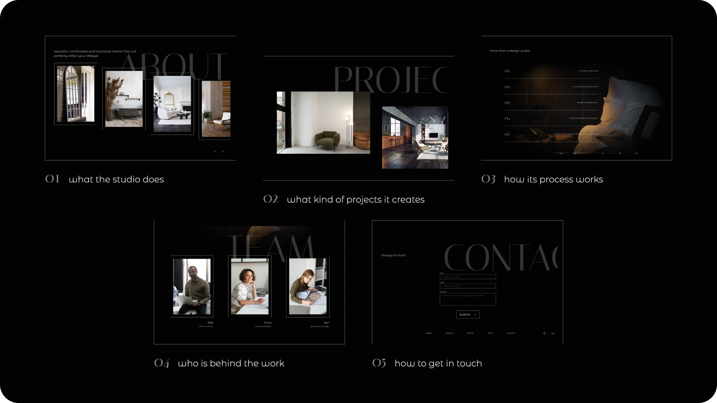
The website needed to feel premium and editorial, but still make it easy for visitors to understand:
what the studio does
what kind of projects it creates
how its process works
who is behind the work
how to get in touch
Rather than adding decorative UI, I focused on using typography, photography, scale, spacing, and composition to create the character of the experience.
Information Architecture
Structuring the site around the studio’s story
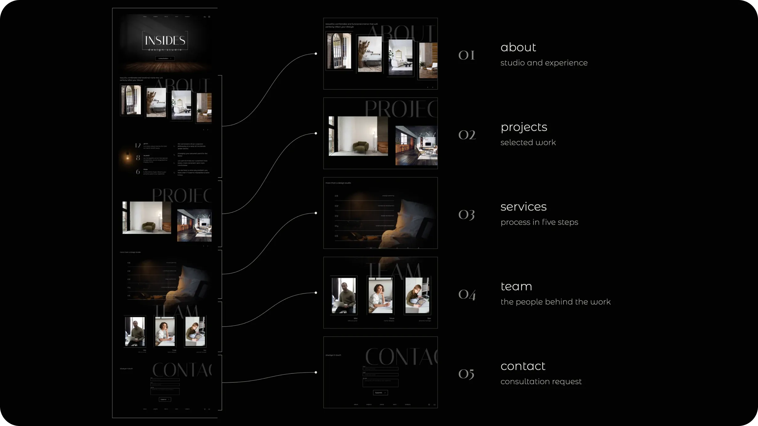
The website was organized around a simple journey:
About → Projects → Services → Team → Contact
The homepage introduces the studio through a combination of selected work, experience, process, and people, allowing visitors to understand both the visual style and the studio behind it without navigating through multiple pages first.
This structure keeps the portfolio central while still giving business information enough visibility.
Visual Direction
An editorial language inspired by interior design
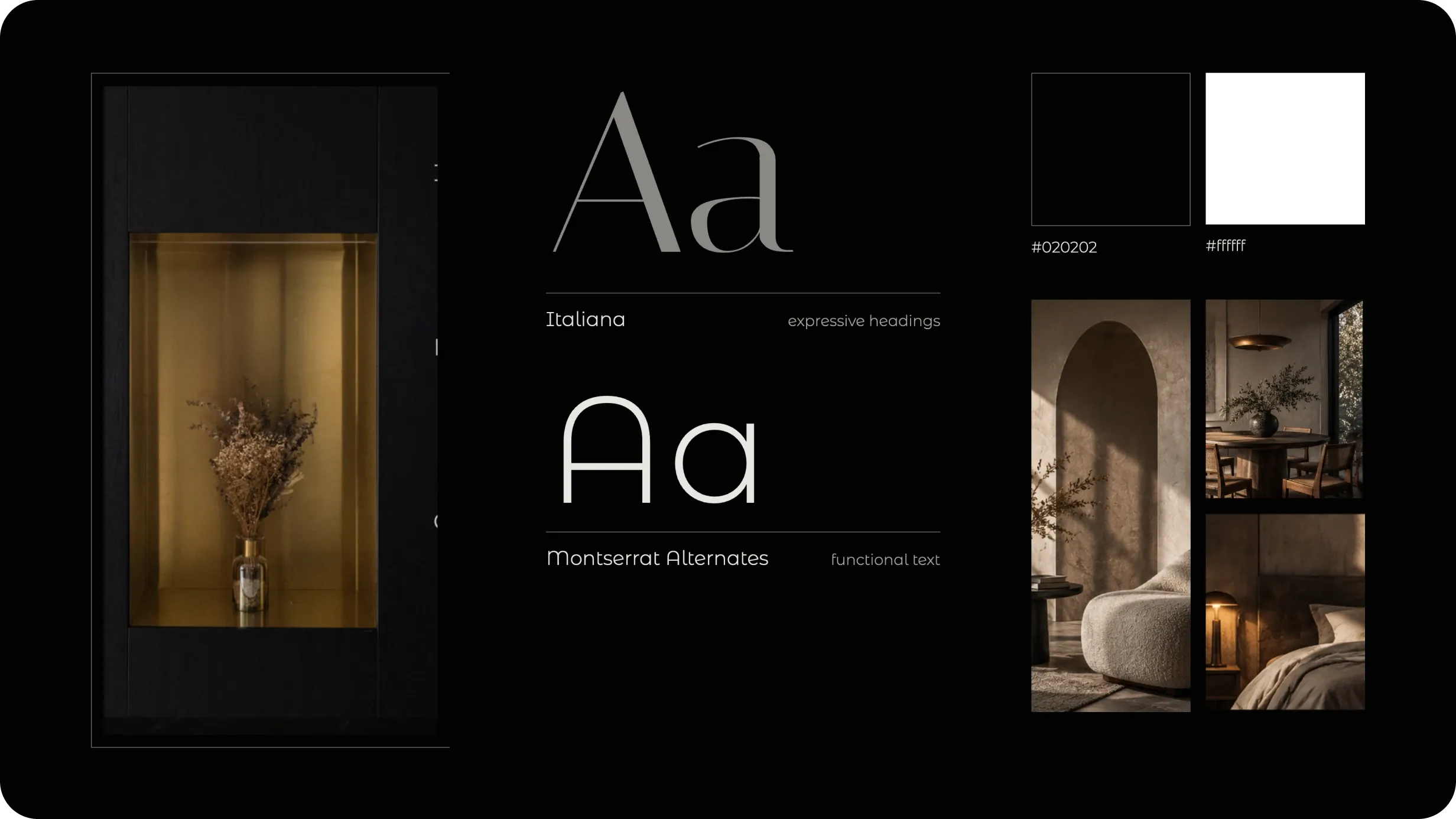
I developed a dark, minimal visual direction built around large imagery, restrained typography, thin structural lines, and generous negative space.
The interface intentionally uses a limited palette so the interior photography becomes the main source of color and emotion.
A combination of refined serif typography and lightweight sans-serif text creates contrast between expressive headings and functional information.
The result is a visual language that feels closer to an architecture or editorial publication than a conventional corporate website.
Project Presentation
Letting imagery lead the experience
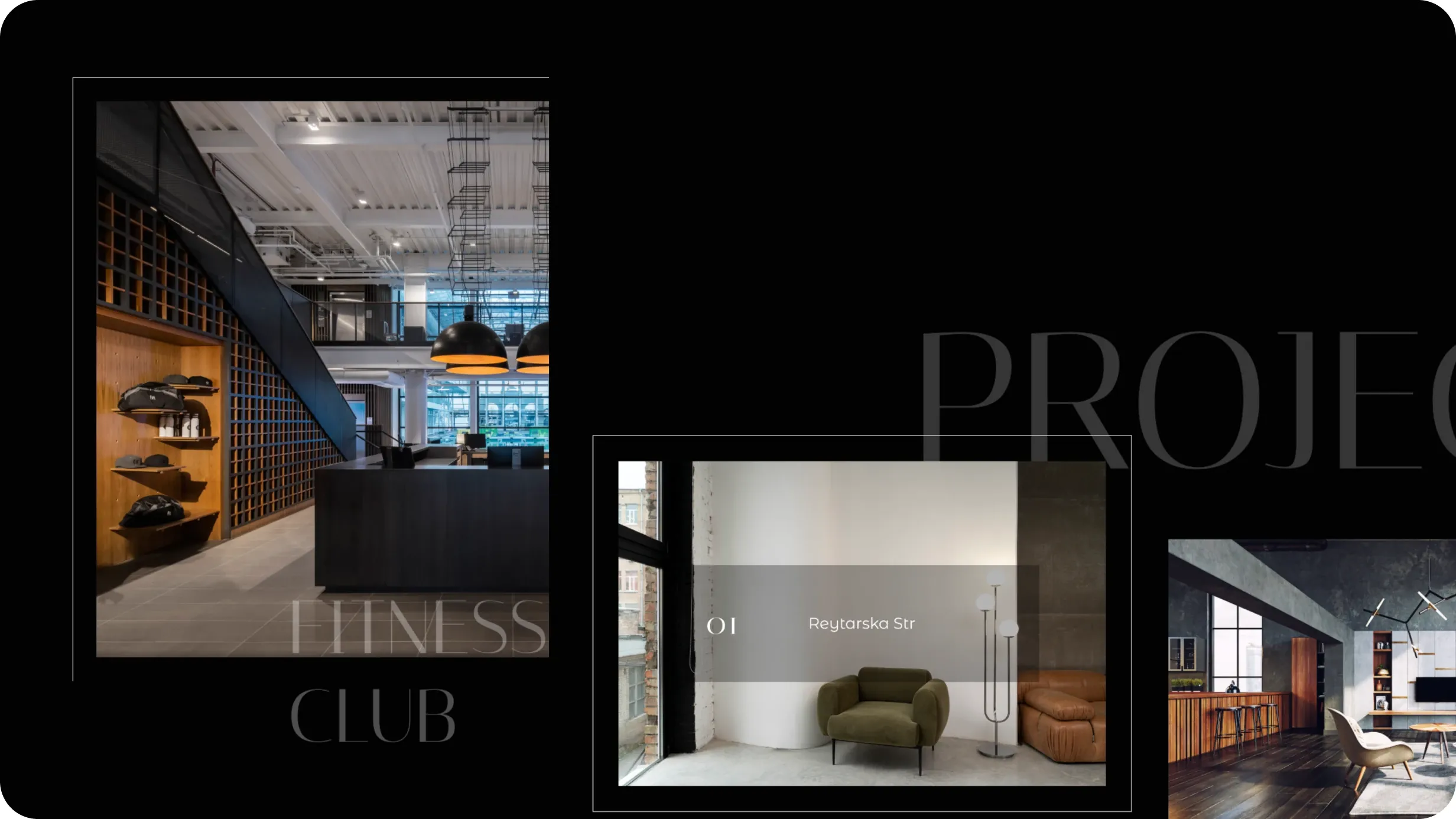
Projects are presented through large editorial compositions rather than conventional card grids.
The layouts use asymmetry, oversized typography, framed imagery, and controlled overlap to create rhythm while keeping individual projects visually distinct.
This approach allows the portfolio to communicate the studio’s aesthetic before users read detailed descriptions.
Services & Studio Story
Connecting visual work with the process behind it
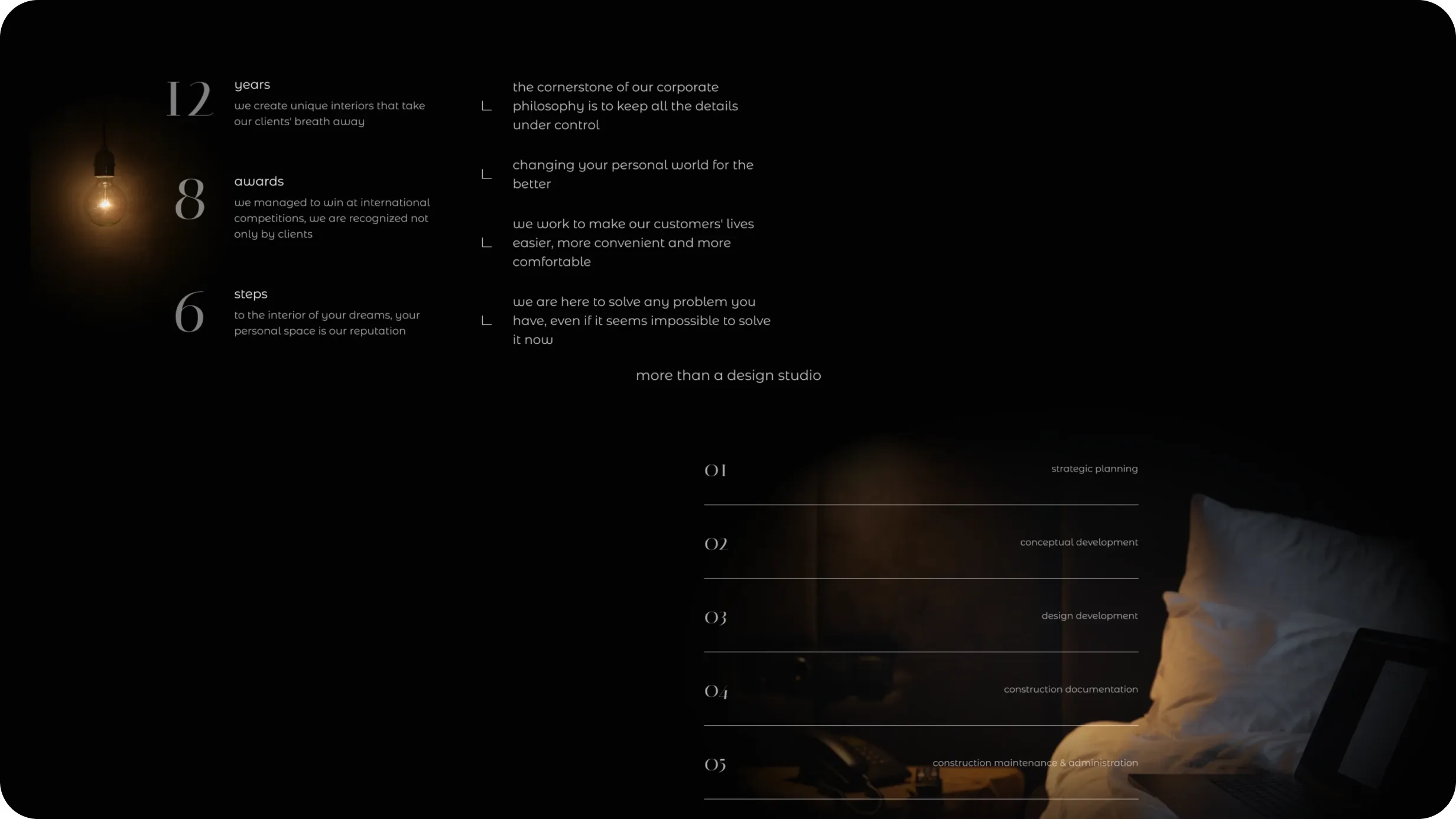
Beyond the portfolio, the website explains how the studio works — from strategic planning and concept development to documentation and implementation.
I kept these sections visually integrated with the rest of the experience, using strong hierarchy and minimal supporting text instead of switching to a more traditional service-page layout.
This helped maintain continuity between brand storytelling and practical information.
Responsive Experience
Preserving the composition across screen sizes
The desktop experience relies heavily on scale, spacing, and layered compositions, so the mobile version could not simply be a reduced copy of the same layout.
I adapted the hierarchy for smaller screens by simplifying compositions, restructuring content vertically, and preserving the most important visual relationships.
The goal was to maintain the same premium and editorial character while keeping navigation and content comfortable on mobile.
UI System
A minimal system supporting a highly visual interface
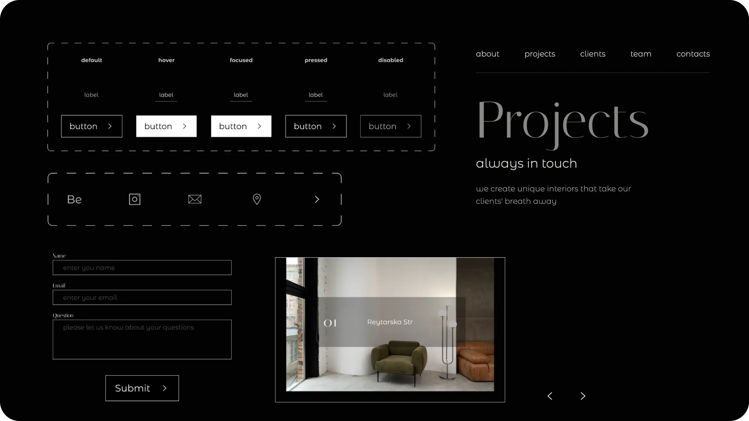
The UI system was intentionally restrained and included only the components required to support the content:
navigation
buttons and interaction states
form fields
project navigation
icons
typography styles
layout and spacing rules
Keeping the interface system minimal allowed components to remain consistent without competing with the photography and brand expression.
Outcome
A digital portfolio built around the studio’s visual identity
The final concept combines portfolio, studio story, services, team, and contact into one cohesive responsive experience.
Rather than treating the website as a neutral container for projects, the interface became an extension of the studio’s identity — using composition, typography, imagery, and motion-ready layouts to create a more distinctive presentation of the work.
Reflection
This project reinforced how much visual hierarchy and restraint matter when the content itself is highly expressive. The strongest design decisions came from knowing when the interface should create character and when it should disappear behind the work.
This case study has been anonymized due to NDA restrictions. Branding, product names, selected UI elements, and data have been modified, while the core design challenges, process, and my contribution remain accurate.
A SaaS platform for managing SEO traffic campaigns, tracking search visibility, and working with large sets of websites and keywords.