SaaS ProductsView case Converza
Converza
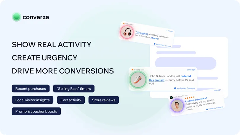
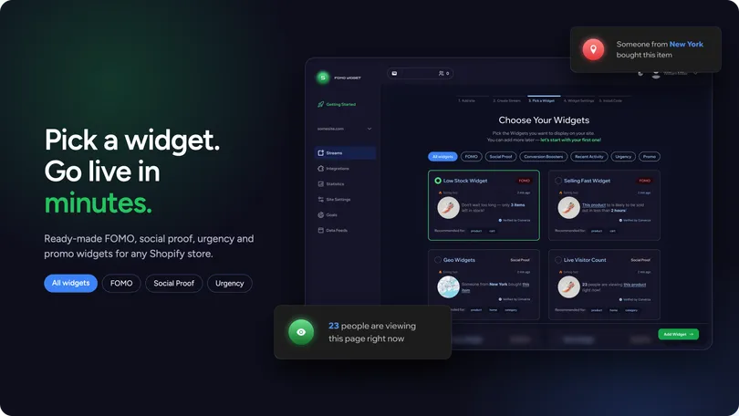
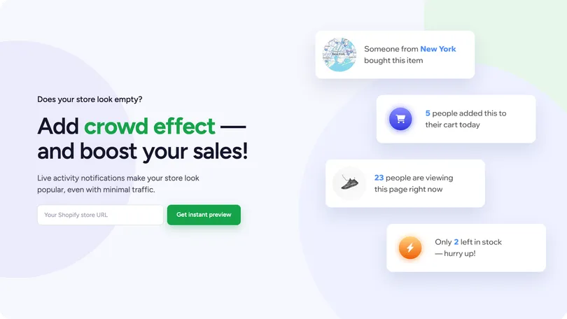
A Shopify SaaS product for creating and managing conversion boosters, promo, social-proof widgets that help merchants build trust and drive conversions.

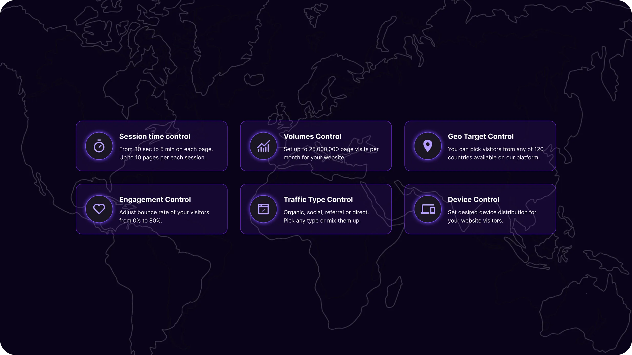
A complex SaaS platform for managing website traffic, tracking search performance, and turning large volumes of SEO data into actionable insights.
The platform was evolving quickly, with new capabilities being introduced across traffic management, analytics, search performance, and project configuration.
My role went beyond designing individual screens. I worked on end-to-end product flows, information architecture, interaction patterns, complex tables and dashboards, and the shared design system supporting the platform.
I collaborated closely with the Product Manager, translating product requirements into user flows and interface solutions, challenging and refining workflows together, and iterating as the product expanded.
A key part of the work was finding the balance between advanced functionality and usability — giving experienced users enough control without making the product unnecessarily difficult to navigate.
The product needed to support increasingly complex workflows while keeping everyday tasks clear and manageable.
Several recurring challenges shaped the design:
The core design challenge was to turn this complexity into a structured product experience where configuration, monitoring, and decision-making remained closely connected but clearly separated by context.
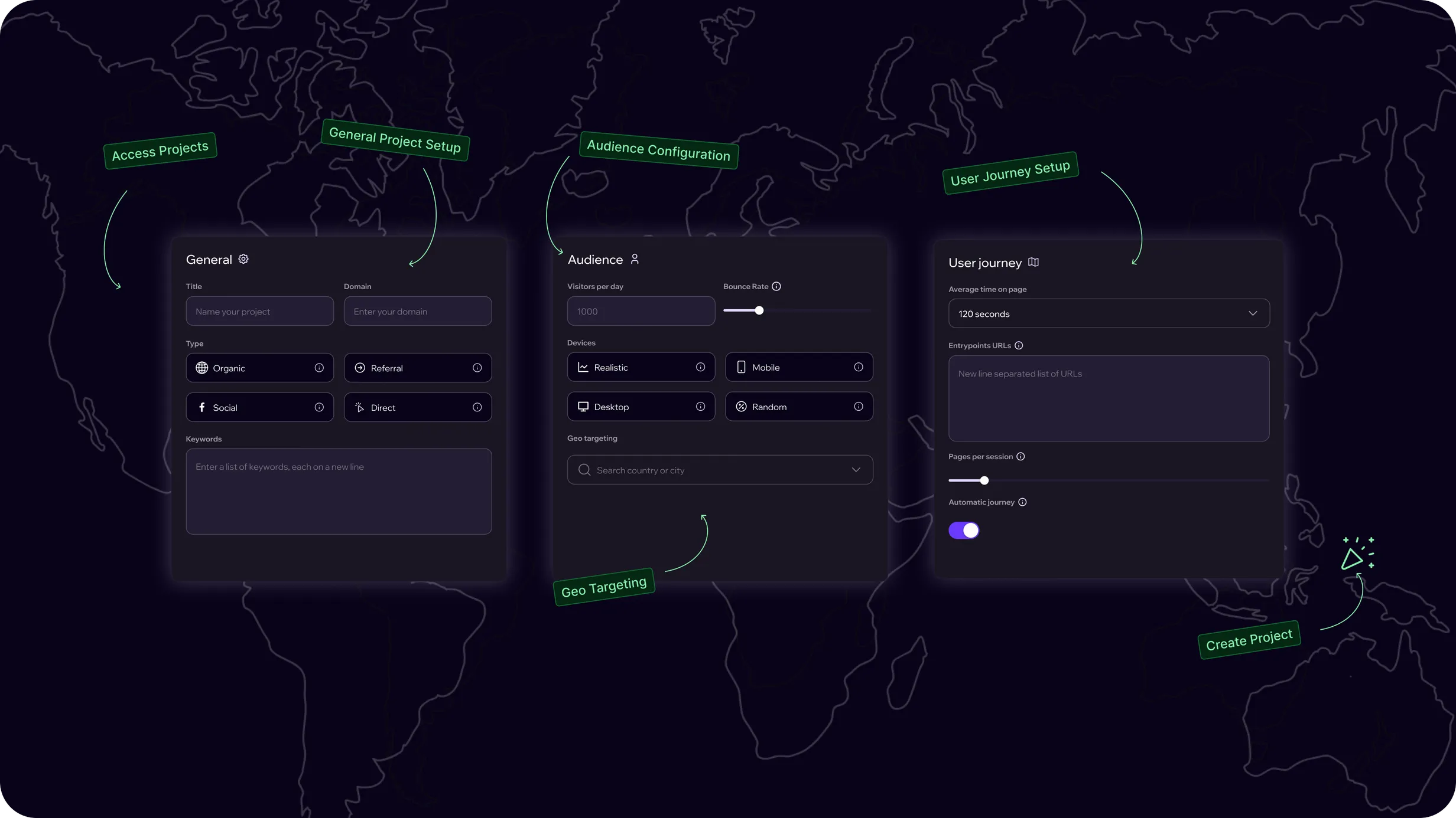
One of the foundational workflows was project creation.
Rather than exposing every available setting at once, I structured the experience around a progressive setup process that grouped related decisions into understandable stages.
Users could define their project and target website, configure geographic targeting, add keywords, adjust traffic and keyword-level settings, and then create the project for ongoing monitoring.
The same principle carried into the rest of the product: complex functionality should remain accessible without forcing users to process everything at the same time.
This created a foundation that could later support more advanced workflows without requiring the entire experience to be redesigned from scratch.
As the platform expanded, maintaining consistency across an increasing number of workflows became essential.
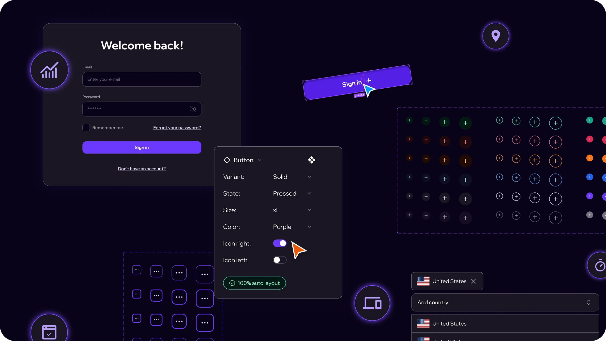
I built a scalable design system based on Chakra UI, creating a shared foundation between design and development.
The system included structured design tokens for color, typography, spacing, radii, shadows, states, and interaction patterns, along with reusable components ranging from basic controls to tables, navigation, cards, modals, and more complex product patterns.
Semantic tokens helped keep visual decisions consistent across different contexts and states, while reusable components reduced the need to redesign common patterns for every new feature.
The system became a shared source of truth, making it easier to extend the platform while maintaining a cohesive user experience.
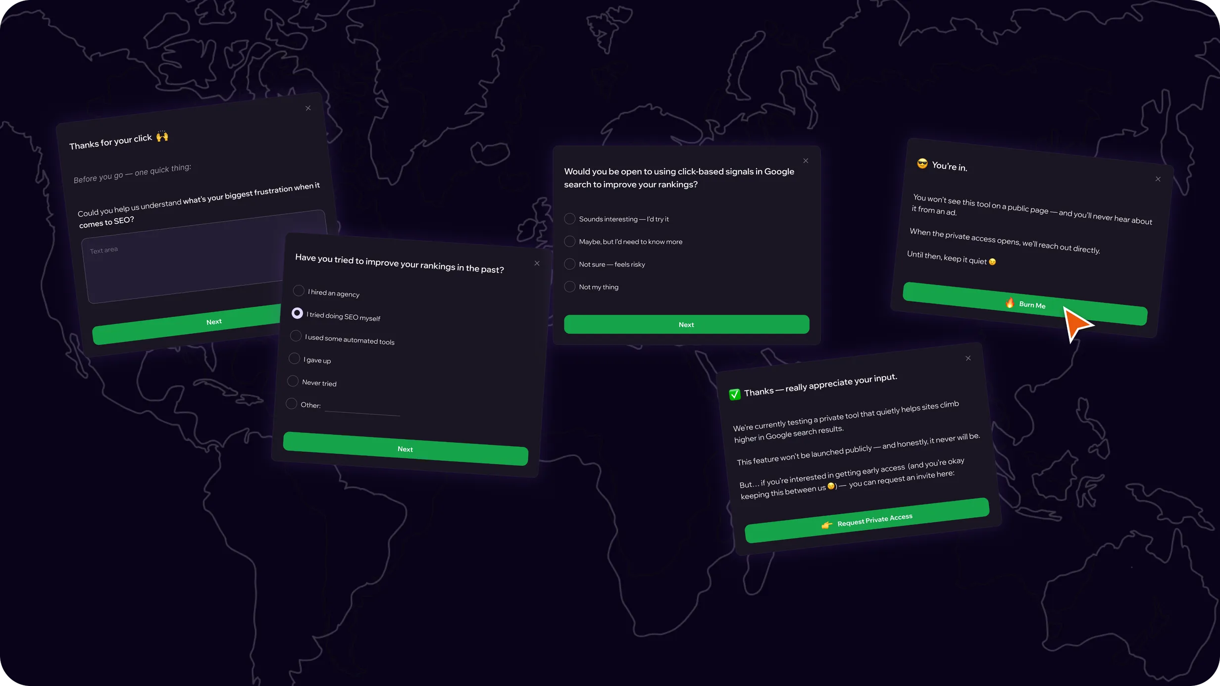
To better understand potential users before giving access to selected features, I designed a short email-based qualification flow combining a lightweight quiz with a private access experience.
The main challenge was to collect useful information without turning the process into a long onboarding form. To keep the experience approachable, the flow was structured as a sequence of simple, focused questions rather than a single complex questionnaire.
The flow was designed to:
The flow created a structured way to collect early user insights and manage access to new functionality without adding unnecessary complexity to the main product experience.
It also provided the team with additional context about user needs before introducing more advanced features.
A large-scale SaaS product expansion focused on search performance, keyword analytics, and click tracking across regions and devices.
As the product evolved, I worked on a major new product area focused on search performance, keyword analytics, and click tracking.
Although integrated into the existing platform, this was a substantial expansion with its own workflows, data structures, dashboards, project configuration, and ongoing management experience.
My role covered the end-to-end UI/UX — from project setup and keyword management to analytics and detailed performance monitoring.
The main challenge was transforming large amounts of ranking, keyword, click, geographic, and device-level data into an experience that remained understandable and scalable.
The goal was not simply to display more data, but to help users quickly understand what changed, where it changed, and which keywords required attention.
During discovery, I analyzed how search performance and click data needed to work together within the product.
Several recurring problems became clear:
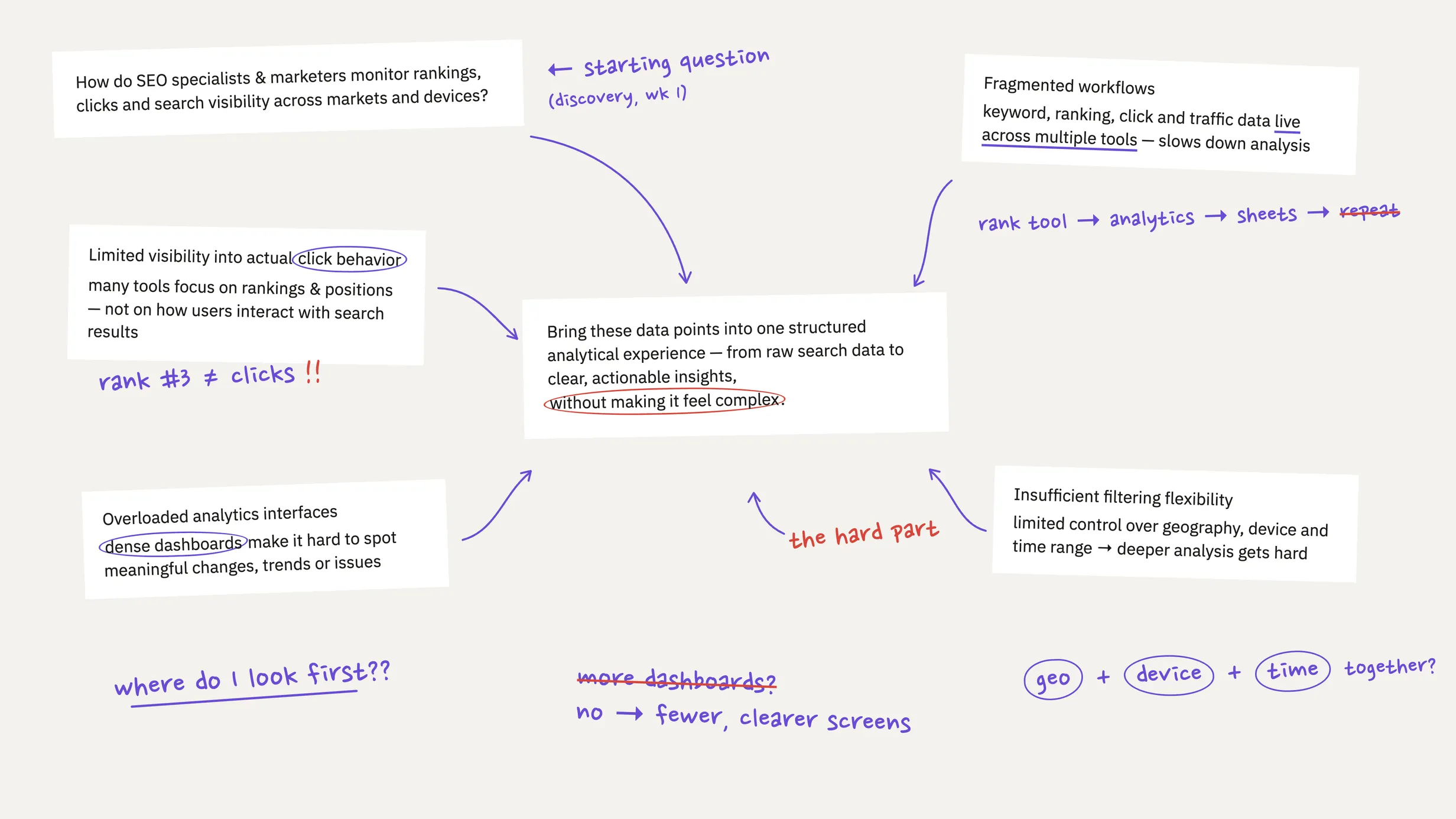
The search-performance experience was built around two closely connected workflows: creating a project and managing its keywords over time.
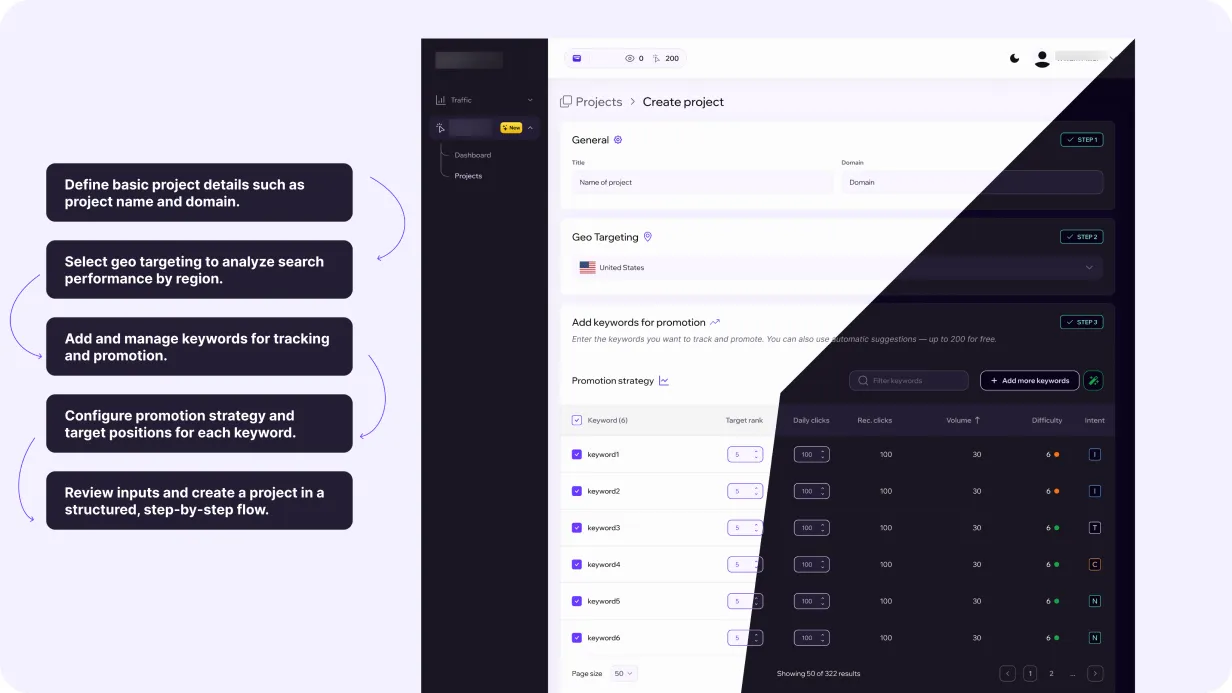
For project setup, I used a structured flow that separated core information from more detailed configuration. Users could define the website, select target markets, add keywords, and configure the parameters required for tracking and delivery.
Once a project was created, keyword management became an ongoing workspace rather than a one-time setup step.
I structured project creation as a progressive, step-by-step flow so users could focus on one group of decisions at a time.
The setup includes:
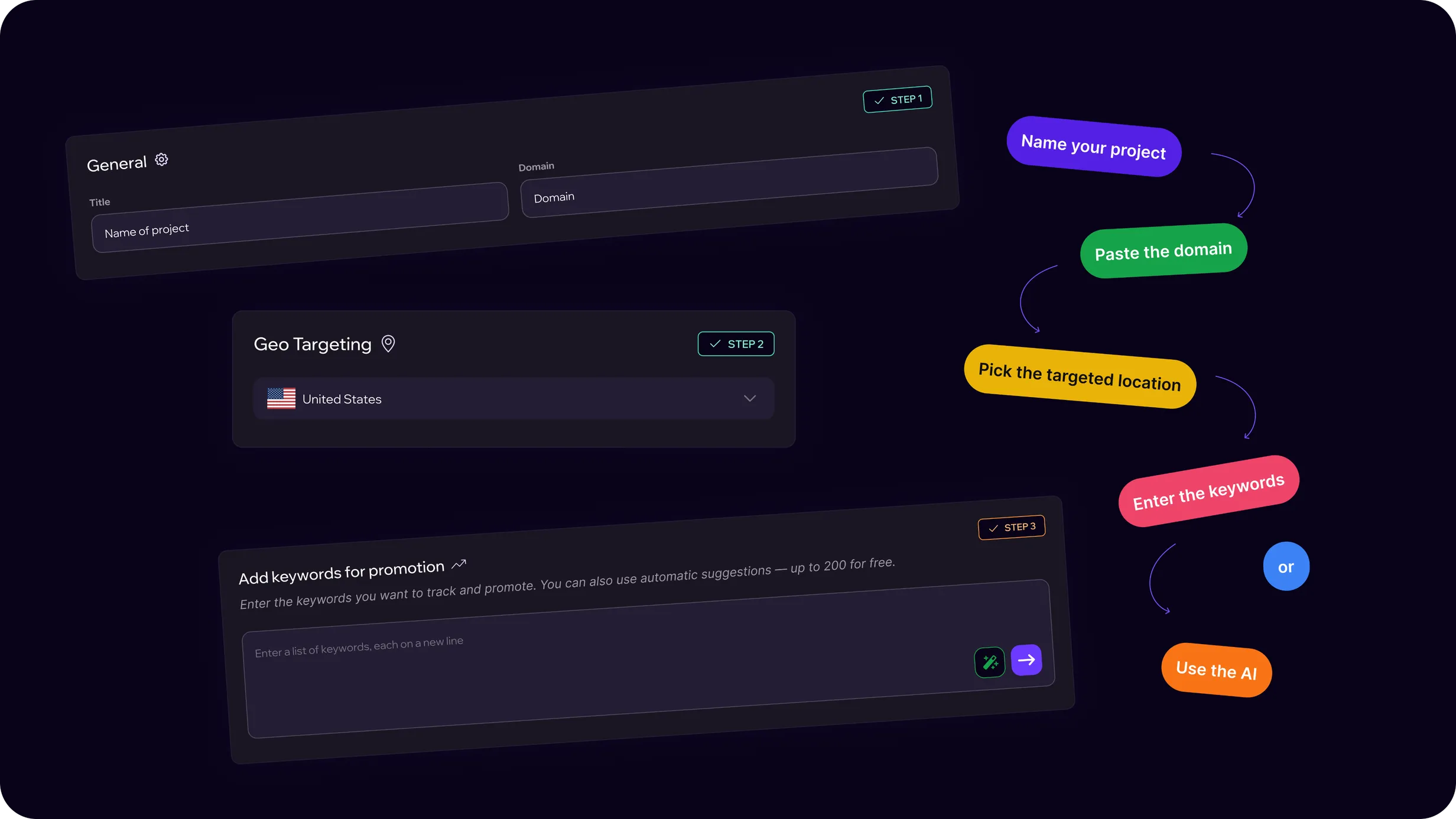
Once the required configuration is complete, the project becomes available in the workspace for ongoing monitoring and management.
After setup, the keyword table becomes the main workspace for controlling and analyzing individual keywords.
Users can:
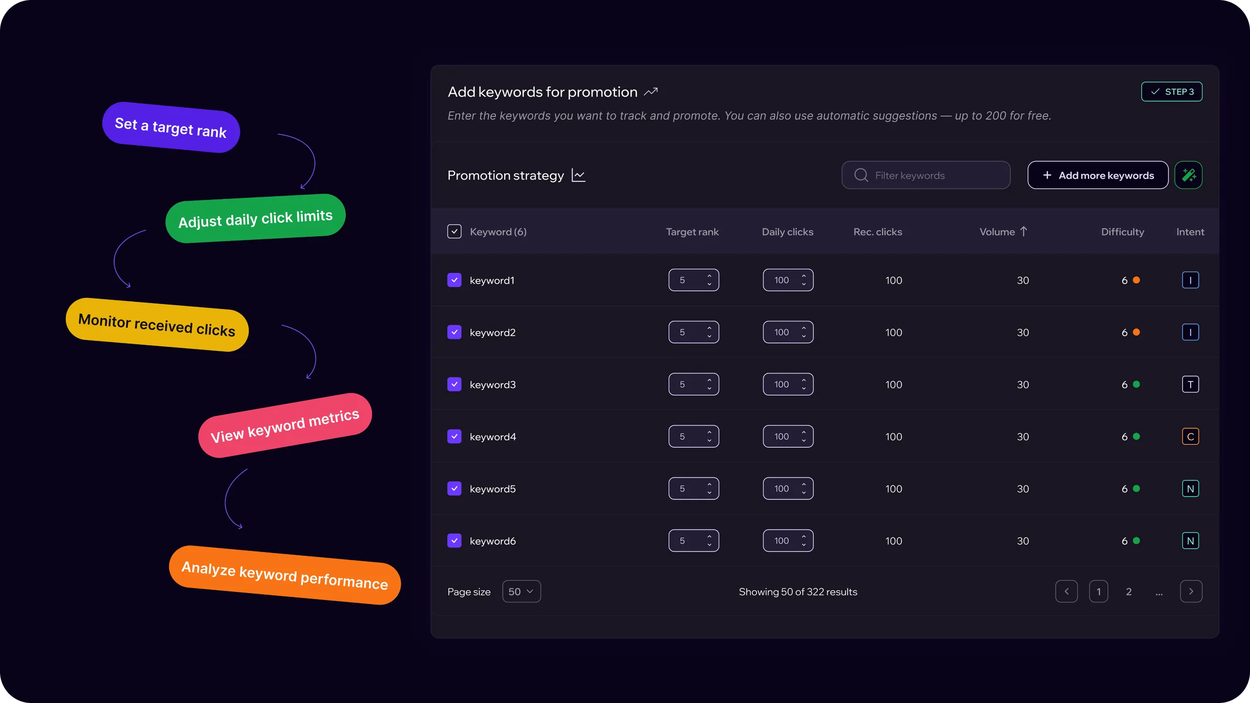
As the product matured, I worked closely with the Product Manager on a significant redesign of the core experience.
The initiative started with new product requirements, but quickly became broader than adding individual features. Together, we reconsidered how users move through the entire lifecycle of a project — from initial setup to analysis, strategy, launch, and ongoing optimization.
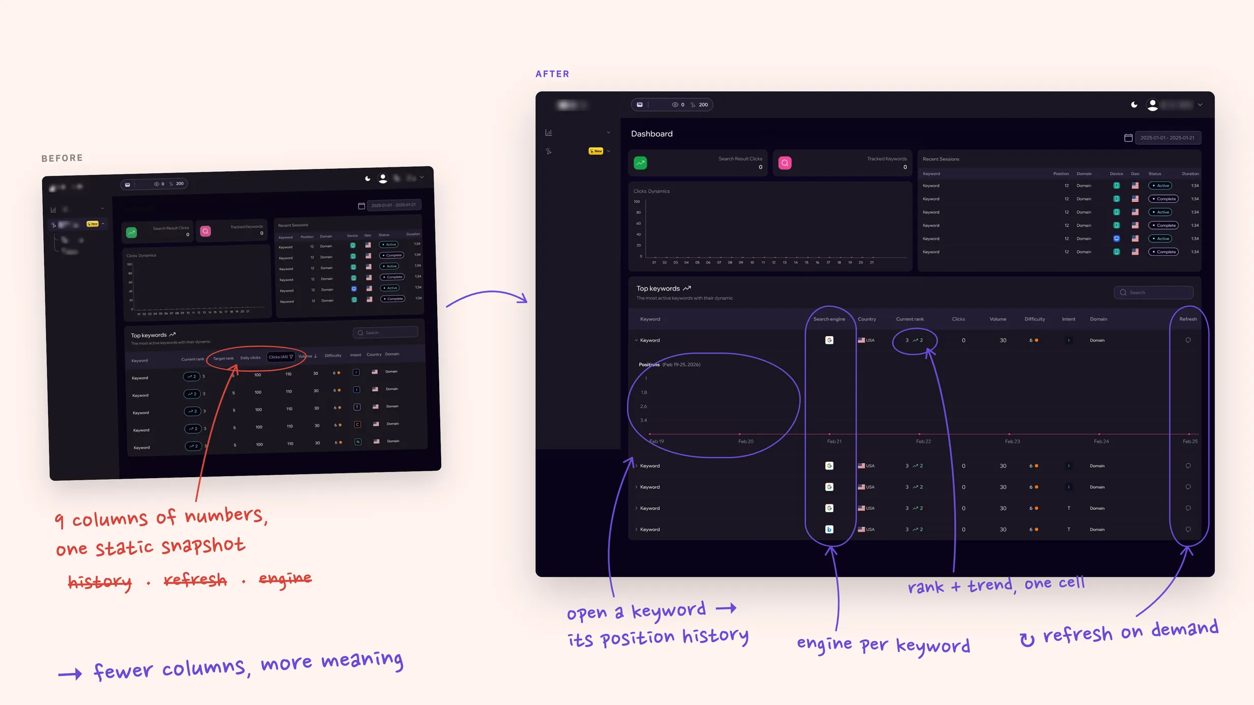
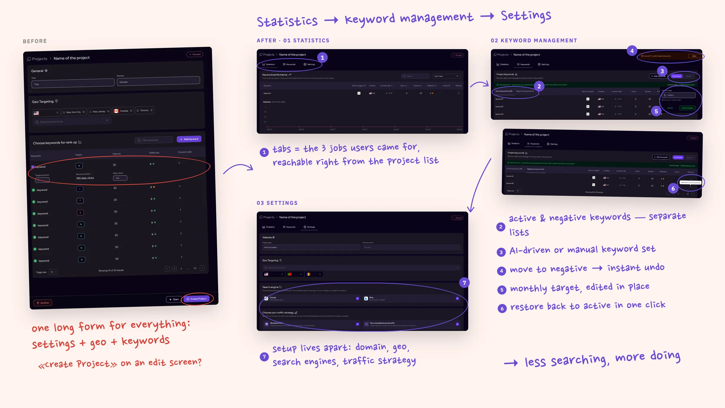
The dashboard evolved from a high-level analytics view into a more actionable monitoring experience.
Users can now inspect keyword position changes over time, understand ranking movement directly within the table, and manually refresh keyword data when they need an updated result.
This made the dashboard less about simply displaying metrics and more about understanding ongoing performance.
The project list also became more task-oriented.
Instead of using a single entry point for every project action, users can now move directly into:
Statistics → Keyword Management → Settings
This separates monitoring from management and configuration, reducing the need to navigate through unrelated screens.
Keyword management was expanded further with separate active and negative keyword states, giving users clearer control over which keywords should remain part of the active strategy.
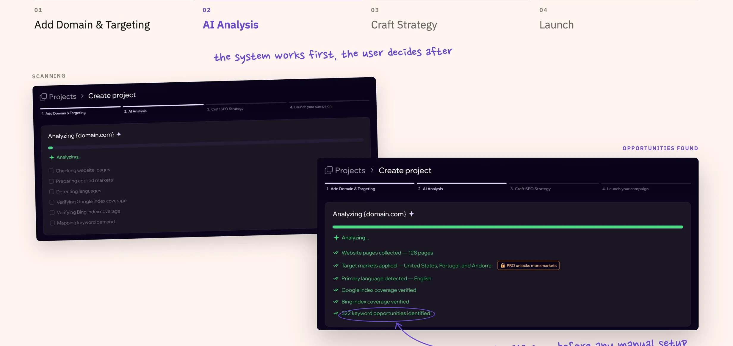
The original configuration flow was redesigned into a more guided journey:
Add Domain & Targeting → AI Analysis → Craft Strategy → Launch
Users first provide the minimum information required to understand the website and target markets.
The platform then performs an AI-assisted analysis, identifying relevant opportunities before the user is asked to make more detailed strategic decisions.
Instead of starting from an empty configuration, users can review and adjust a proposed strategy — including search engines, traffic approach, and recommended keywords.
This shifts the experience from manual configuration toward guided decision-making.
We also introduced a clearer transition between strategy configuration and campaign launch.
Users can define their monthly traffic target, understand the approximate delivery pace, review the selected markets and keywords, and see the corresponding pricing before committing.
This provides more context around the consequences of their configuration and creates a natural bridge between product setup and purchase.
Previously, project creation ended once the configuration was completed.
The updated flow extends all the way through launch by introducing checkout directly into the experience.
Users can select a plan, review the order summary, choose a payment method, and complete the purchase without leaving the project setup journey.
By integrating the commercial step into the same flow, the transition from strategy → configuration → purchase → launch becomes much more continuous and predictable.
The work transformed the platform from a set of configuration and analytics screens into a more structured product ecosystem.
The updated experience establishes clearer roles for each part of the product:
Across both the original platform and the search-performance expansion, the goal remained consistent: make a complex, data-heavy product easier to understand, manage, and evolve without removing the flexibility advanced users need.
The platform evolved from a configuration-heavy analytics tool into a more structured product experience covering the full project lifecycle — from setup and analysis to strategy, launch, monitoring, and ongoing optimization.
One of the main lessons from this project was that adding functionality does not have to make a product feel more complex.
Working closely with the Product Manager, I learned to treat new requirements as an opportunity to reconsider the surrounding workflow — not simply add another screen or control.
As the platform evolved, separating monitoring, management, and configuration into clearer contexts became just as important as designing the individual features themselves.
A Shopify SaaS product for creating and managing conversion boosters, promo, social-proof widgets that help merchants build trust and drive conversions.