Converza — Social Proof & Urgency Tools for Shopify
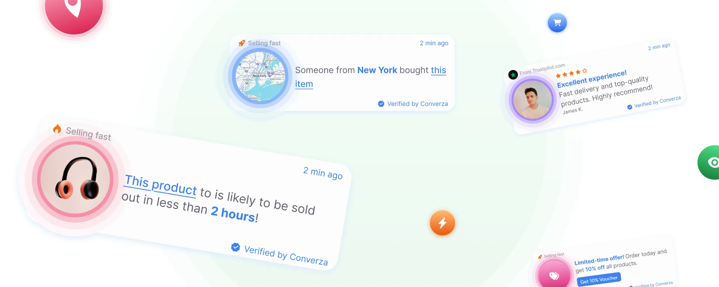
Converza is a SaaS product for Shopify merchants that helps create and manage on-site social proof and urgency experiences, including recent purchase notifications, selling-fast messages, reviews, and cart activity.
Role
Product Designer
Platform
B2B SaaS · Web · Shopify
Focus
Configuration UX · User Flows · Design System
Context / Role
The product needed to make these tools easy to configure while giving merchants enough control over content, appearance, targeting, and behavior — without requiring technical setup.
My work focused on creating a clear, scalable product experience that could support multiple widget types while keeping configuration predictable and consistent across the platform.
Task
My task was to design the UI/UX for a Shopify SaaS product built around configurable social proof and urgency widgets.
The main design challenge was balancing three different needs:
making widget setup simple enough for non-technical merchants
providing enough flexibility to adapt widgets to different storefronts and use cases
ensuring urgency and social proof felt credible and non-intrusive, rather than disruptive to the shopping experience
I focused on designing a reusable configuration model, clear interaction patterns, and a scalable interface that could support different widget types without creating a completely different workflow for each one.
The goal was to help merchants move from choosing a widget → configuring its behavior and appearance → previewing the result → publishing it through a consistent and understandable flow.
Widget Creation & Management Flow
The core experience was structured around a simple progression from creating a stream to configuring, previewing, and managing live widgets.
The main UX goal was to keep setup lightweight while still giving merchants enough control over targeting, content, appearance, and behavior.
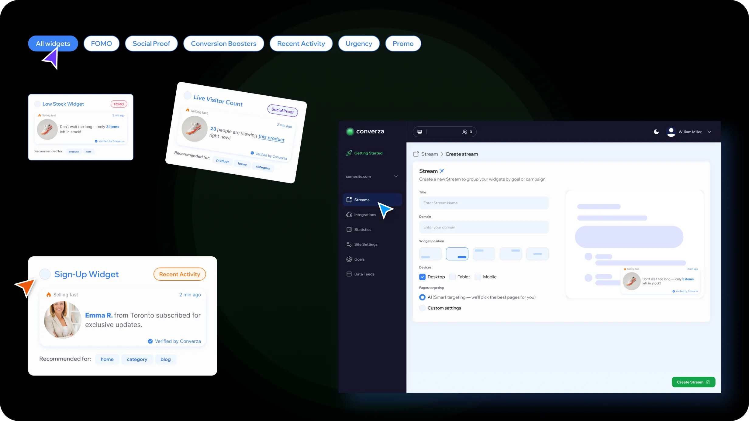
1. Create a Stream
Merchants start by creating a stream — a container for a group of widgets used within a specific campaign or storefront context.
At this stage, they define the core settings such as domain, placement, supported devices, and targeting rules.
2. Select Widgets
Users can then choose from a library of social proof and urgency widgets, organized by category and use case.
This allows merchants to discover relevant widgets without having to understand every available configuration option upfront.
3. Configure & Preview
Users can then choose from a library of social proof and urgency widgets, organized by category and use case. This allows merchants to discover relevant widgets without having to understand every available configuration option upfront.
Each widget follows a consistent configuration pattern, allowing users to adjust:
content and messaging
data sources
calls to action
targeting and behavior
visual appearance
A live preview provides immediate feedback, helping merchants understand how changes will appear on the storefront before publishing.
4. Connect Store Data
Shopify integration enables widgets to use live store data, supporting dynamic content such as recent purchases, inventory levels, reviews, and cart activity.
5. Manage the Stream
Once configured, widgets can be enabled, edited, reordered, or removed from the stream.
Keeping these actions within a single workspace makes it easier to manage multiple active widgets without navigating between separate areas of the product.
The flow was designed around a consistent configuration model, so merchants could learn the interaction pattern once and reuse it across different widget types.
Product Structure & Navigation
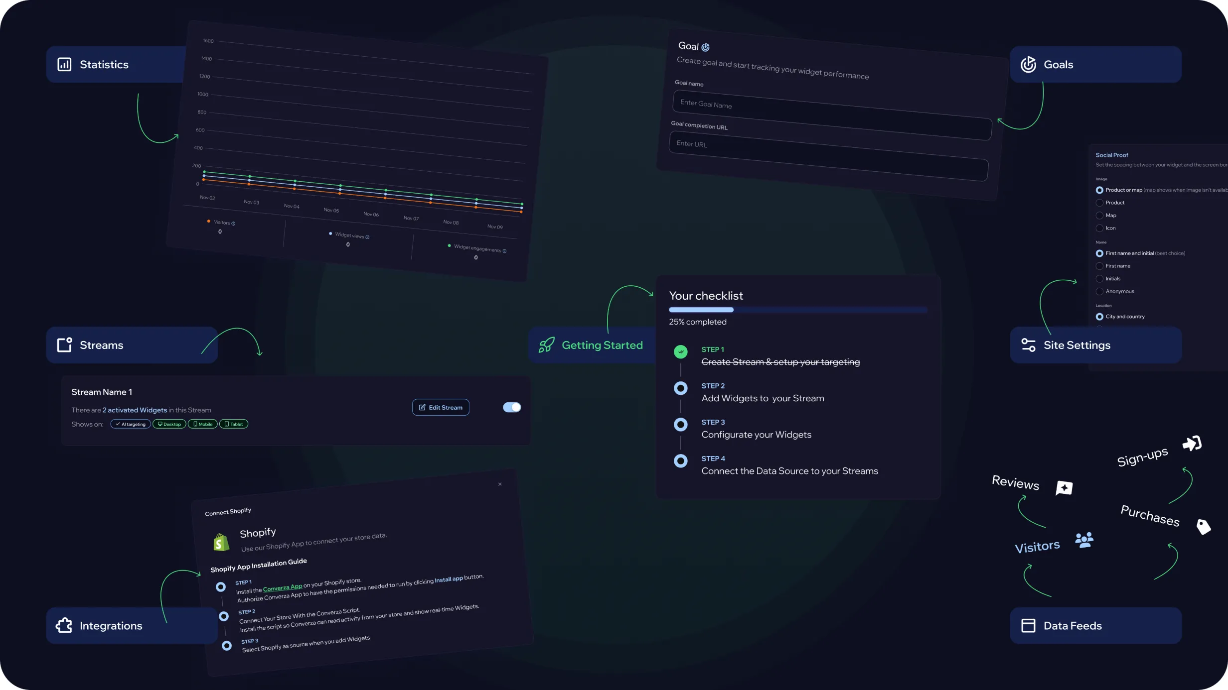
As the product needed to support both everyday widget management and more advanced configuration, I structured the navigation around distinct areas of responsibility.
The goal was to keep the most frequent merchant workflows easy to reach while moving setup, data, and system-level controls into dedicated sections.
The product was organized around several key areas:
Getting Started — onboarding and initial store setup
Streams — the primary workspace for creating and managing widget groups
Statistics — performance monitoring and analysis
Integrations & Data — external connections and data sources used by widgets
Site Settings — store-wide configuration and preferences
Goals — business objectives connected to widget activity
This separation helped distinguish daily operational tasks from advanced configuration, keeping the primary workflow focused while still making deeper controls available when needed.
The navigation was designed to remain scalable as new widget types, integrations, and product capabilities were introduced.
Widget Discovery & Selection
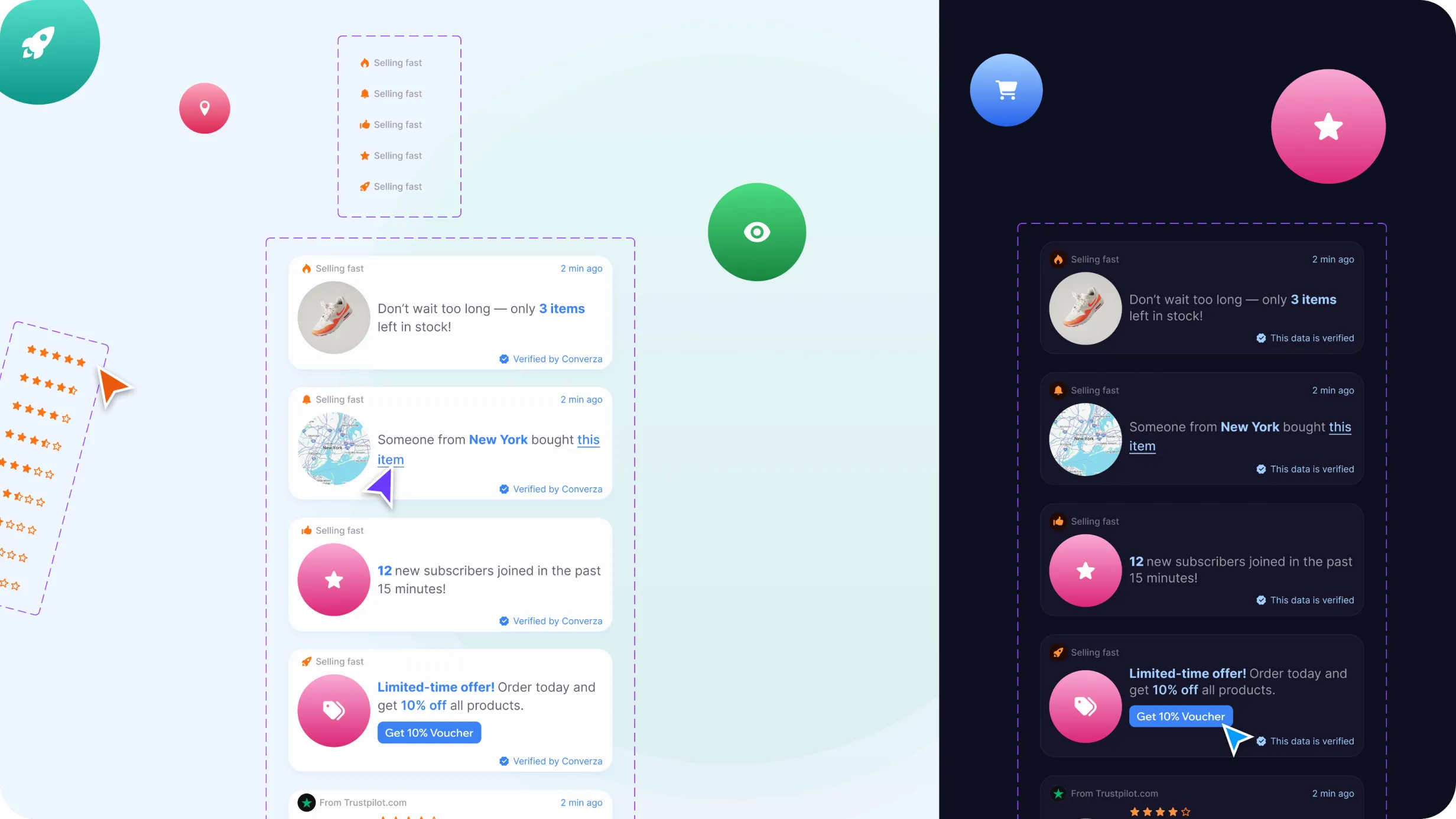
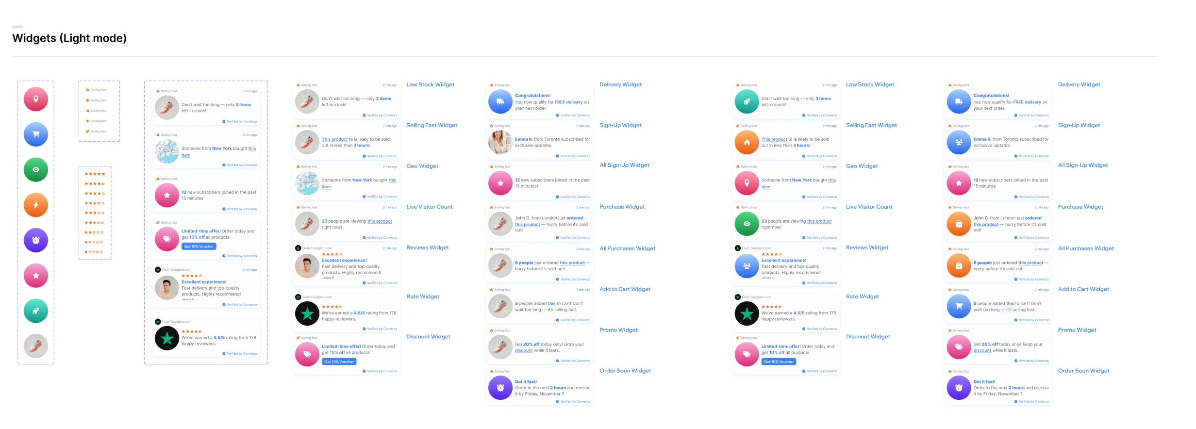
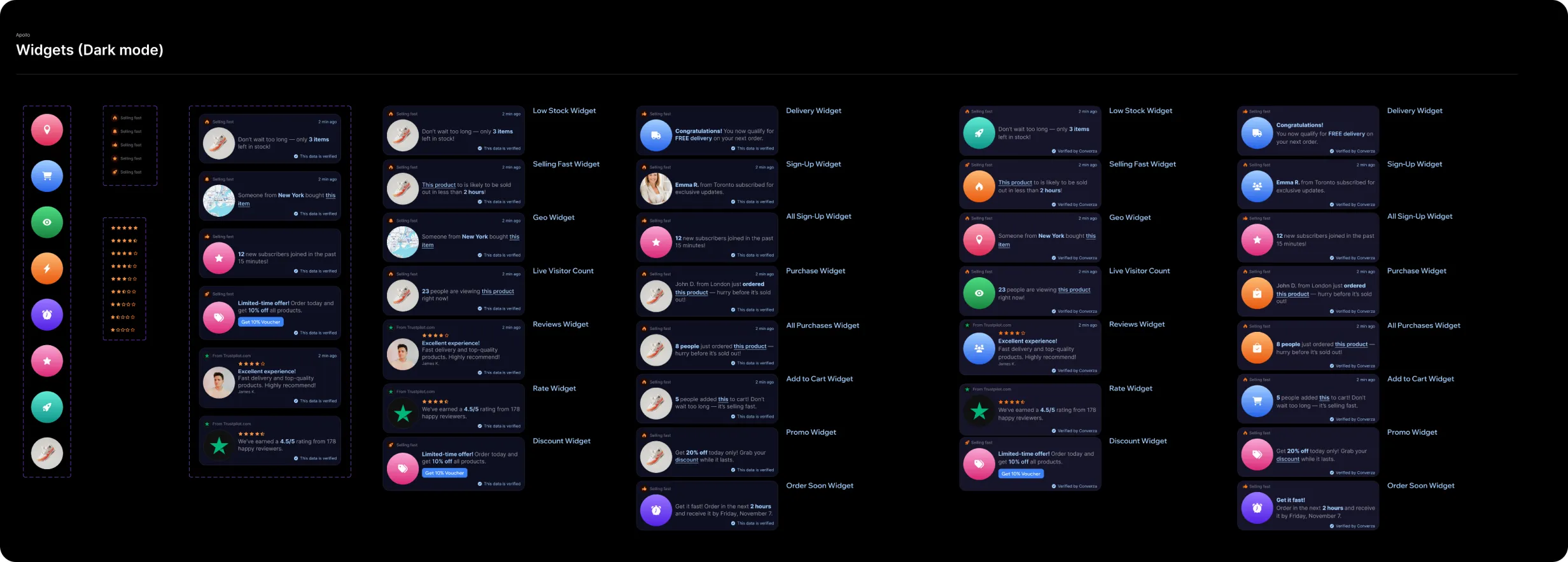
Converza supports multiple widget types across social proof, urgency, recent activity, and promotional use cases. The challenge was to make this growing library easy to explore without turning widget selection into another complex configuration step.
I designed the library around quick comparison and recognition. Each widget is presented through a consistent card structure with a preview, category, placement context, and clear selection state, allowing merchants to understand the option before opening its configuration.
Filters help narrow the library by use case, while realistic previews reduce ambiguity around how each widget will appear on the storefront.
The same structure also supports custom widgets, giving merchants additional flexibility without introducing a separate interaction model.
The goal was to make widget selection feel like a clear product decision rather than a trial-and-error process — helping users move quickly from discovery to configuration.
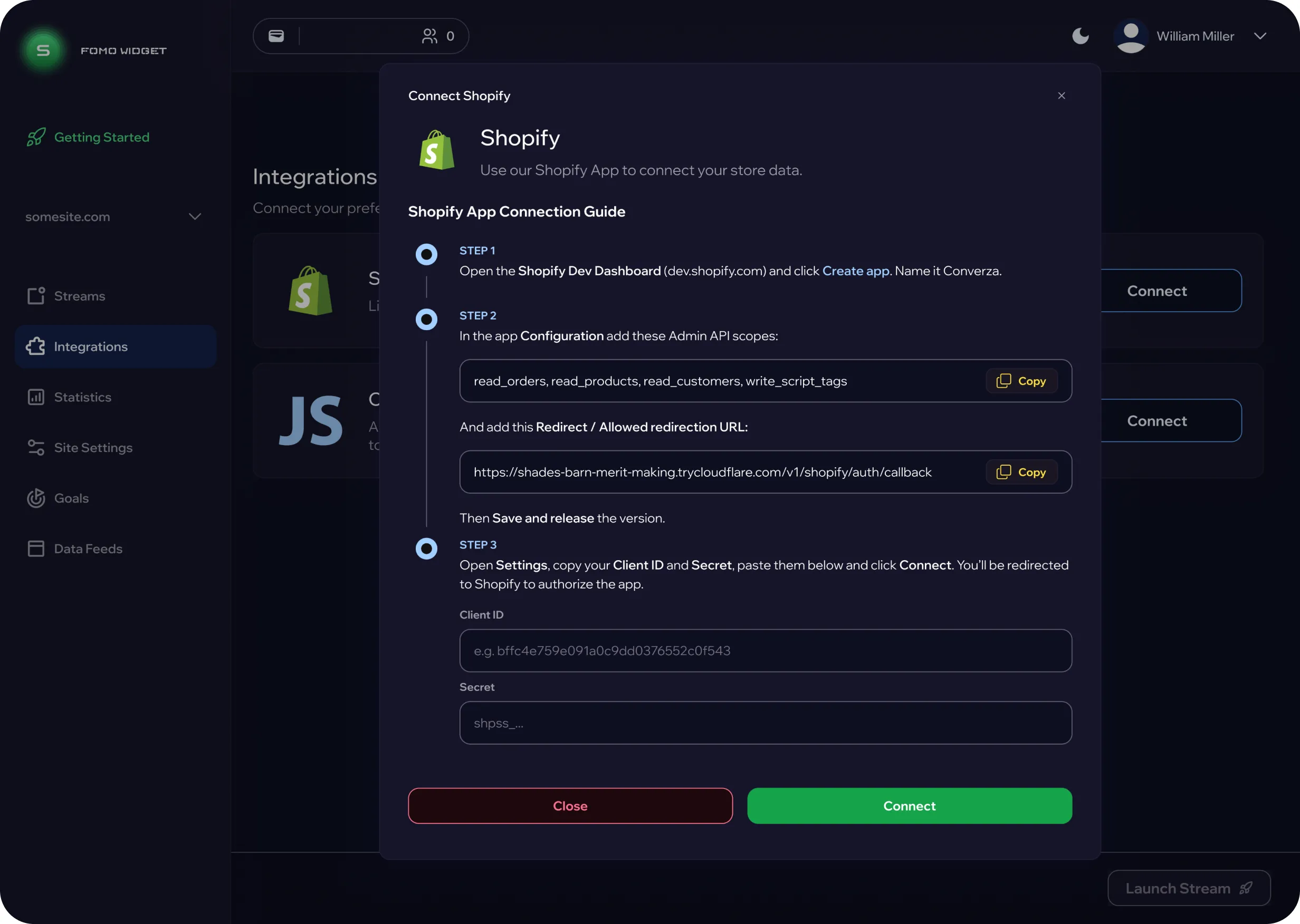
From Shopify-Only to Flexible Installation
The original integration concept relied on a direct Shopify connection, allowing merchants to install the app and start using widgets with very little setup.
As technical constraints became clearer, it was no longer possible to support the full integration through Shopify alone. The experience needed to work across a broader range of storefronts while still remaining understandable for users with different levels of technical knowledge.
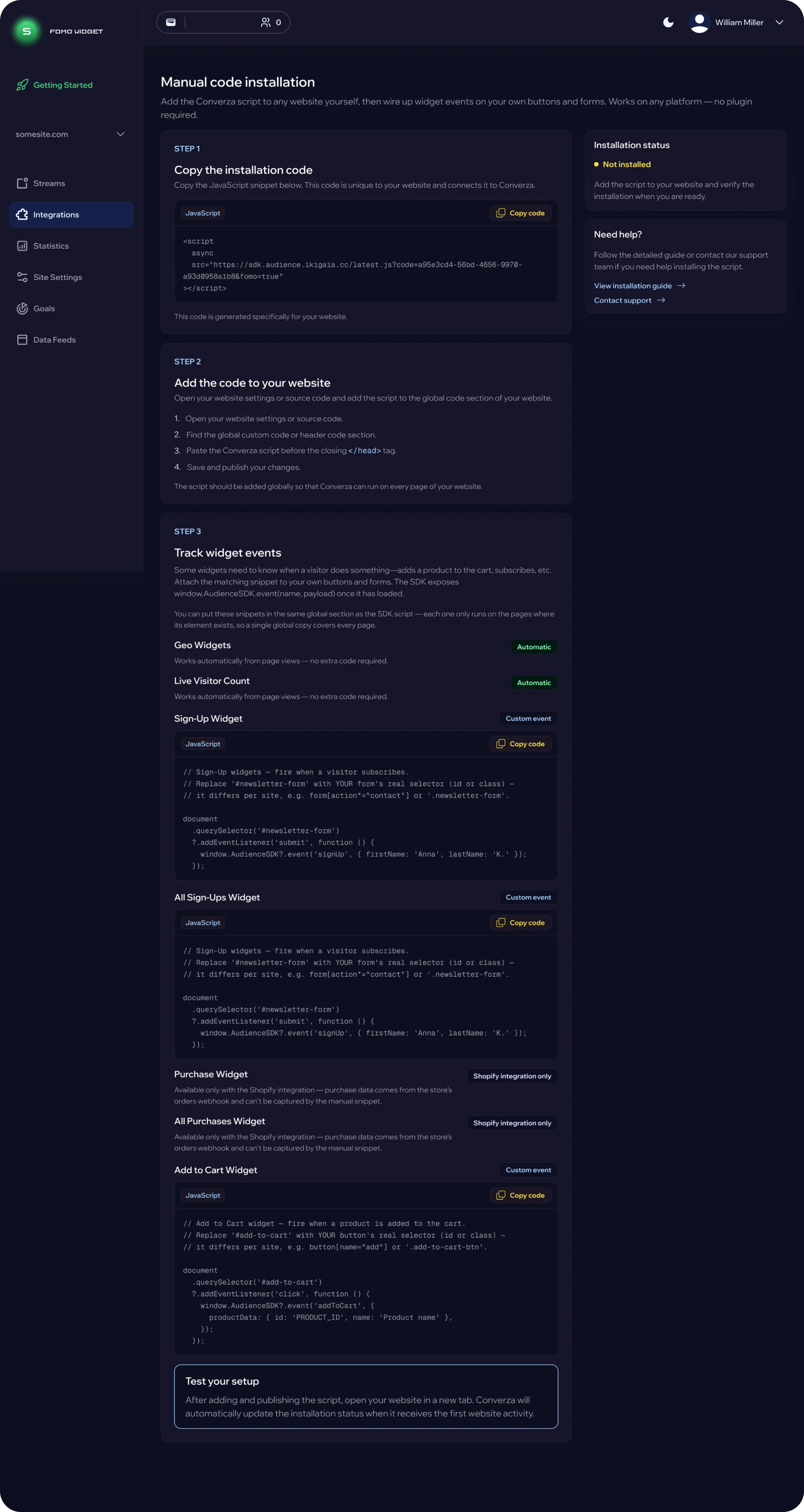
I redesigned the flow around a guided manual installation process, breaking the setup into clear stages:
adding the installation code to the website
connecting available events
configuring custom events when needed
validating the integration before moving forward
Because the new process introduced more technical steps, I focused on making each action explicit and easy to verify. The interface includes copy-ready code snippets, installation status, contextual guidance, and clear distinctions between automatic, custom, and platform-specific functionality.
This approach allowed the integration model to expand beyond a single platform while keeping the setup structured and predictable.
Design System
As Converza expanded across multiple widget types, configuration flows, and product states, I created a scalable design system to keep the experience consistent and easier to extend.
The system was built around Chakra UI and a shared set of design tokens covering color, typography, spacing, radii, shadows, and interaction states.
I used semantic tokens to define recurring UI roles such as primary actions, backgrounds, borders, success states, and warnings. This helped keep visual decisions consistent while allowing the interface to adapt across different contexts.
The component library combined Chakra UI foundations with product-specific patterns, including:
buttons, inputs, badges, and form controls
cards, modals, dropdowns, and navigation
widget configuration patterns
reusable layout and interaction structures
Rather than designing each new feature from scratch, the system provided a shared foundation that could be reused and extended as the product evolved.
This helped improve consistency across the platform and created a clearer bridge between design and development.
Product Landing Experience
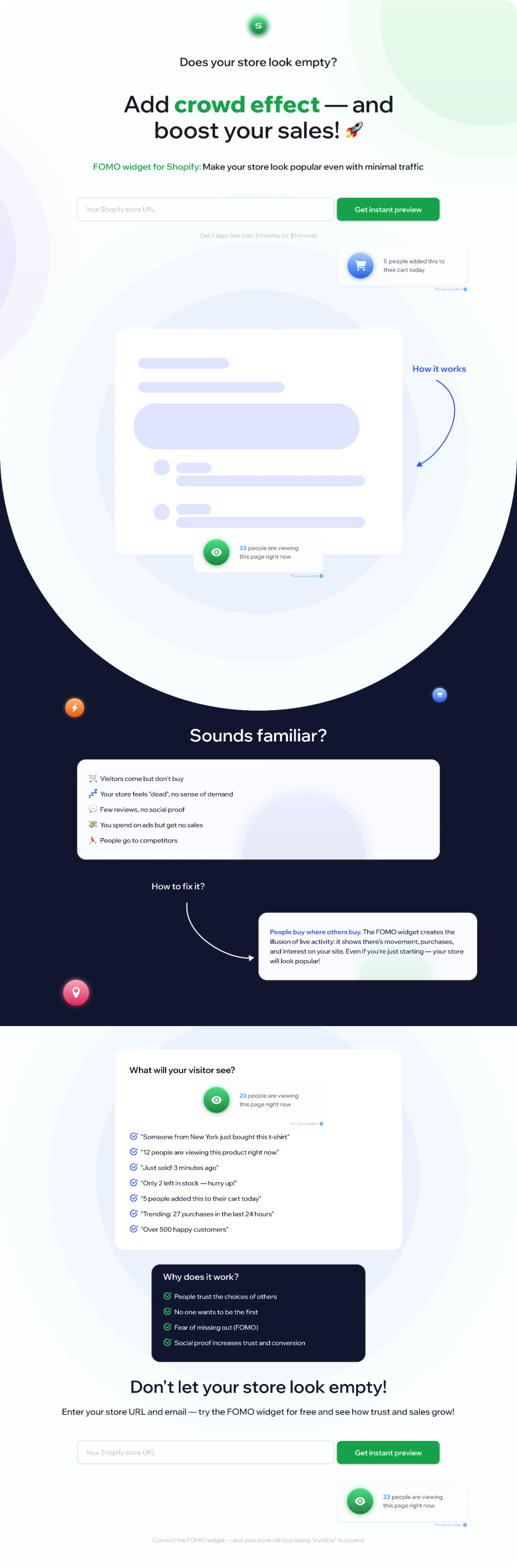
Alongside the core product, I also designed a landing experience focused on explaining the value of FOMO widgets to Shopify merchants before they entered the product.
The challenge was to communicate the concept quickly without relying on technical language or abstract product descriptions.
I structured the page around a simple narrative: store problem → social proof behavior → real widget examples → expected value → clear call to action
The landing page used contextual widget previews directly within the storytelling flow, helping merchants understand not only what the product does, but how the experience would appear to their own customers.
The goal was to create a clearer transition from product discovery to activation, keeping the messaging closely connected to the actual product experience.
Result
The final experience turned Converza into a more structured and scalable product for creating, configuring, and managing social proof and urgency widgets.
The redesigned product established clearer roles for each part of the experience:
Streams became the main workspace for organizing and managing active widgets.
Widget Discovery made it easier to compare options and move from selection to configuration.
Configuration followed a consistent interaction model across different widget types.
Live Preview helped merchants understand changes before publishing.
Integrations evolved from a Shopify-only concept into a more flexible installation flow that could support broader technical scenarios.
Navigation separated everyday widget management from advanced data, settings, and integration controls.
Design System provided a reusable foundation for expanding the product without introducing inconsistent patterns.
The result was a product experience that could support increasing functionality without making the core merchant workflow feel increasingly complex.
The key outcome was not simply adding more widget types, but creating a product structure that could scale with them.
Outcome
The project resulted in a more structured and scalable experience for creating, configuring, and managing social proof and urgency widgets. Instead of treating each widget as a separate flow, the product now relies on a consistent configuration model, clearer navigation, reusable interaction patterns, and a more flexible integration approach. This created a stronger foundation for expanding the platform with new widget types, integrations, and functionality without making the core merchant experience increasingly complex.
Reflection
One of the key takeaways from this project was the importance of designing systems rather than isolated screens. As the product evolved, new widget types, configuration options, and technical constraints could easily have introduced more complexity. Building reusable patterns and a shared design system helped keep the experience predictable while still allowing the product to grow.
The integration redesign was especially valuable: when the original Shopify-only approach was no longer technically viable, I had to rethink the workflow around a more complex setup without exposing that complexity directly to the user.
This project reinforced my approach to product design: understand the underlying product and technical constraints first, then build an experience that can scale around them.
This case study has been anonymized due to NDA restrictions. Branding, product names, selected UI elements, and data have been modified, while the core design challenges, process, and my contribution remain accurate.
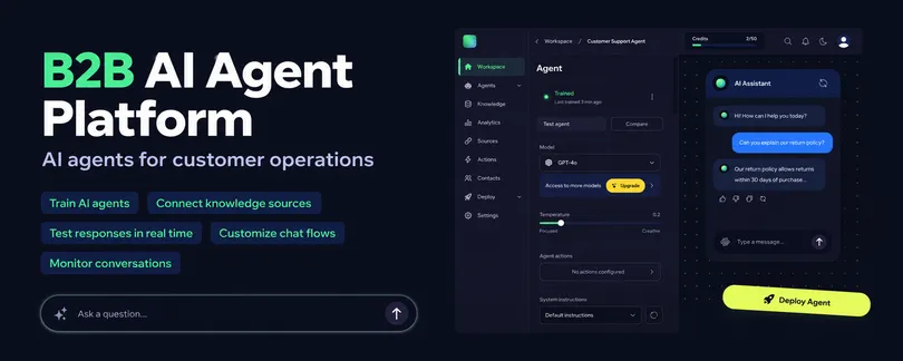
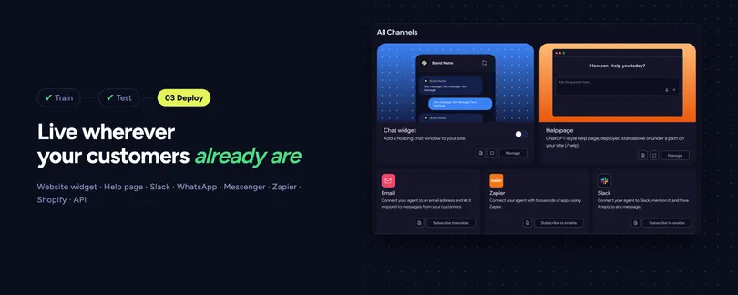
A SaaS platform for creating, training, testing, and deploying AI agents with configurable models, data sources, actions, and analytics.