Web & E-commerceView case Tasty Banka
Tasty Banka
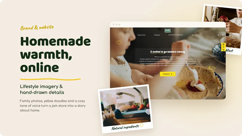
A warm, brand-led e-commerce experience for a family food business, combining product discovery, storytelling, and corporate ordering.



Apollo is a design system created to support complex B2B SaaS interfaces across different product areas, interaction states, and visual themes.
I designed the system around a shared set of foundations, semantic tokens, reusable components, and usage guidelines aligned with Chakra UI.
The goal was to create a common language between design and development — one that could keep the product consistent while remaining flexible enough to evolve.
I worked across the full system — from foundations and tokens to component behavior, themes, documentation, and usage rules — while keeping the structure closely aligned with how components would be implemented in Chakra UI.
Creating consistency without making the system restrictive
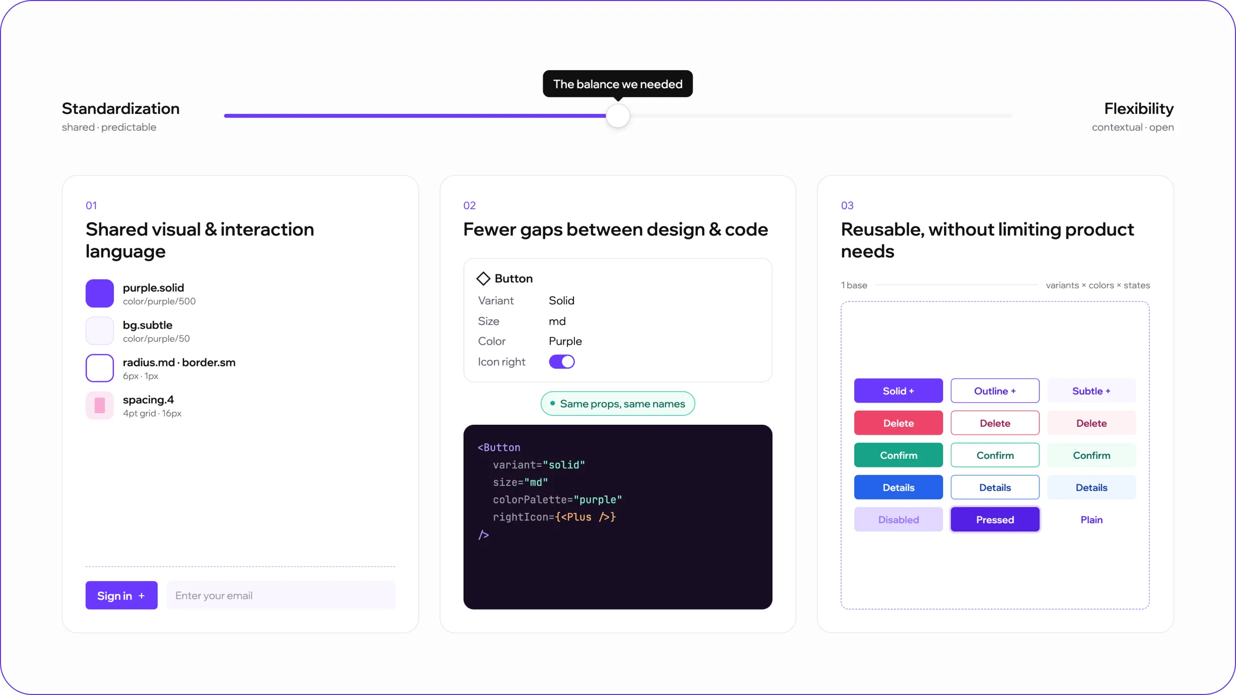
The main challenge was finding the right balance between standardization and flexibility.
The system needed to reduce duplicated design decisions and keep interfaces visually consistent, while still supporting different product contexts, interaction states, and future requirements.
Three priorities shaped the work:
Building the system in layers
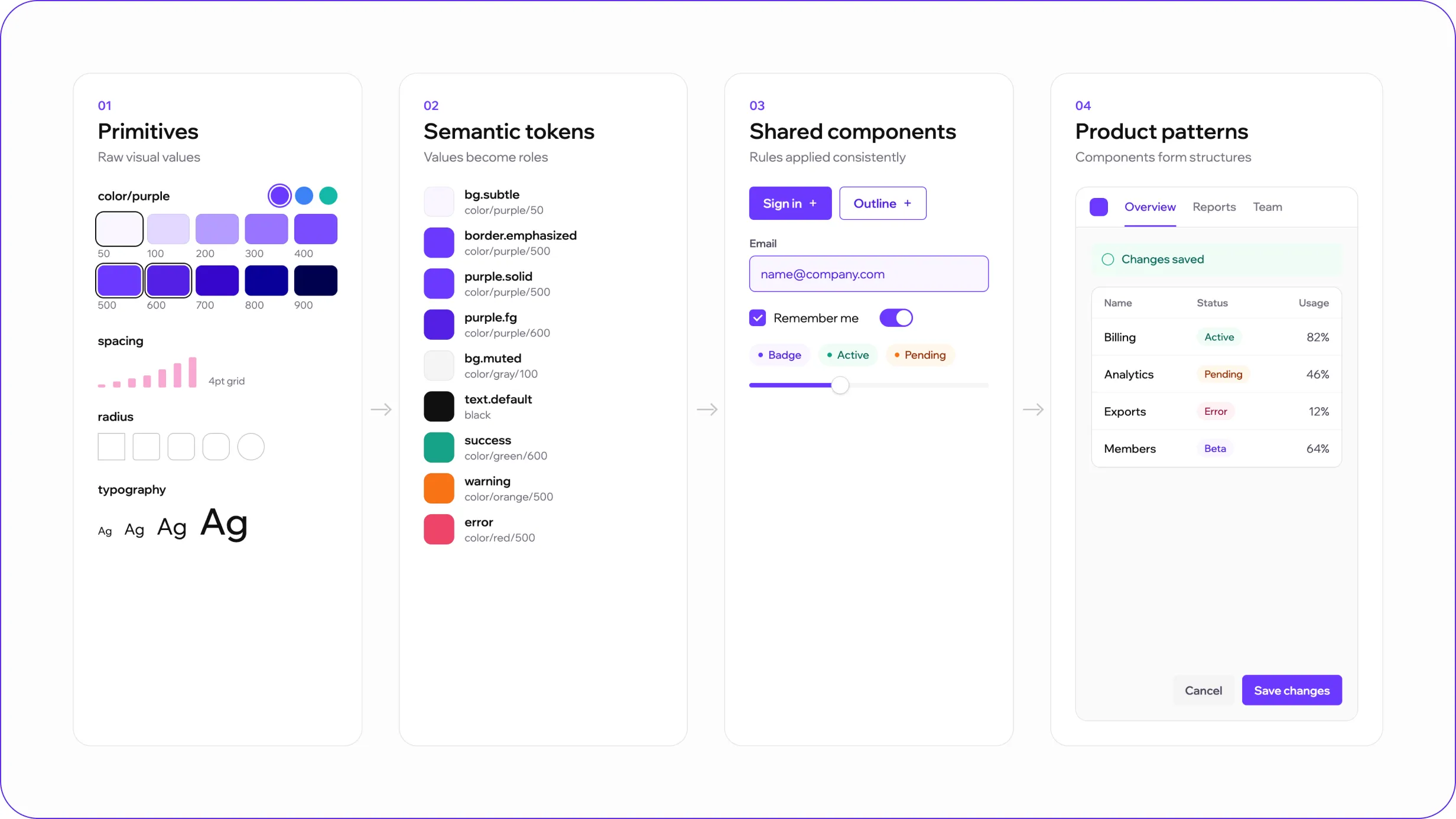
I structured Apollo as a set of connected layers rather than a flat component library.
Primitives define the raw visual values such as color, spacing, typography, and radius.
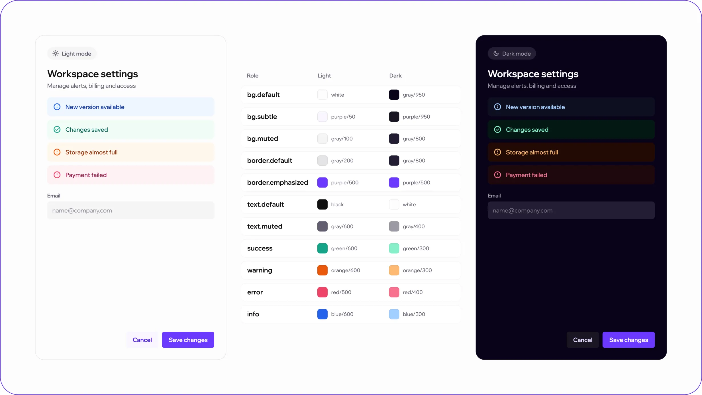
Semantic tokens translate those values into contextual roles such as backgrounds, borders, text, success, warning, and error states.
Shared components apply those rules consistently across common interactions.
Product patterns combine components into larger structures such as forms, navigation, feedback, and data-heavy interfaces.
This hierarchy allows visual decisions to evolve at the system level without requiring every component to be updated individually.
Establishing a predictable visual language
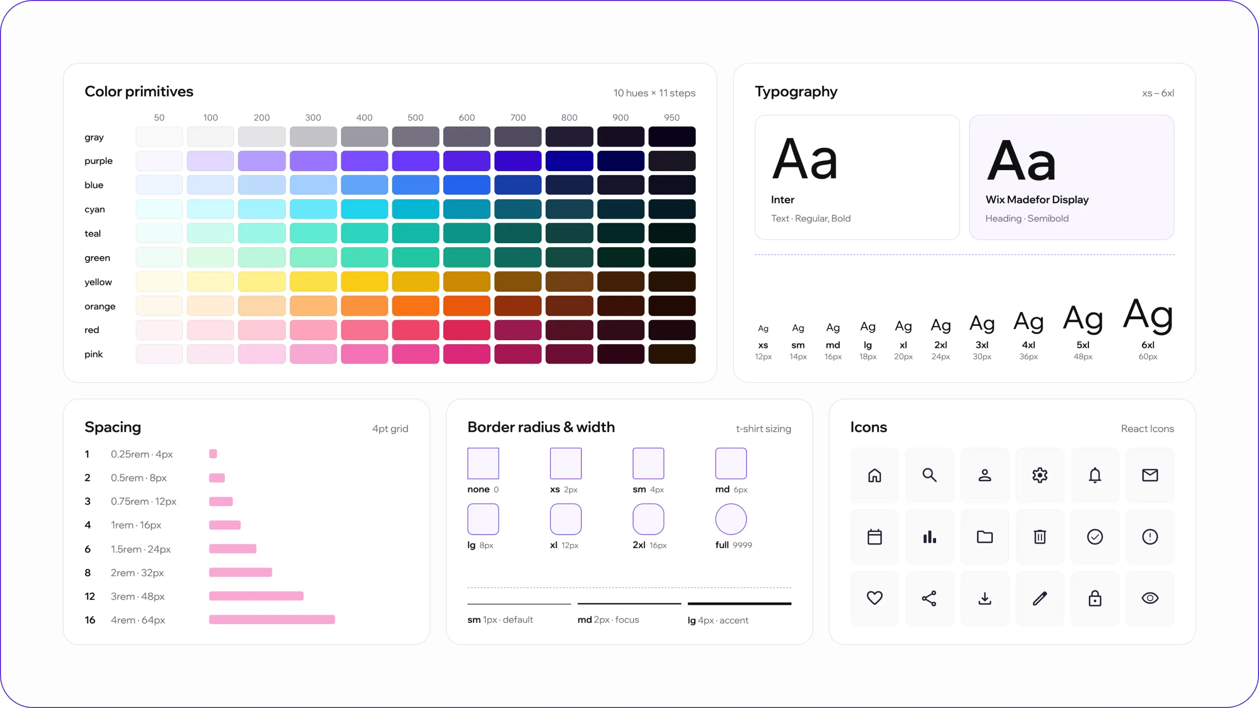
The foundation layer defines the core visual rules used throughout the product.
It includes:
The scales were aligned with Chakra UI conventions where possible, creating a predictable relationship between design specifications and implementation.
Instead of choosing values independently for each screen, designers could work from a shared set of rules that remained consistent across the interface.
Designing around meaning rather than fixed values
One of the most important parts of the system was separating raw color values from their functional meaning.
Rather than assigning fixed colors directly to components, semantic tokens define roles such as:
background · border · text · success · warning · error · info
The same semantic role can then resolve to different values depending on context or theme.
This created a more scalable foundation for light and dark modes, allowing components to preserve their hierarchy and meaning without maintaining separate styling logic for each theme.
Components built as systems, not isolated elements
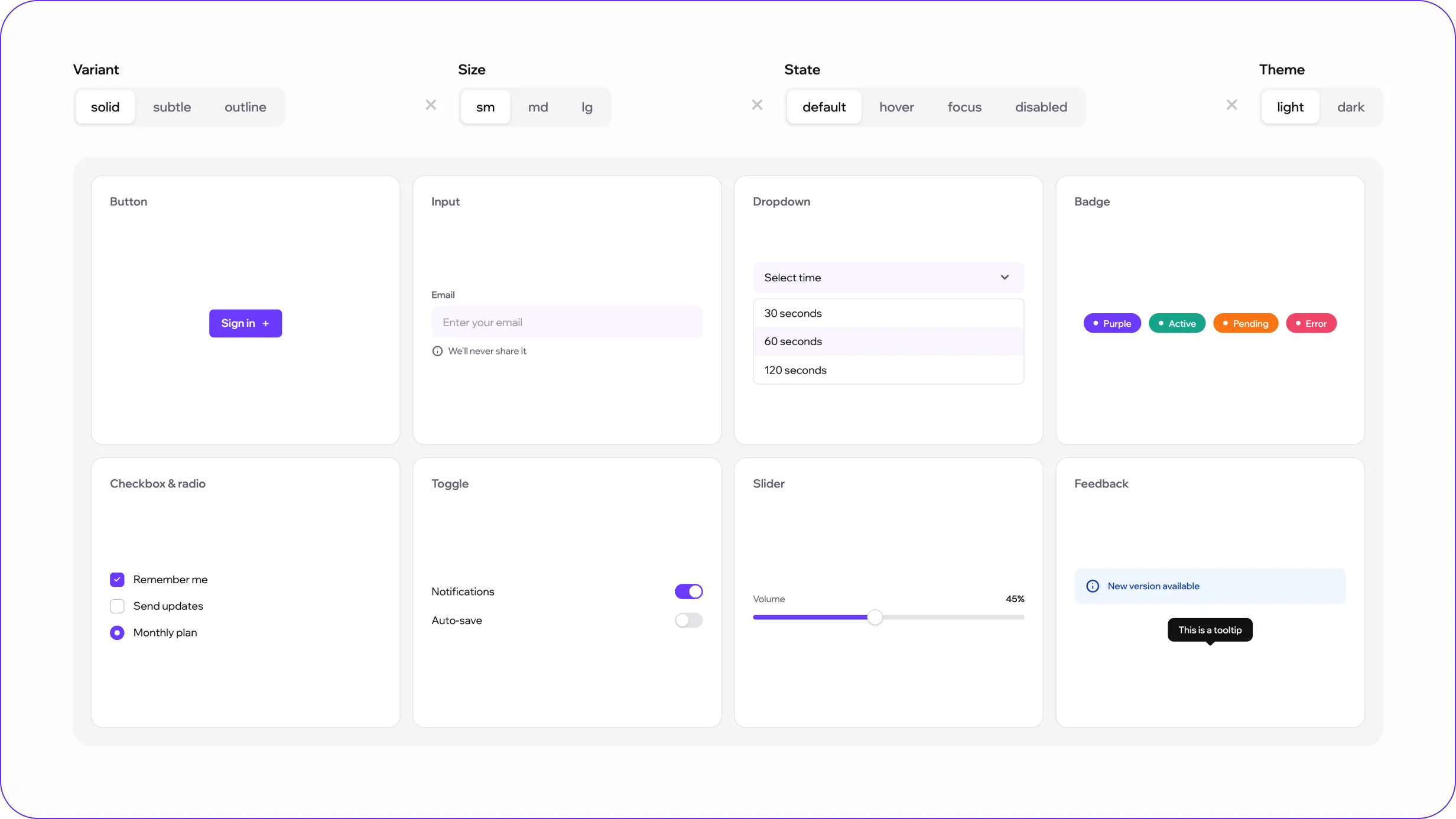
Shared components were designed around a consistent logic of:
variant × size × state × theme
The library includes patterns such as buttons, inputs, dropdowns, badges, selection controls, toggles, sliders, and feedback components.
Each component supports the variations required by the product while following the same underlying token structure.
This made it possible to extend components without creating one-off versions every time a new interface requirement appeared.
Making interaction and system states predictable
For a data-heavy SaaS product, consistency becomes especially important when something changes, succeeds, fails, or requires attention.
I defined reusable visual patterns for states such as:
The same semantic logic is reused across inputs, badges, alerts, progress indicators, and other feedback components.
This helps users learn the meaning of states once and recognize them consistently throughout the product.
Making the system usable beyond the Figma library
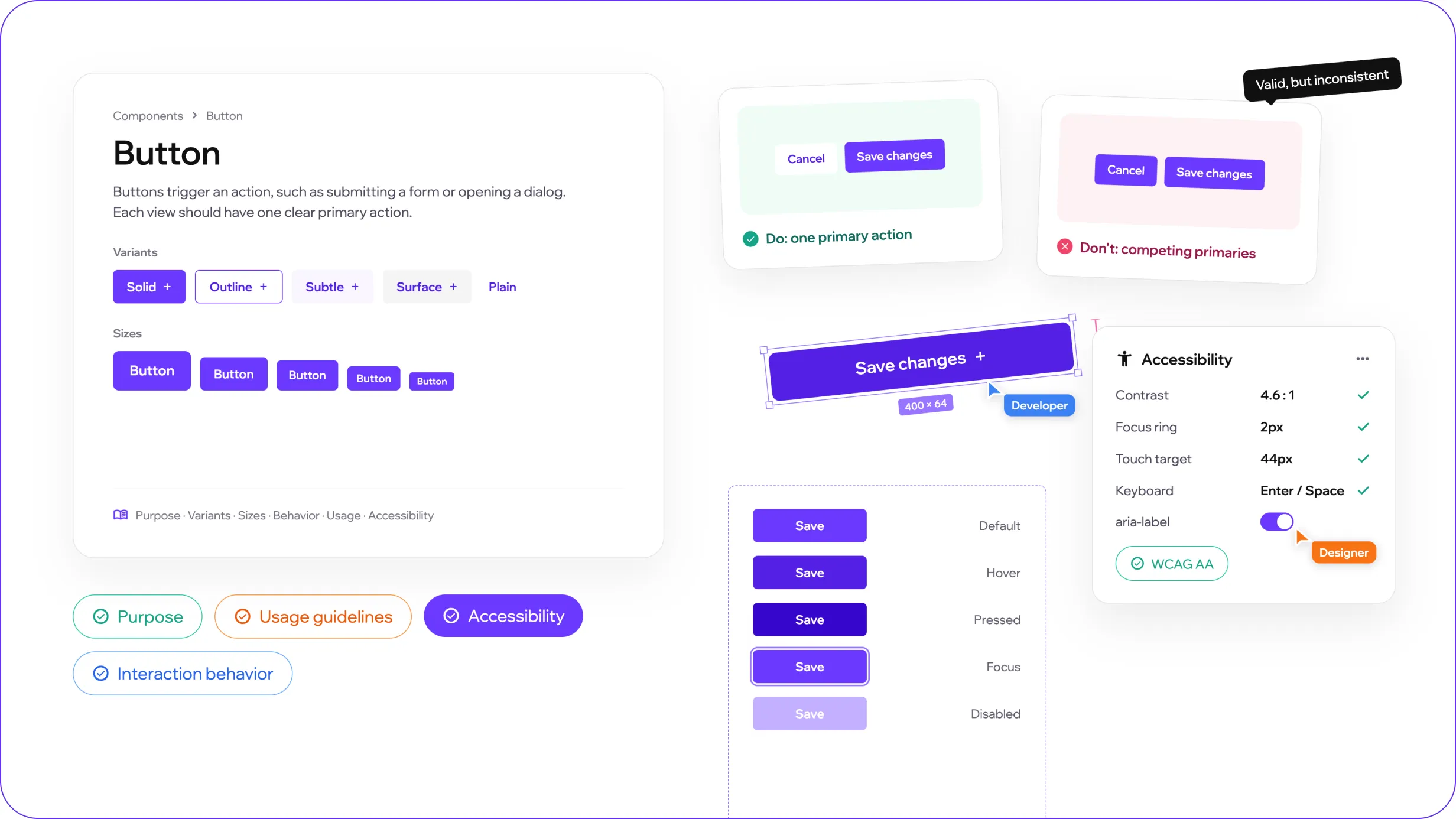
A component library alone does not explain when or why a pattern should be used.
For key foundations and components, I documented:
This documentation gives designers and developers context behind the component rather than only providing its visual specification.
It also helps prevent technically valid component combinations from being used in ways that create inconsistent experiences.
A reusable foundation for evolving SaaS interfaces
Apollo established a shared framework for designing and implementing product interfaces more consistently.
The system created:
A consistent product language
Shared visual and interaction rules across different areas of the interface.
A reusable foundation
New features can build on existing tokens, components, and patterns instead of redefining common decisions.
Closer design–development alignment
The structure of the design system reflects the logic used in implementation, reducing ambiguity during handoff.
The result is a system that supports product growth without requiring the same UI decisions to be solved repeatedly.
Building Apollo reinforced that a design system is not simply a collection of components — it is a shared set of decisions. The most valuable part of the work was defining the logic behind tokens, states, and reusable patterns so the system could stay consistent without becoming rigid.
A warm, brand-led e-commerce experience for a family food business, combining product discovery, storytelling, and corporate ordering.