Web & E-commerceView case Rukh
Rukh
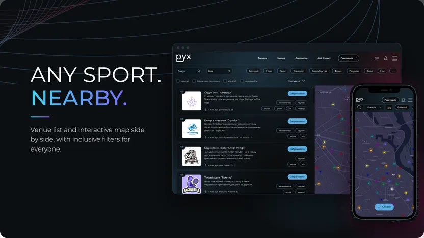
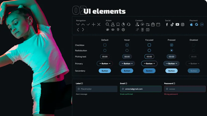
A sports marketplace for discovering venues and activities, comparing options on a map, booking sessions, paying online & donating.


A warm, brand-led e-commerce experience for a family food business, combining product discovery, storytelling, and corporate ordering.
Tasty Banka was a small local business with a very personal brand story built around family, homemade recipes, natural ingredients, and direct relationships with customers.
The website needed to do more than showcase products. It had to become a practical sales channel while preserving the feeling of buying from a real family business rather than a generic online store.
My role was to structure the experience from the ground up — defining the information architecture, designing the main shopping flows, and translating the brand’s informal personality into the interface.
Making e-commerce feel personal
The main challenge was balancing two very different needs.
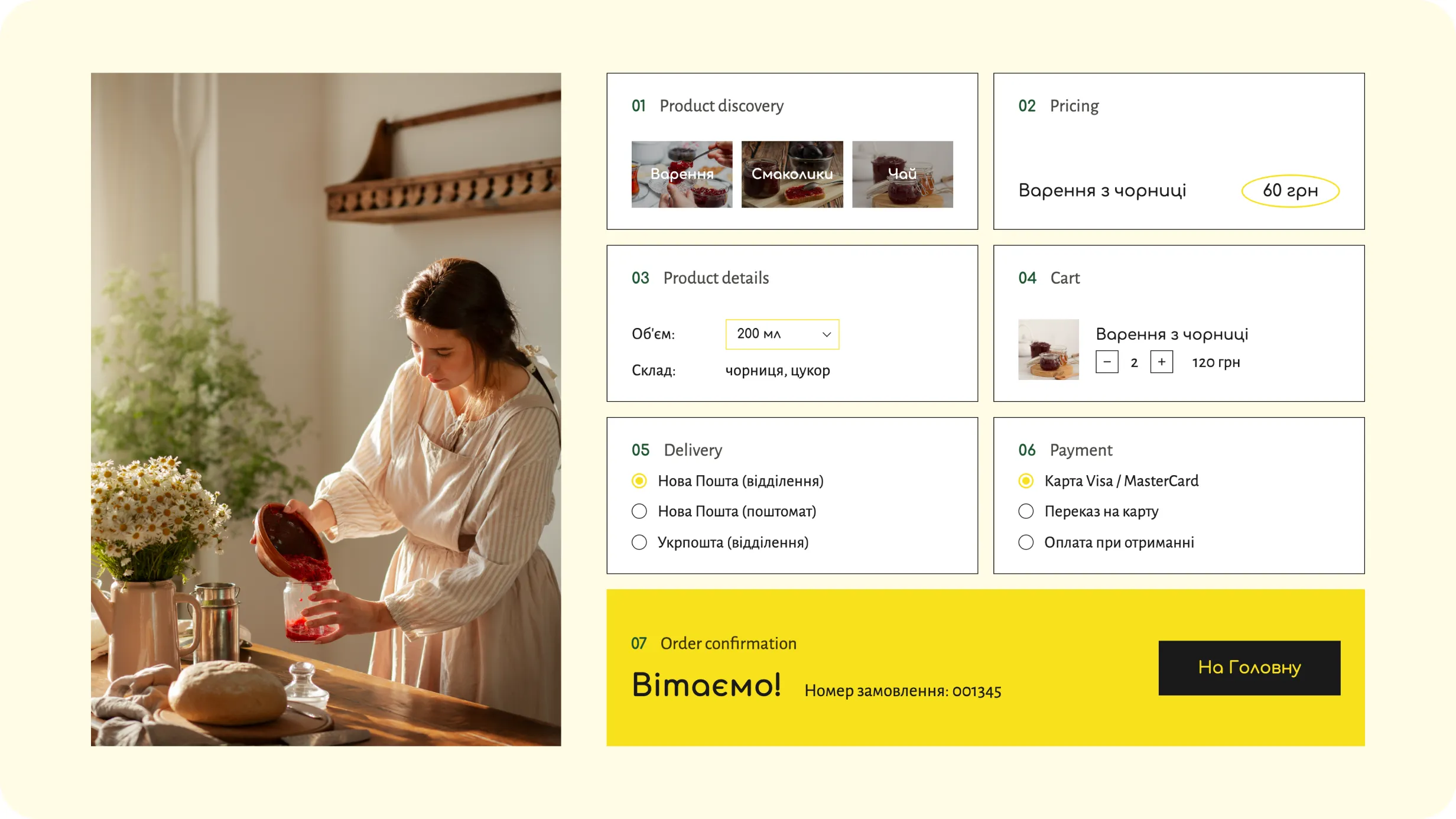
The experience had to provide the clarity users expect from an online store — product discovery, pricing, product details, cart, delivery, payment, and order confirmation — while still feeling warm, informal, and recognizable as a small family brand.
The goal was to make purchasing straightforward without making the business feel corporate or overly polished.
Building the experience around both story and purchase
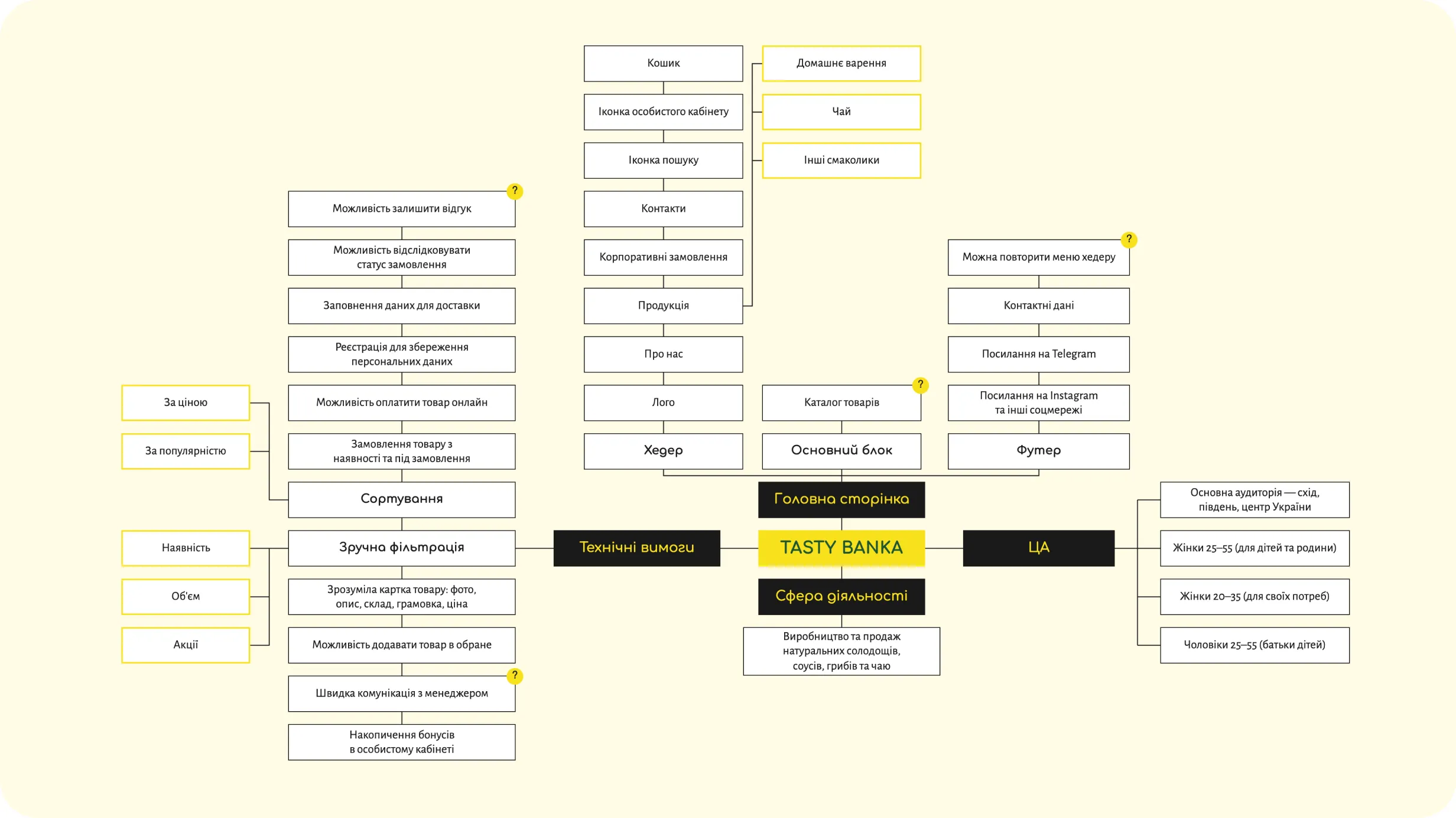
Before designing the interface, I mapped the core product areas and customer actions.
The structure connected four main parts of the experience:
Brand story — introducing the family behind the products
Product discovery — browsing jams, tea, and other treats
Shopping — product details, cart, checkout, and account
Corporate orders — a separate path for larger and personalized requests
This helped keep the navigation simple while supporting both everyday customers and business clients.
Bringing the personality of a small handmade brand online
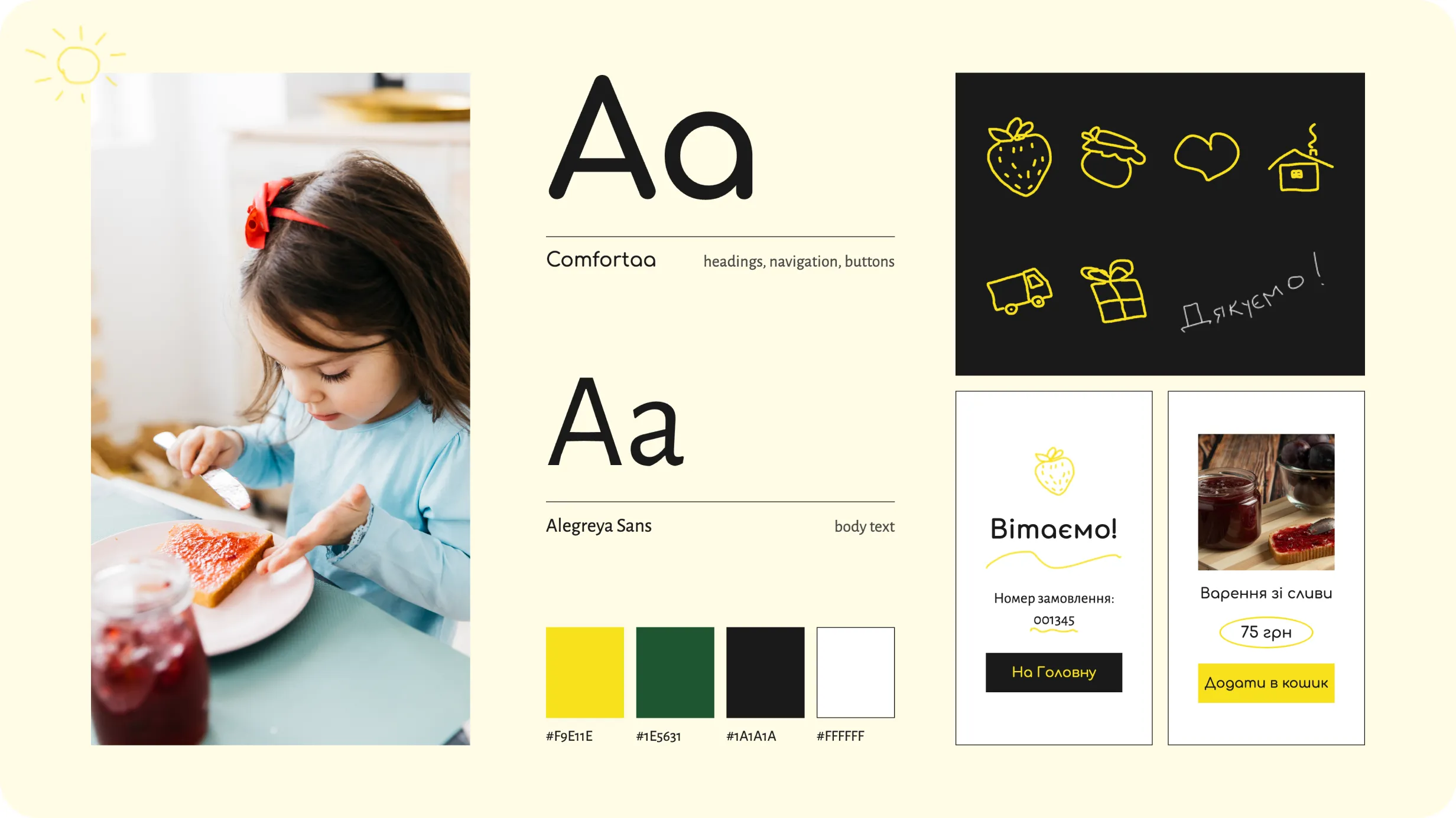
The visual language was intentionally informal and human.
I combined clean layouts and large lifestyle photography with hand-drawn yellow illustrations, handwritten accents, playful typography, and small imperfect details that make the interface feel less commercial.
Rather than creating a highly polished marketplace aesthetic, I wanted the site to feel closer to the brand itself — homemade, approachable, cheerful, and personal.
The illustrations also became a functional part of the interface, drawing attention to products, CTAs, important information, and moments of confirmation.
Keeping the catalog simple and familiar
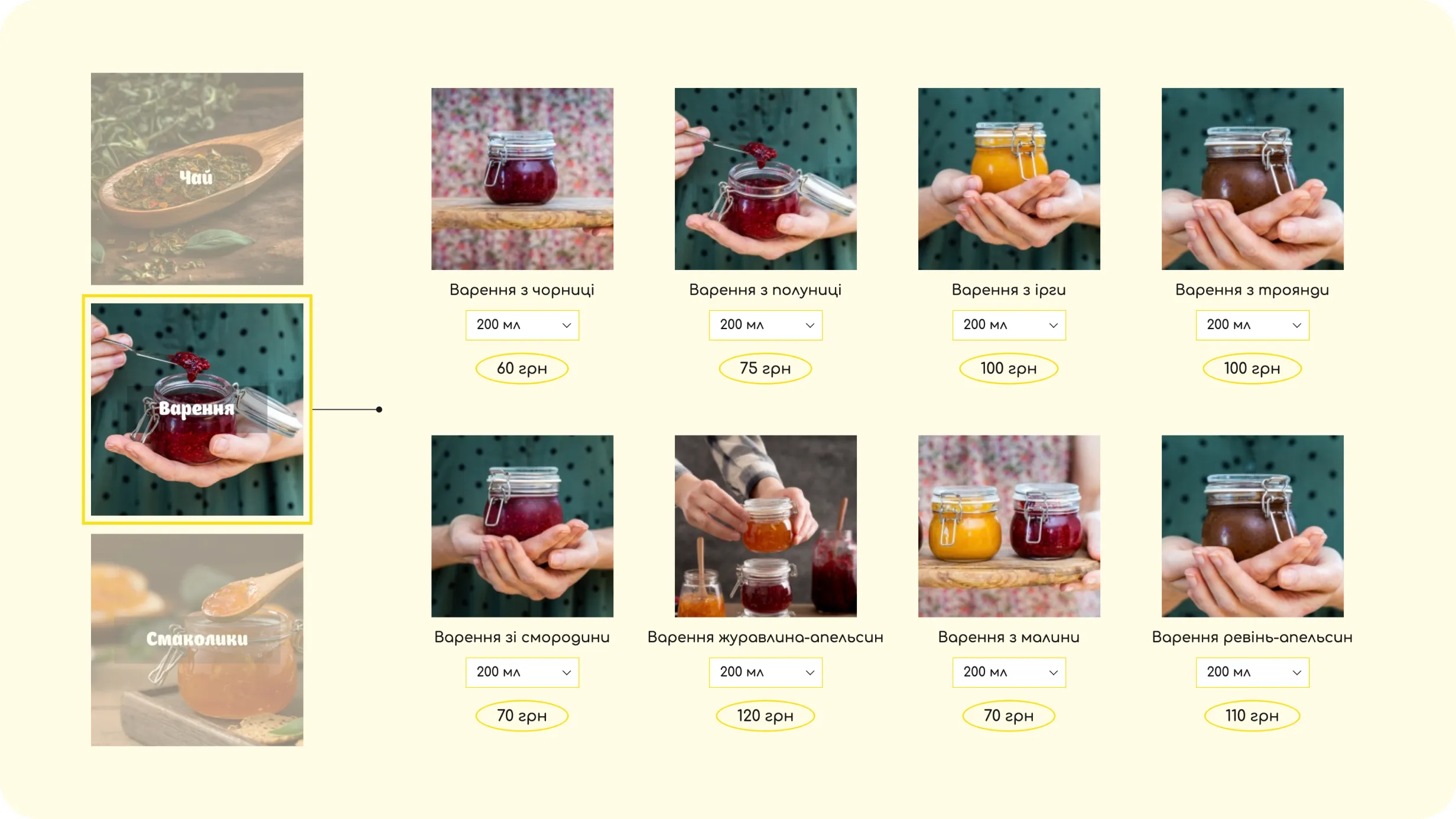
The product structure was designed around a small number of clear categories, including jam, tea, and other treats, reflecting the brand’s actual assortment.
Users can move from a category into a straightforward product grid, compare available products, select a size, and see pricing without unnecessary complexity.
The goal was to make browsing feel closer to choosing something from a small local shop than navigating a large marketplace.
Giving users enough information to buy with confidence
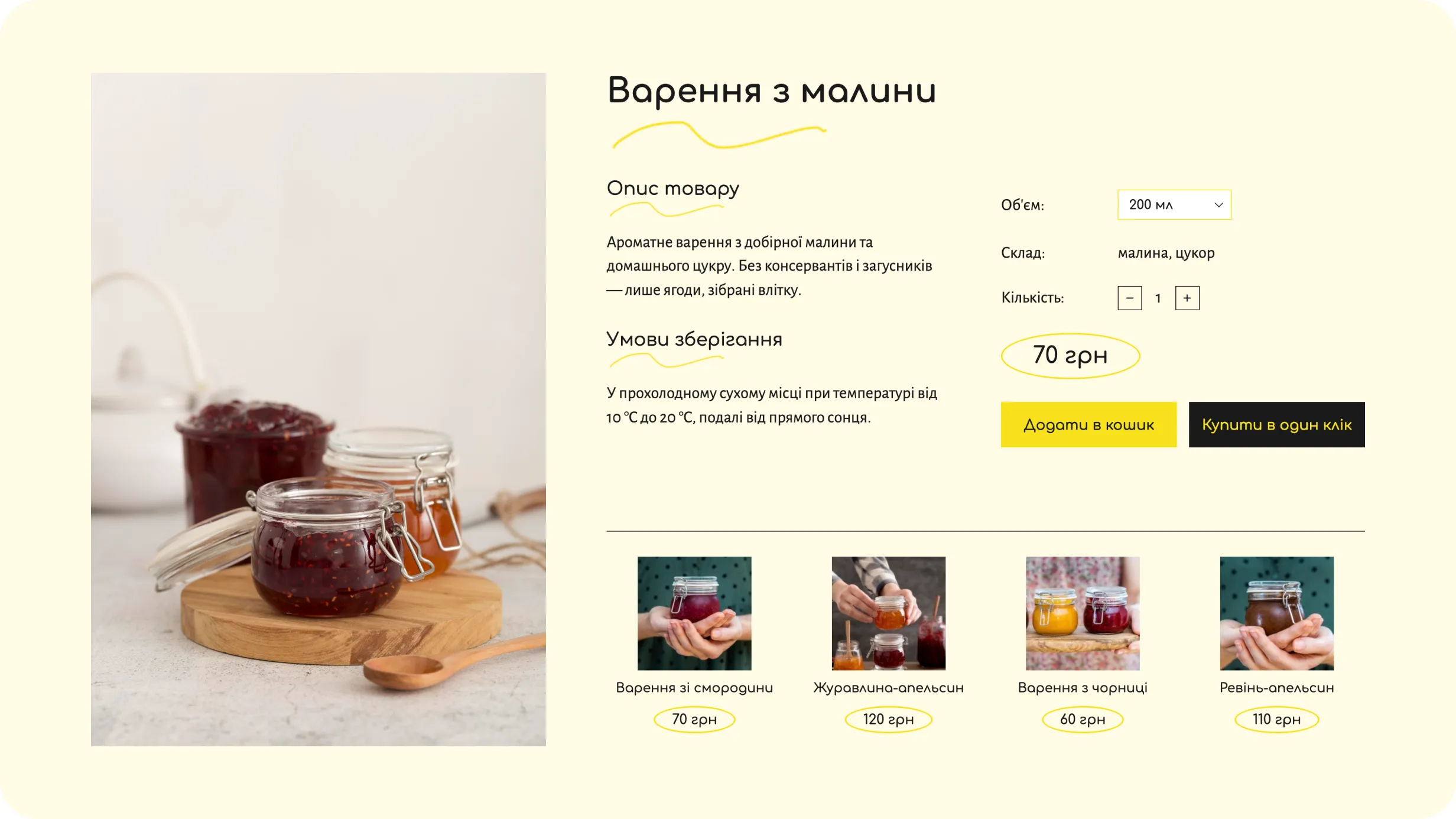
Product pages bring the most important information into one place:
Primary actions remain immediately visible, allowing users either to add an item to the cart or continue directly toward purchase.
Related products extend discovery without interrupting the main purchasing decision.
Supporting a second customer journey
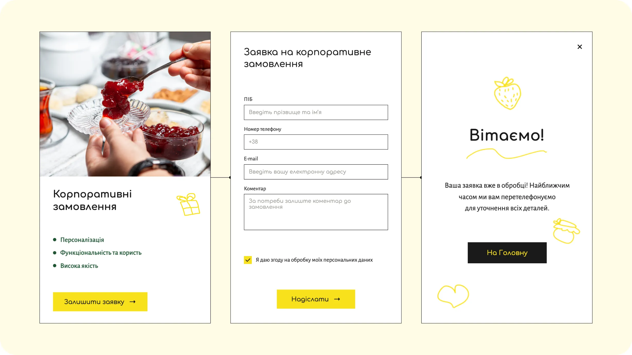
Corporate orders required a different experience from regular e-commerce.
Instead of forcing business customers through the standard product checkout, I created a dedicated page explaining the offer and a short request form for starting a conversation.
This allows the business to handle personalized quantities, gift configurations, and other requirements directly with the customer while keeping the first step lightweight.
After submission, users receive a clear confirmation that the request is being processed.
Making repeat purchases easier without forcing registration
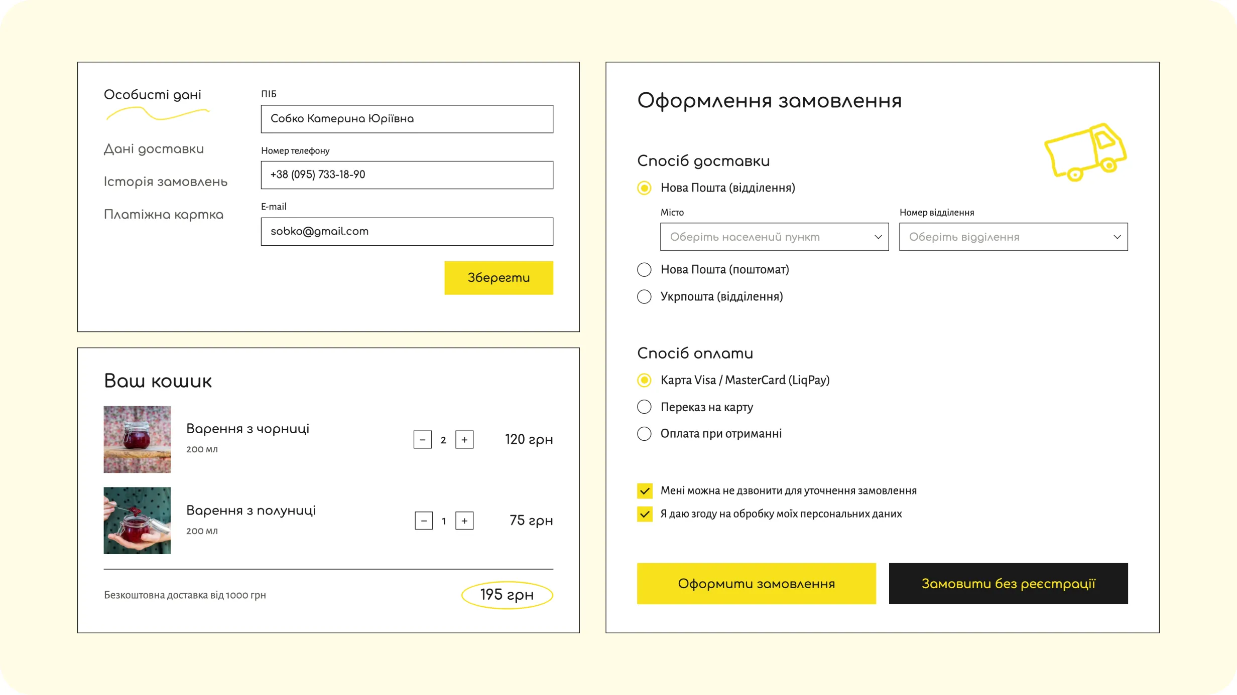
The website supports an account area where customers can manage personal details and access their order-related information.
At checkout, users can choose delivery and payment options, review the cart, adjust quantities, and complete the purchase.
I also included an option to order without registration, reducing friction for customers who simply want to complete a one-time purchase.
This was especially important for a small local store where the purchasing journey needed to remain as straightforward as possible.
Selling the product through the people behind it
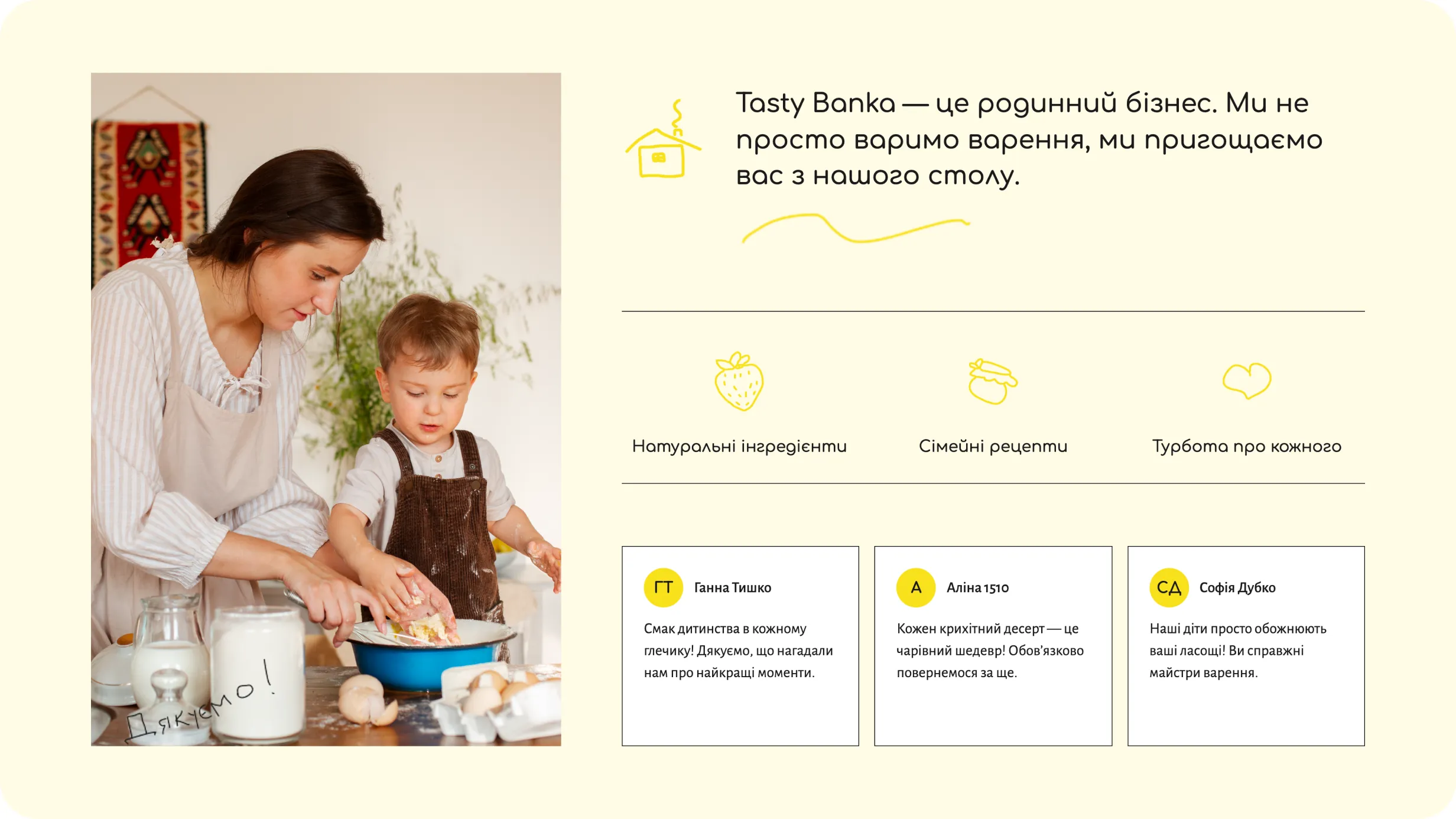
The brand story was treated as part of the shopping experience rather than a separate corporate page.
Photography, family-oriented copy, customer reviews, and hand-drawn elements help communicate why the products exist and who makes them.
The original positioning emphasizes natural ingredients, family tradition, and personal care for customers, so these ideas became part of the interface rather than being limited to an “About” section.
A small-business website that supports both identity and sales
The final concept turns Tasty Banka’s informal local presence into a structured online experience covering brand storytelling, product discovery, purchasing, customer accounts, and corporate requests.
The result preserves the warmth and personality of the family business while introducing the functionality needed for customers to confidently browse, choose, and order products online.
Working with a small local business showed me how closely brand personality and usability can support each other. Instead of separating branding from the shopping experience, I used the brand’s warmth and imperfections to make a functional e-commerce flow feel more personal and memorable.
A sports marketplace for discovering venues and activities, comparing options on a map, booking sessions, paying online & donating.