Mobile AppsView case Sorti
Sorti
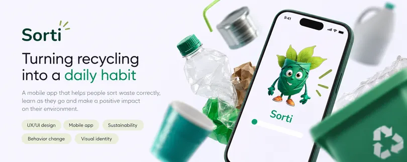
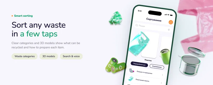
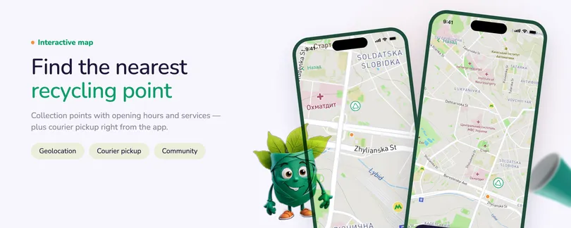
A mobile recycling assistant that helps users identify how to sort everyday waste, scan items, and find nearby recycling points.

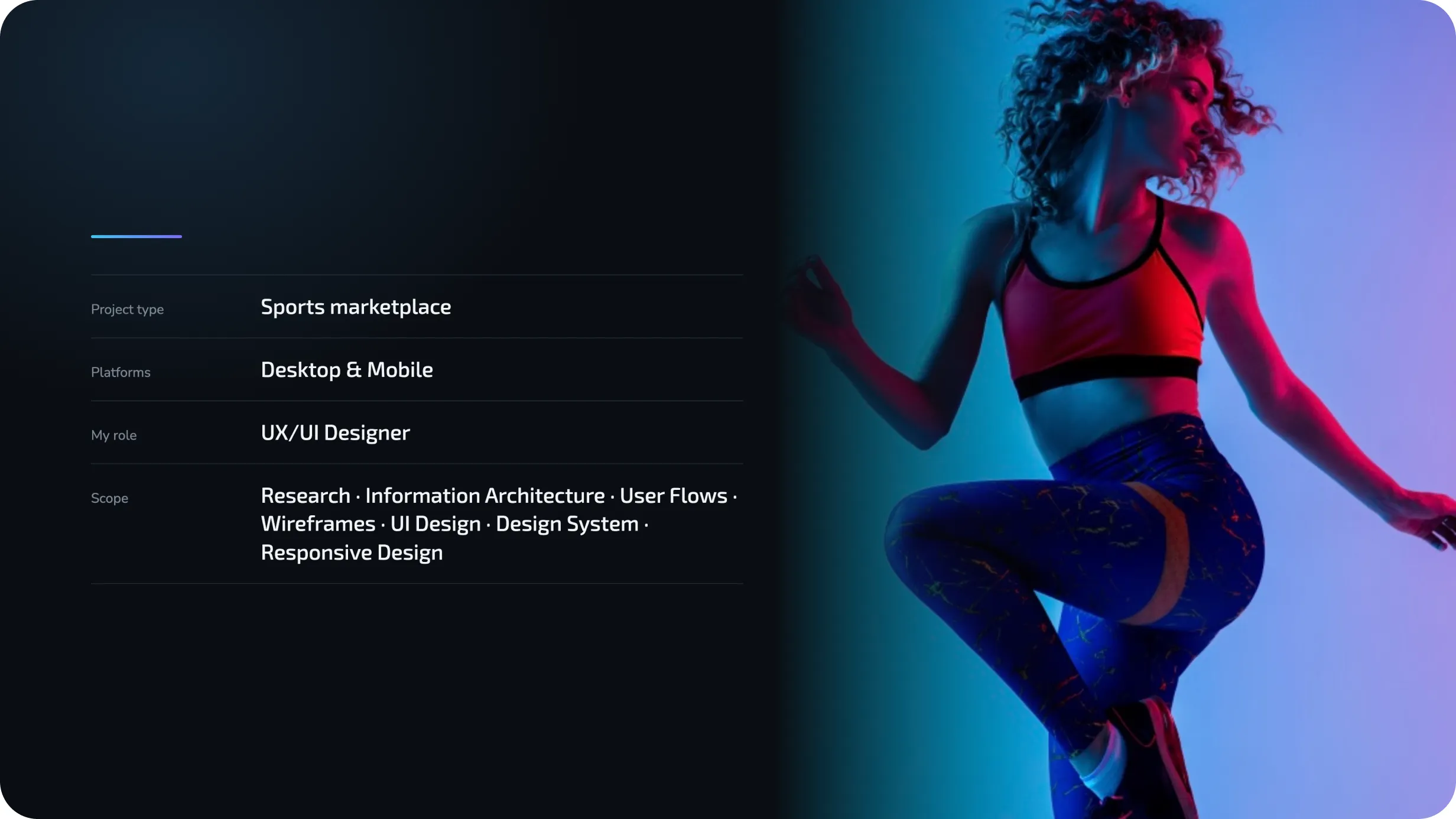
A sports marketplace for discovering venues and activities, comparing options on a map, booking sessions, paying online & donating.
Making sports easier to discover and access
RUKH was conceived as a digital marketplace connecting people with sports clubs, studios, trainers, activities, and local initiatives across Ukraine.
The idea went beyond creating another directory. The platform needed to support the full journey — from discovering what is available nearby to comparing options, understanding whether a venue meets specific needs, booking a session, and completing payment online.
At the same time, RUKH was designed as a two-sided platform, giving smaller sports businesses a digital space to present their services and reach new audiences without building their own booking infrastructure.
Sports options exist. Finding the right one is the hard part.
Sports clubs, studios, trainers, and local initiatives are scattered across websites, social media pages, and offline recommendations. Information about schedules, pricing, accessibility, or availability is often inconsistent — and booking frequently requires calling or messaging each venue separately.
For users, this creates unnecessary friction between the intention to be active and actually booking a session.
For smaller sports businesses, the challenge is different: many lack the resources to build their own websites, booking systems, and digital marketing channels.
The challenge was to bring both sides into one ecosystem.
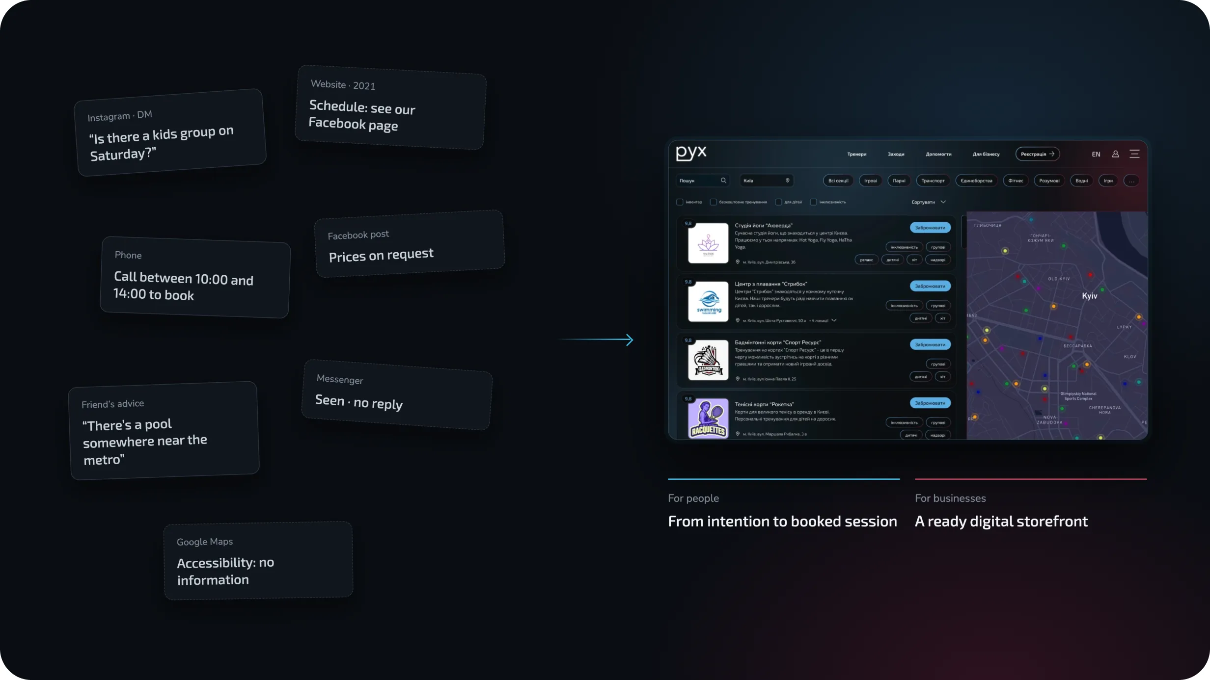
What the platform needed to solve
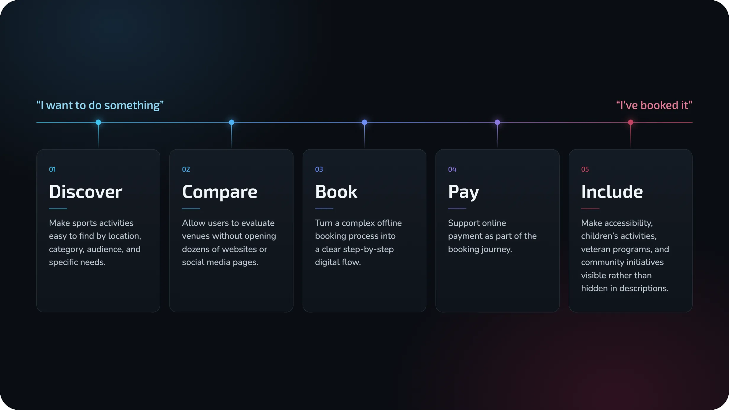
Discover
Make sports activities easy to find by location, category, audience, and specific needs.
Compare
Allow users to evaluate venues without opening dozens of websites or social media pages.
Book
Turn a complex offline booking process into a clear step-by-step digital flow.
Pay
Support online payment as part of the booking journey.
Include
Make accessibility, children’s activities, veteran programs, and community initiatives visible rather than hidden in descriptions.
The product was designed around one principle: reduce the distance between “I want to do something” and “I’ve booked it.”
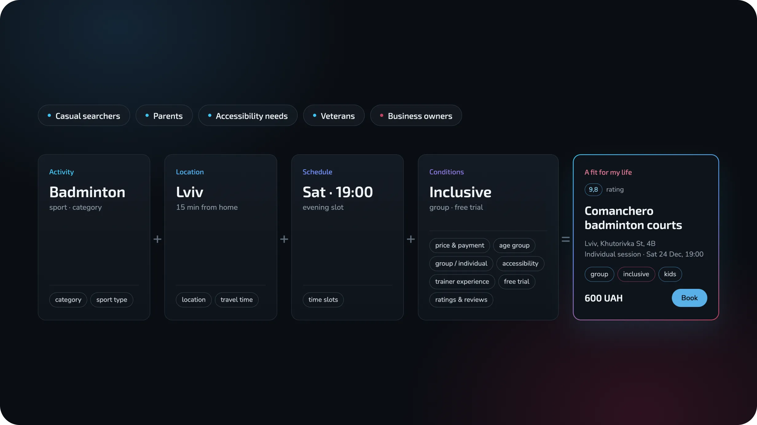
Understanding different ways people look for sports
The platform needed to support a wide range of users — from people casually searching for a new activity to parents looking for classes for their children, users with accessibility requirements, veterans returning to sport, and business owners promoting their venues.
Research therefore focused not only on what sport people wanted, but also on the context behind the decision:
Key insight:
Users rarely search for “a sports club” in isolation. They search for a combination of activity + location + schedule + conditions that fits their life.
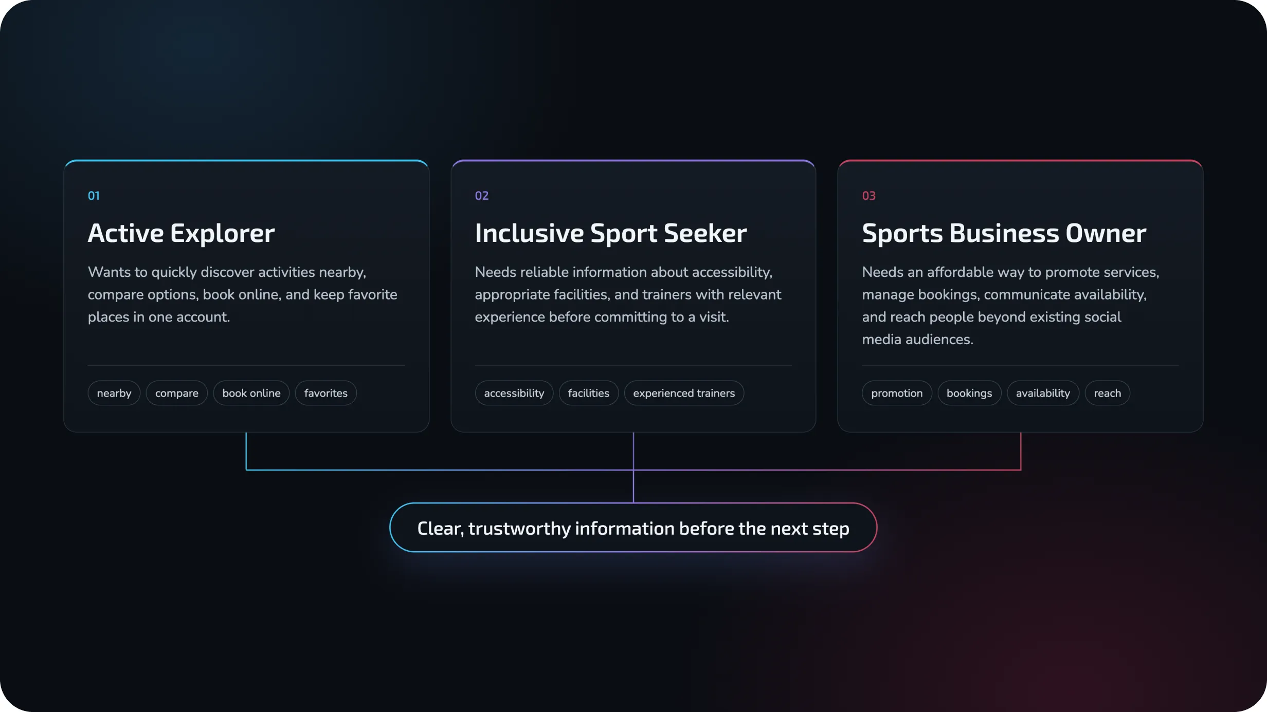
Designing for different motivations
Active Explorer
Wants to quickly discover activities nearby, compare options, book online, and keep favorite places in one account.
Inclusive Sport Seeker
Needs reliable information about accessibility, appropriate facilities, and trainers with relevant experience before committing to a visit.
Sports Business Owner
Needs an affordable way to promote services, manage bookings, communicate availability, and reach people beyond existing social media audiences.
Despite very different goals, all three groups shared the same need: clear, trustworthy information before taking the next step.
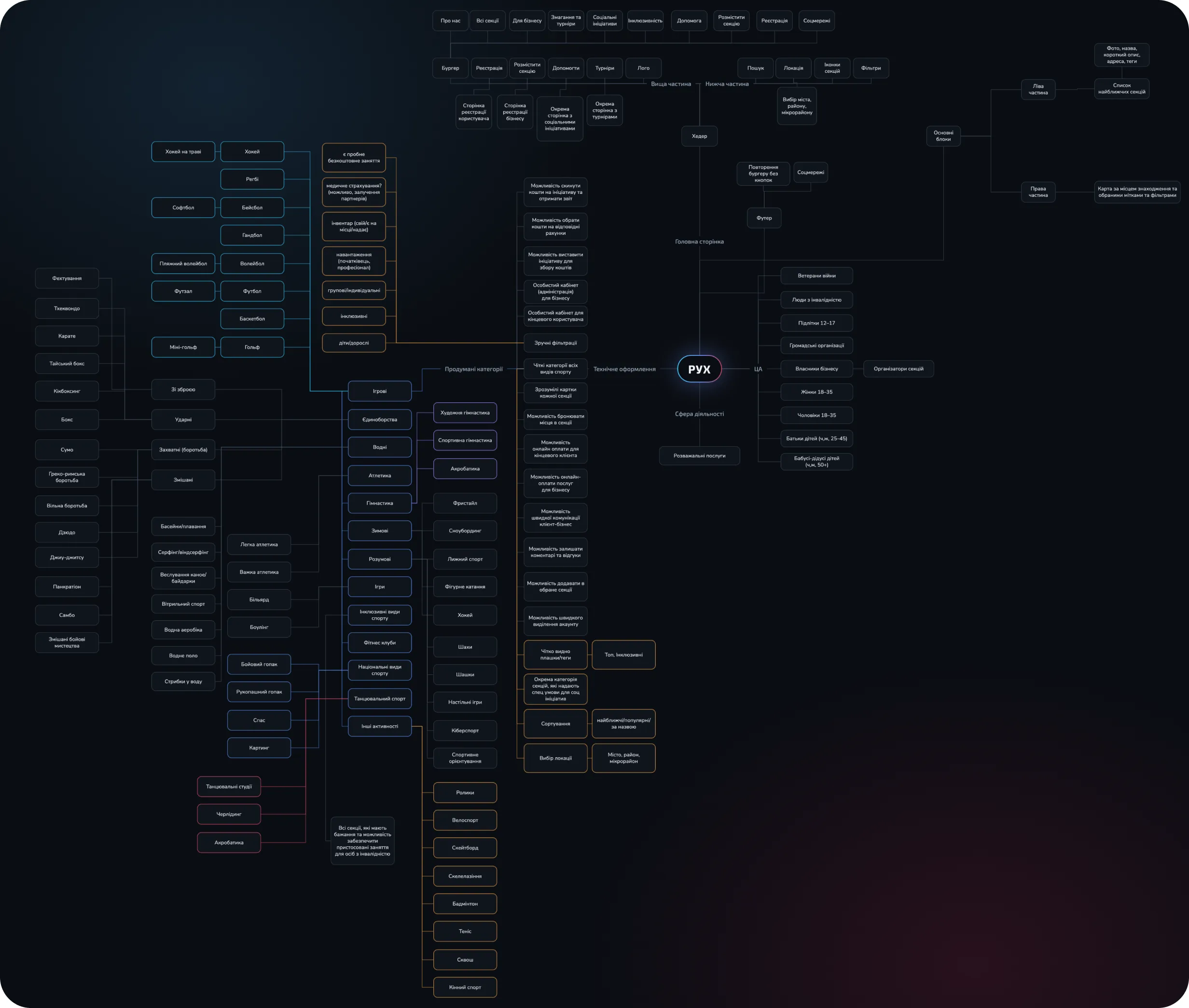
Turning a large sports ecosystem into a navigable structure
One of the biggest UX challenges was the volume and variety of content.
RUKH included sports categories, trainers, venues, events, social initiatives, programs for veterans, donations, business profiles, and personal accounts.
Instead of forcing users through a deep hierarchy, I structured the platform around a few high-intent entry points:
Search, location, categories, and filters work across this structure, allowing users to narrow the system according to their needs rather than learning how the platform is organized.
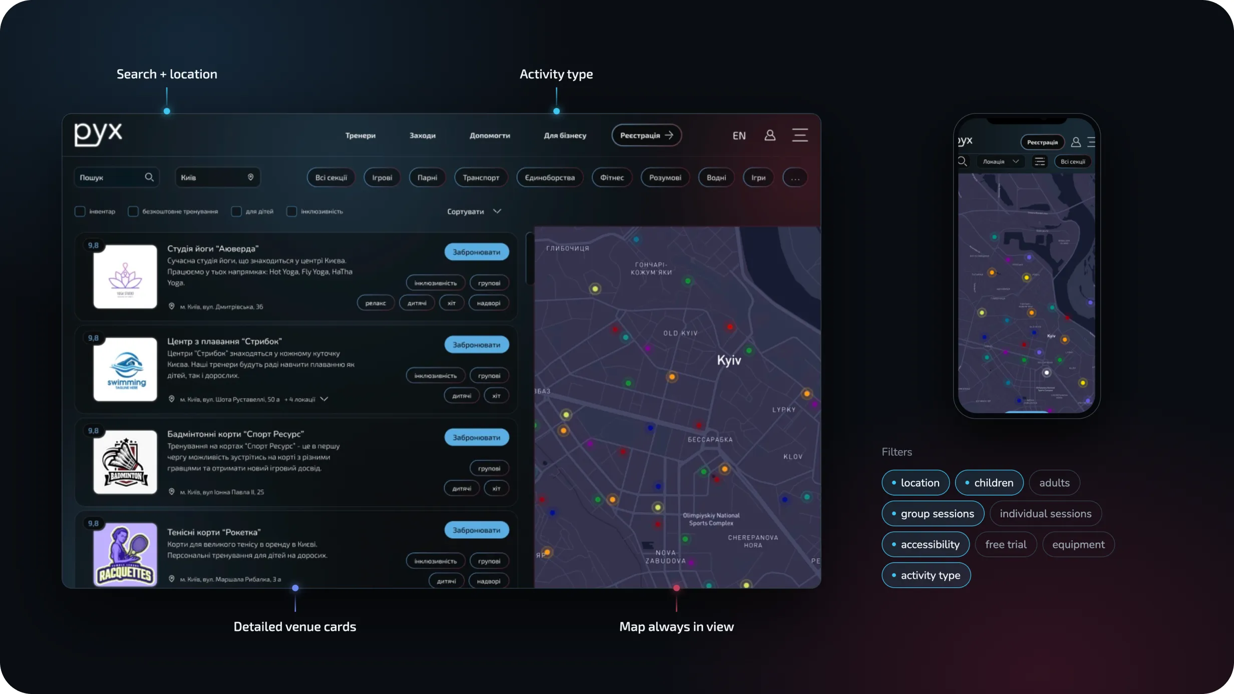
Search the way people actually think
The main discovery experience combines a results list and an interactive map.
Users can browse detailed venue cards while keeping geographical context visible at all times. This makes it possible to compare not only services and ratings, but also how conveniently each option fits into a daily route.
Flexible filtering
The filtering system supports more than sports categories. Users can refine results by:
location · children · adults · group sessions · individual sessions · accessibility · free trial · equipment · activity type
Instead of asking users to know exactly what they are looking for, the interface progressively narrows the options around their priorities.
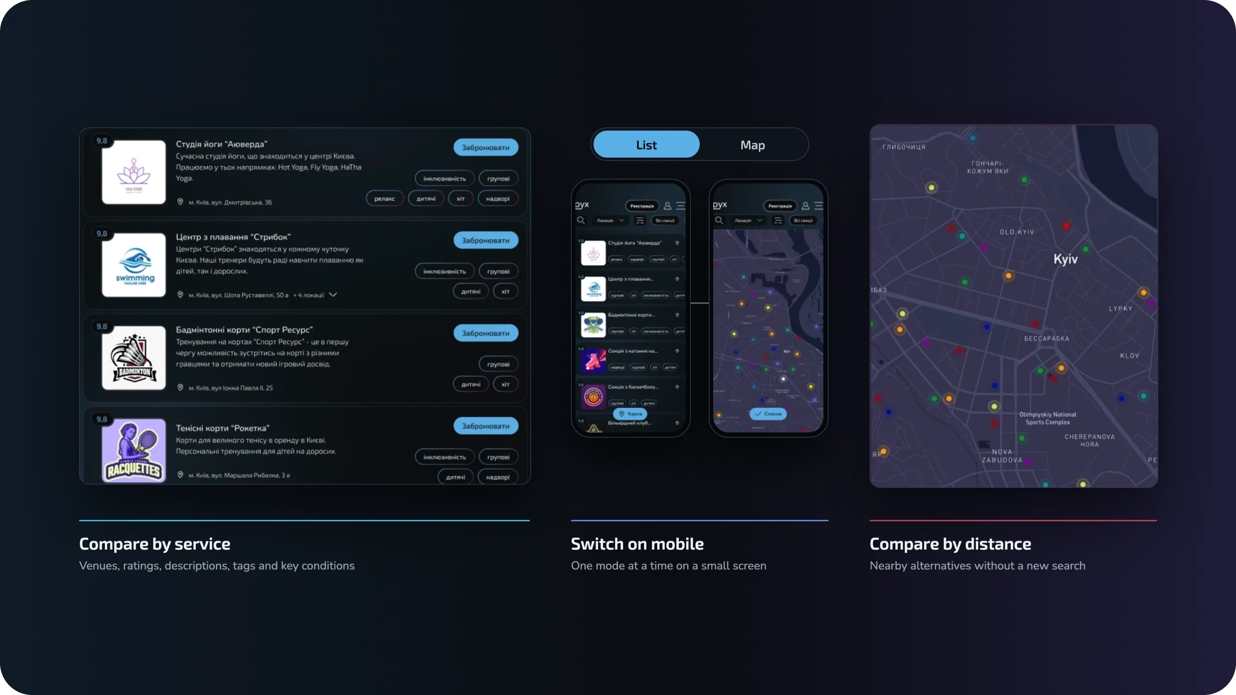
One search. Two ways to explore.
RUKH supports both behaviors.
The list view makes it easy to compare venues, ratings, descriptions, tags, and key conditions. The map gives immediate spatial context and makes nearby alternatives visible without restarting the search.
On mobile, users can switch between both modes instead of forcing two dense interfaces onto a small screen.
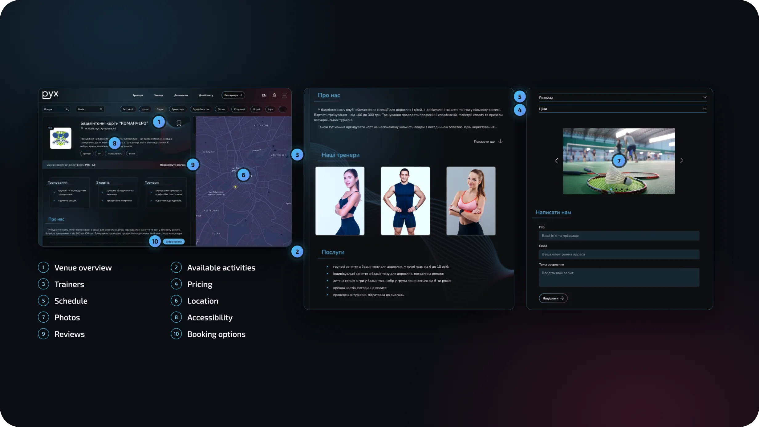
All the information needed before booking
Each venue page was designed to answer the questions users normally need to solve through messages, calls, or multiple browser tabs.
The experience brings together:
The goal was to move the moment of decision inside the product — rather than sending users elsewhere to collect missing information.
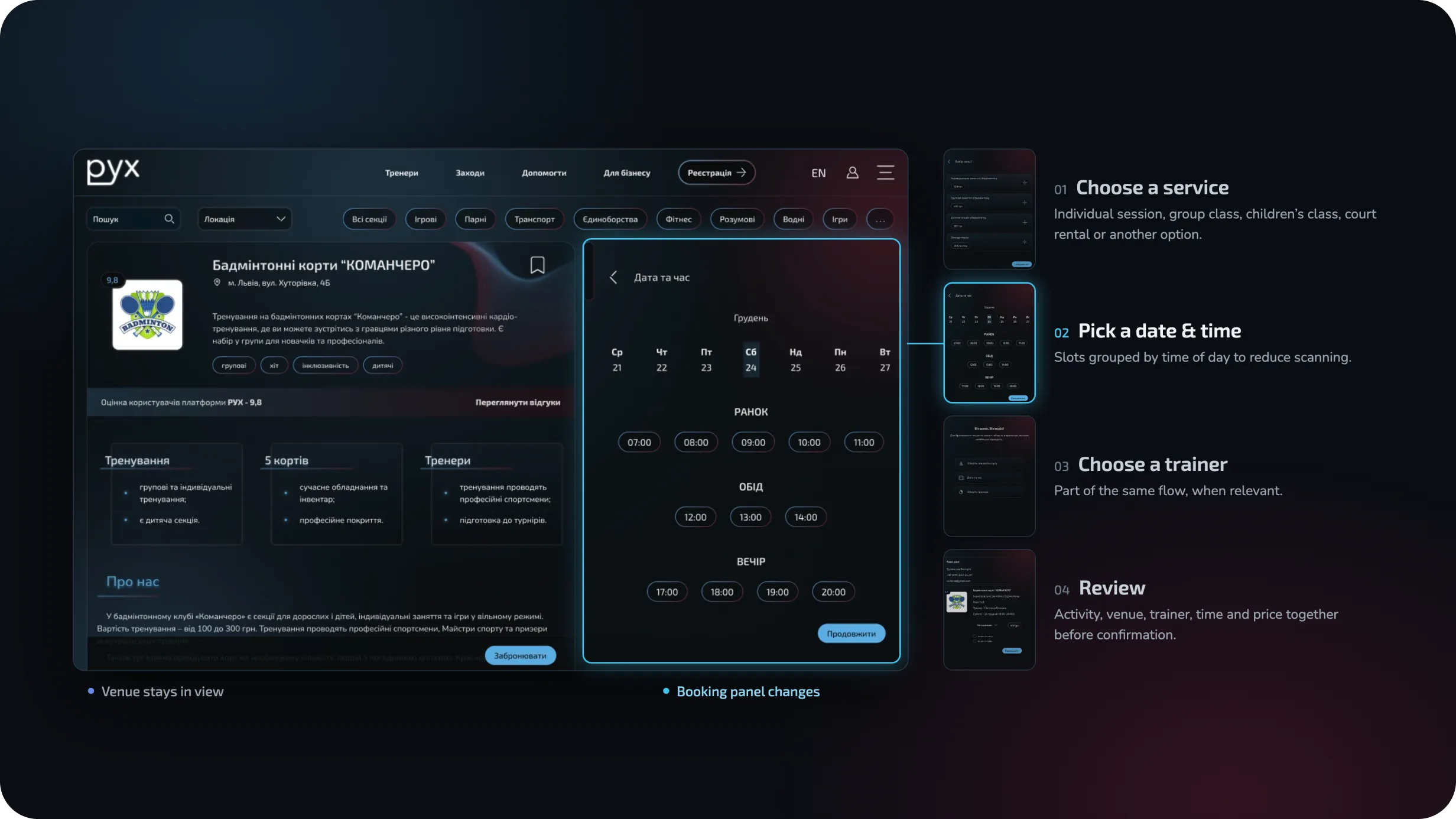
From discovery to booking without leaving the page
Booking was designed as a contextual flow rather than a separate checkout experience.
The venue remains visible while the user moves through each decision:
01 — Choose a service
Select an individual session, group class, children’s class, court rental, or another available option.
02 — Pick a date & time
Available slots are grouped by time of day to reduce scanning.
03 — Choose a trainer
When relevant, users can select a trainer as part of the same booking flow.
04 — Review
The booking summary brings the selected activity, venue, trainer, time, and price together before confirmation.
Why this approach
Keeping the venue context visible throughout the flow reduces uncertainty and makes the booking process feel like a continuation of discovery rather than a separate transaction.
Defining the product before defining the visual style
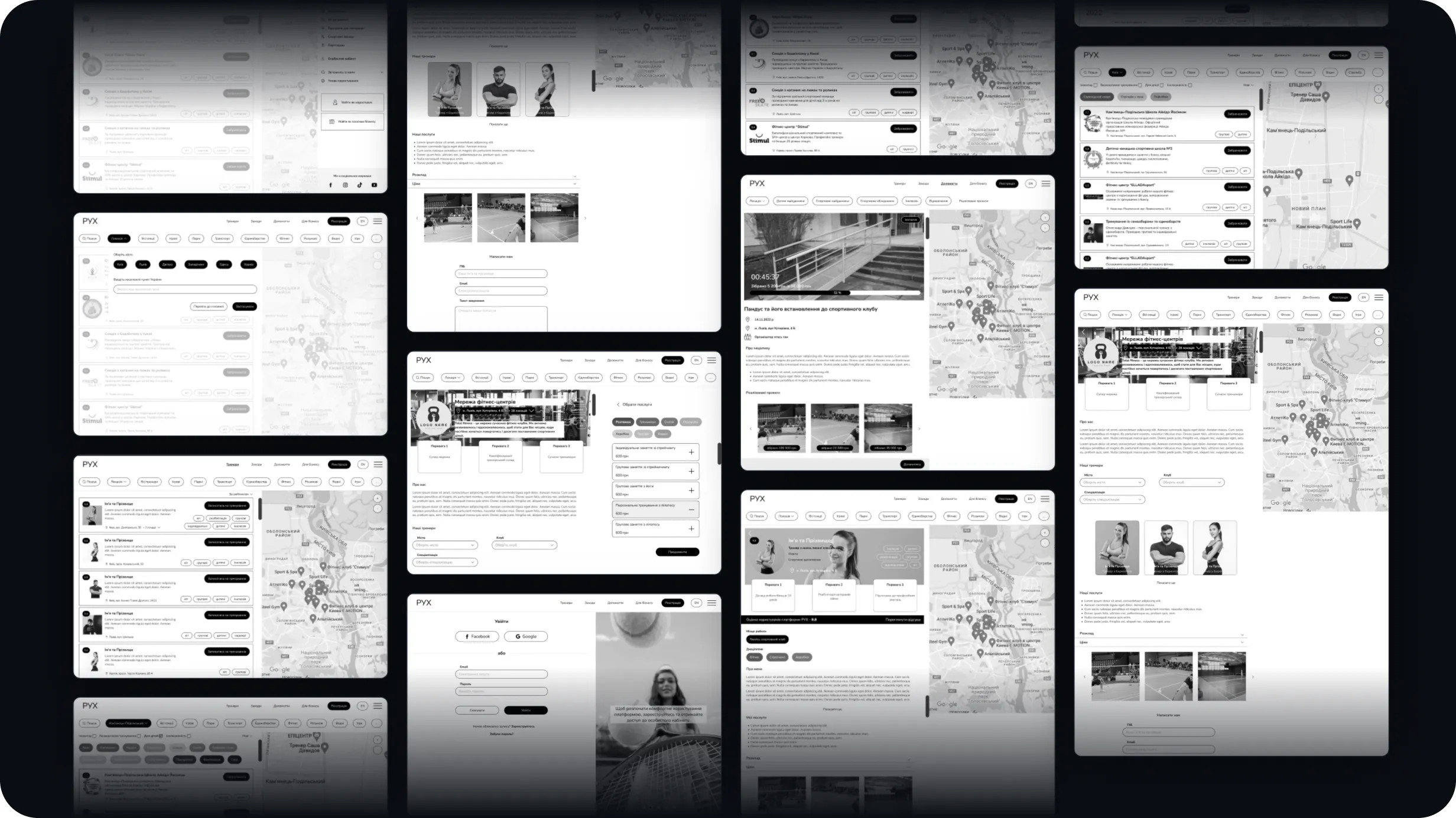
Early wireframes focused on validating the platform structure and the relationship between discovery, venue content, booking, and account management.
At this stage, the goal was not visual polish. It was to answer structural questions:
The final interface evolved from these decisions rather than from visual styling alone.
A system built for a content-heavy marketplace
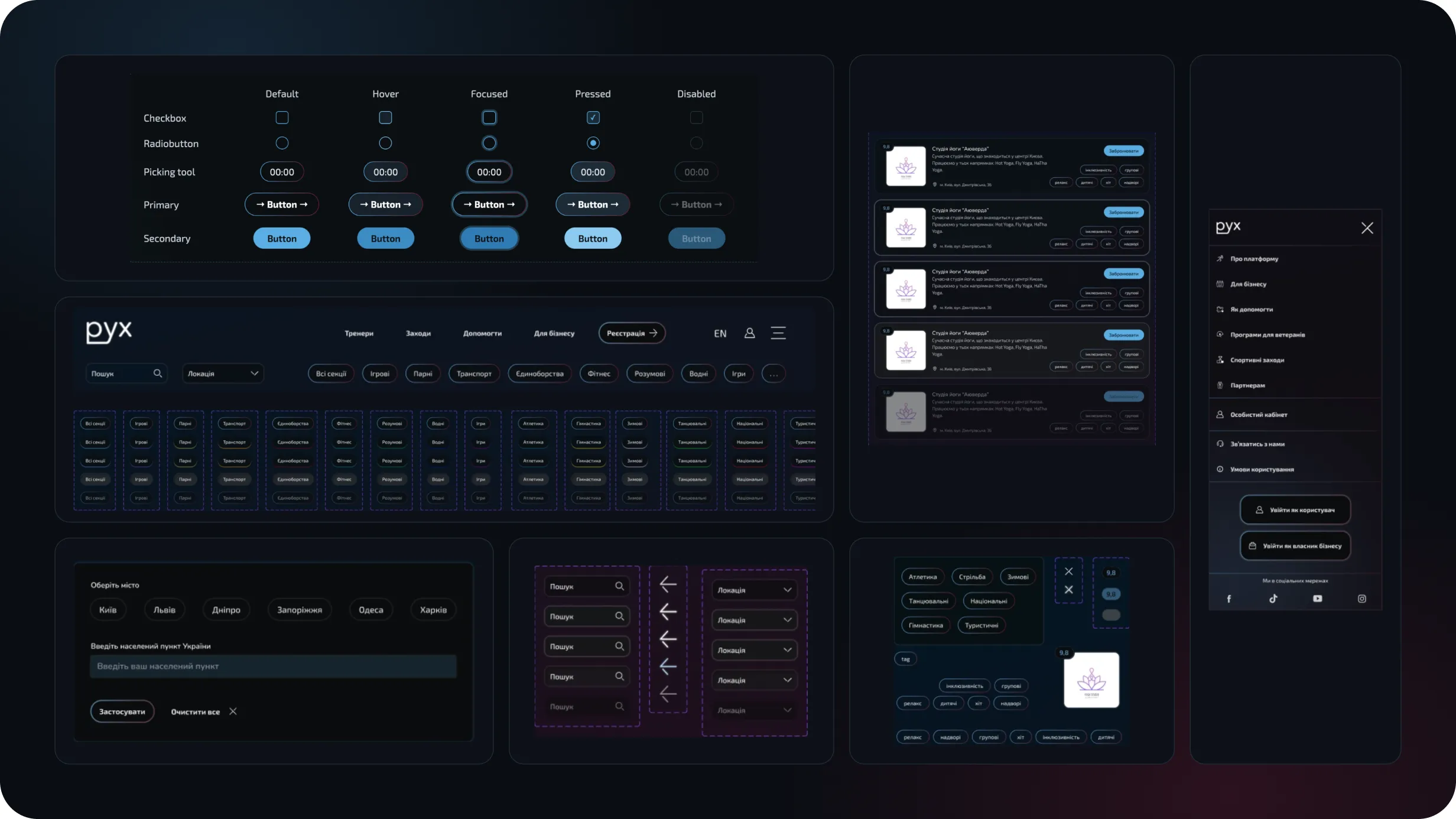
Because RUKH combines search, maps, cards, filters, booking states, profiles, and forms, consistency across UI states was essential.
I created a reusable component system covering:
buttons · inputs · filters · tags · navigation · venue cards · location controls · booking controls · ratings · menus · responsive states
Components were designed across multiple interaction states to support predictable behavior throughout the platform.
Designed beyond desktop
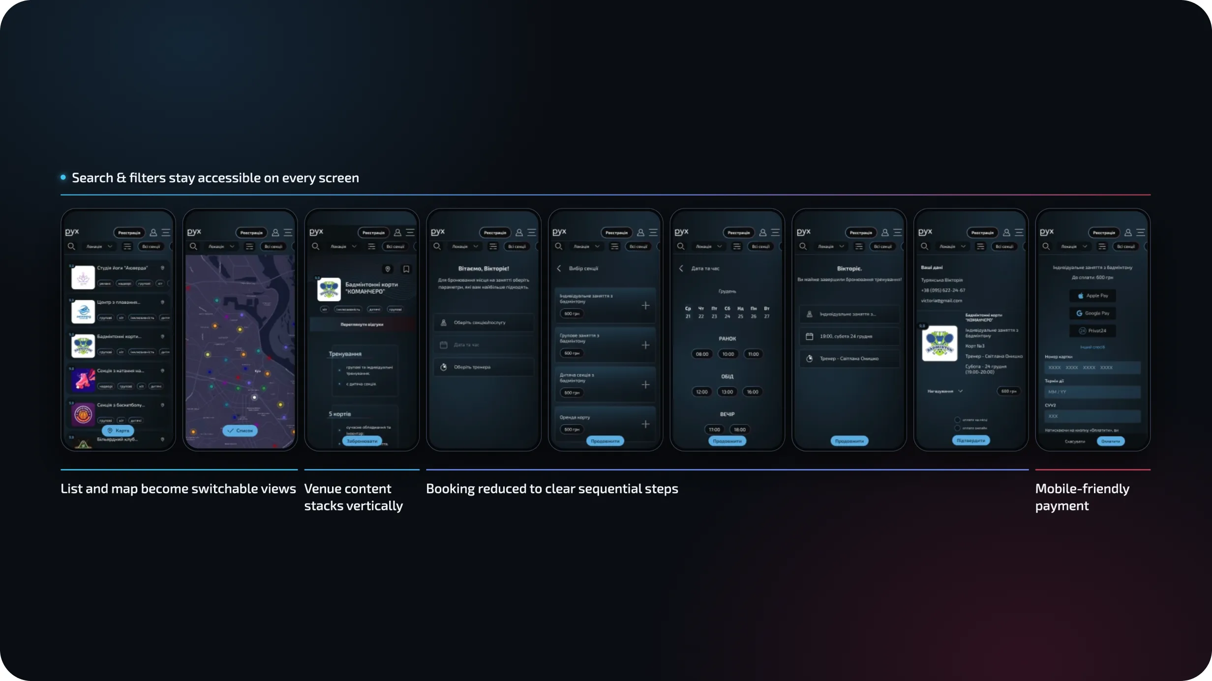
RUKH was designed as a responsive product rather than a desktop interface scaled down to mobile.
On smaller screens, the information architecture adapts to prioritize the user’s immediate task:
The goal was to preserve the same product logic while reducing cognitive load on smaller screens.
The result
RUKH became a complete product concept for a multi-sided sports marketplace — connecting discovery, location, venue information, booking, payments, inclusion, and community initiatives within one ecosystem.
The project demonstrates how a broad initial idea can be transformed into a structured product through research, information architecture, reusable interaction patterns, and a scalable UI system.
The biggest challenge was not designing individual screens — it was managing complexity.
RUKH serves users with very different motivations while supporting venues, trainers, social initiatives, accessibility requirements, and transactional flows at the same time.
This project taught me to continuously distinguish between what the platform can contain and what the user needs at this moment.
A mobile recycling assistant that helps users identify how to sort everyday waste, scan items, and find nearby recycling points.