Web & E-commerceView case Alina Suprun
Alina Suprun
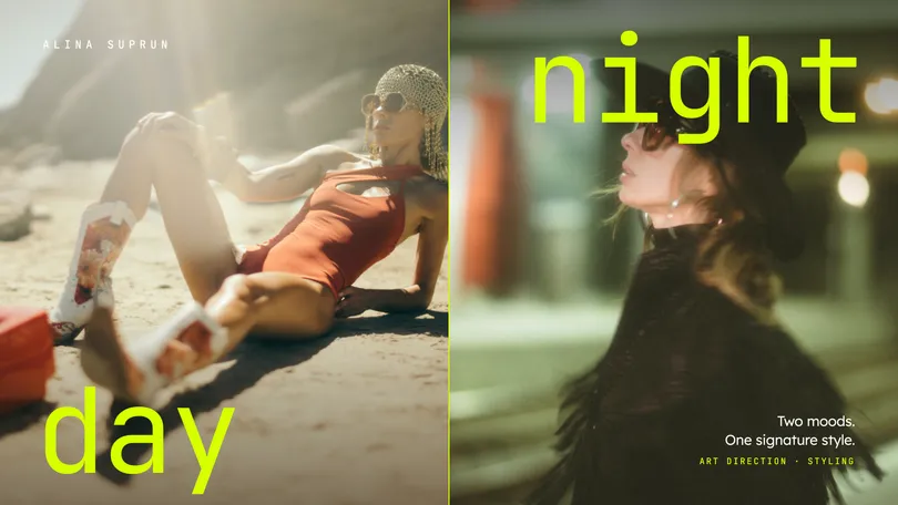
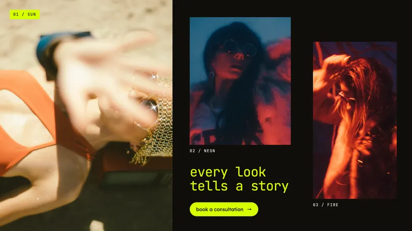
A personal brand website for a stylist, designed to showcase her approach, services, and guide visitors toward booking a consultation.


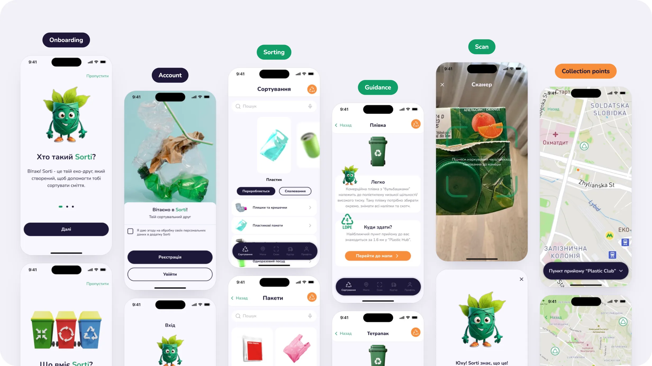
A mobile recycling assistant that helps users identify how to sort everyday waste, scan items, and find nearby recycling points.
Recycling often requires more knowledge than users expect. Different materials need different preparation, collection points accept different categories, and even common household items can be difficult to classify correctly.
I designed Sorti as a mobile-first experience that brings this information into one structured product.
My work covered the product structure, user flows, information architecture, visual direction, reusable UI components, and core mobile experiences including sorting guidance, collection points, and pickup scenarios.
Turning recycling knowledge into clear everyday actions
The main challenge was not simply giving users more information about recycling.
The product needed to answer a few practical questions quickly:
Long educational content or complex environmental terminology would make the experience harder to use in the moment.
The goal was to transform this information into short, contextual guidance that helps users make the next decision quickly.
Organizing the experience around real recycling tasks
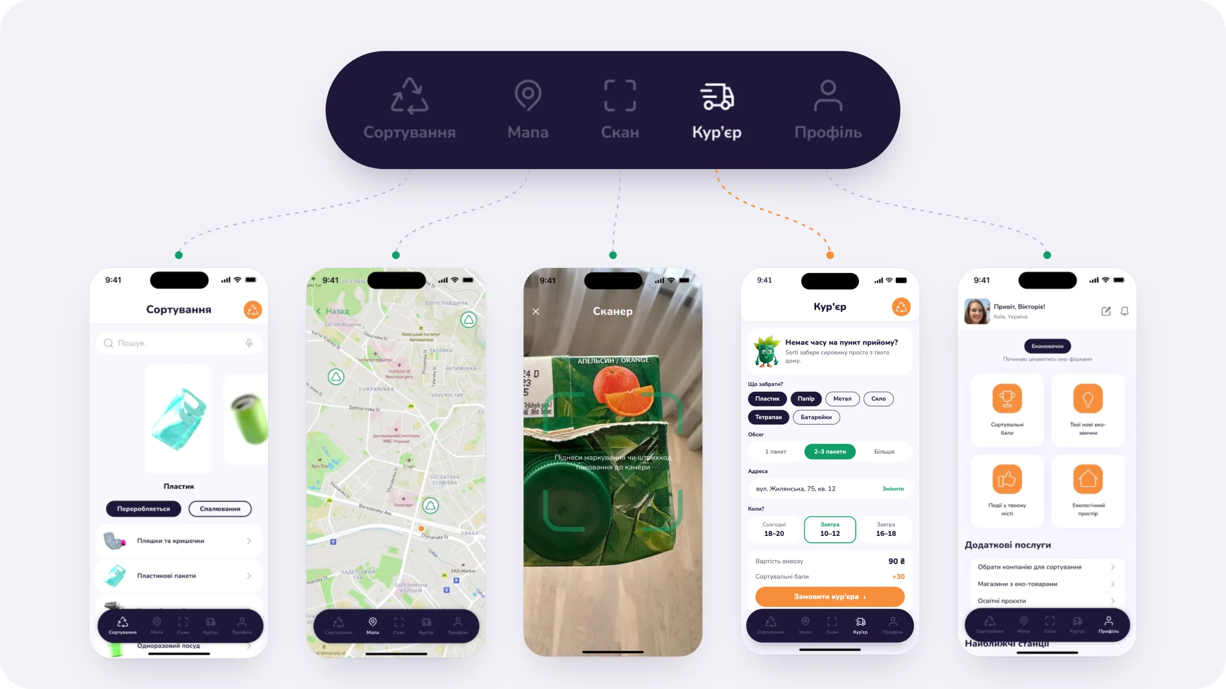
I structured the app around the main actions users may need throughout the recycling process:
Sorting — understand materials and disposal rules
Map — find nearby collection points
Scan — identify an item more quickly
Courier — arrange collection when drop-off is inconvenient
Profile — manage the personal experience and account
This keeps education connected to action. Instead of learning about recycling in one part of the app and then searching elsewhere for what to do next, users can move directly from identification to disposal.
Helping users understand what belongs where
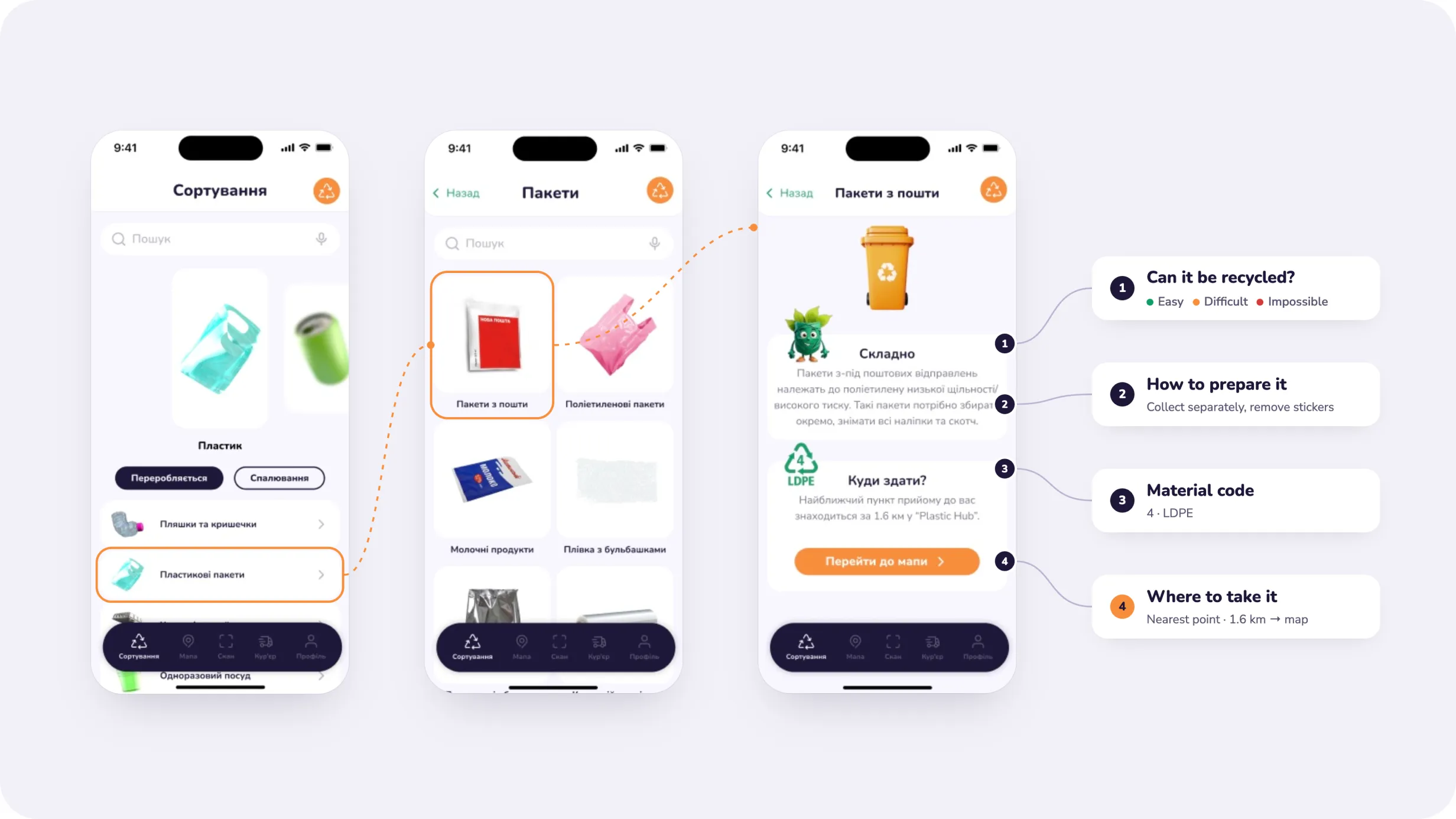
Sorting is the core educational experience of the product.
Rather than presenting recycling rules as long articles, I organized information around recognizable material categories and everyday objects.
Users can browse categories such as plastic and then move into more specific item types to understand:
Visual objects and 3D elements make different waste types easier to recognize, while the content focuses on practical instructions rather than environmental theory.
The goal was to make sorting feel like a guided decision, not a research task.
Connecting education with the next step
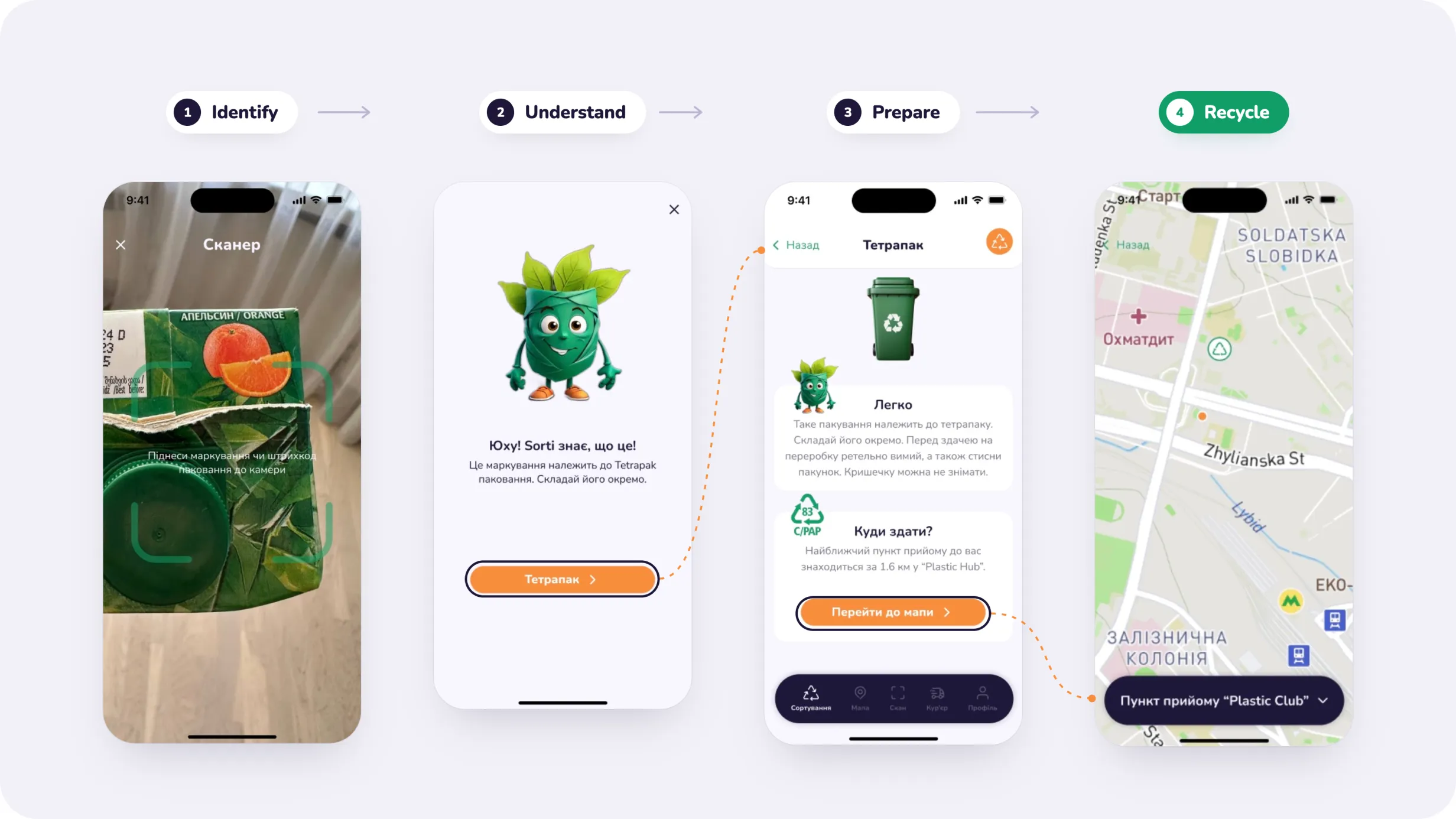
Understanding how an item should be recycled is only useful if the user can act on that information.
Material detail screens connect sorting guidance directly with the next available action.
After learning how to prepare an item, users can continue to a nearby collection point instead of leaving the flow and searching for one separately.
This creates a simple sequence:
Identify → Understand → Prepare → Recycle
and keeps the experience focused on completing the task rather than only providing information.
Making local recycling options easier to find
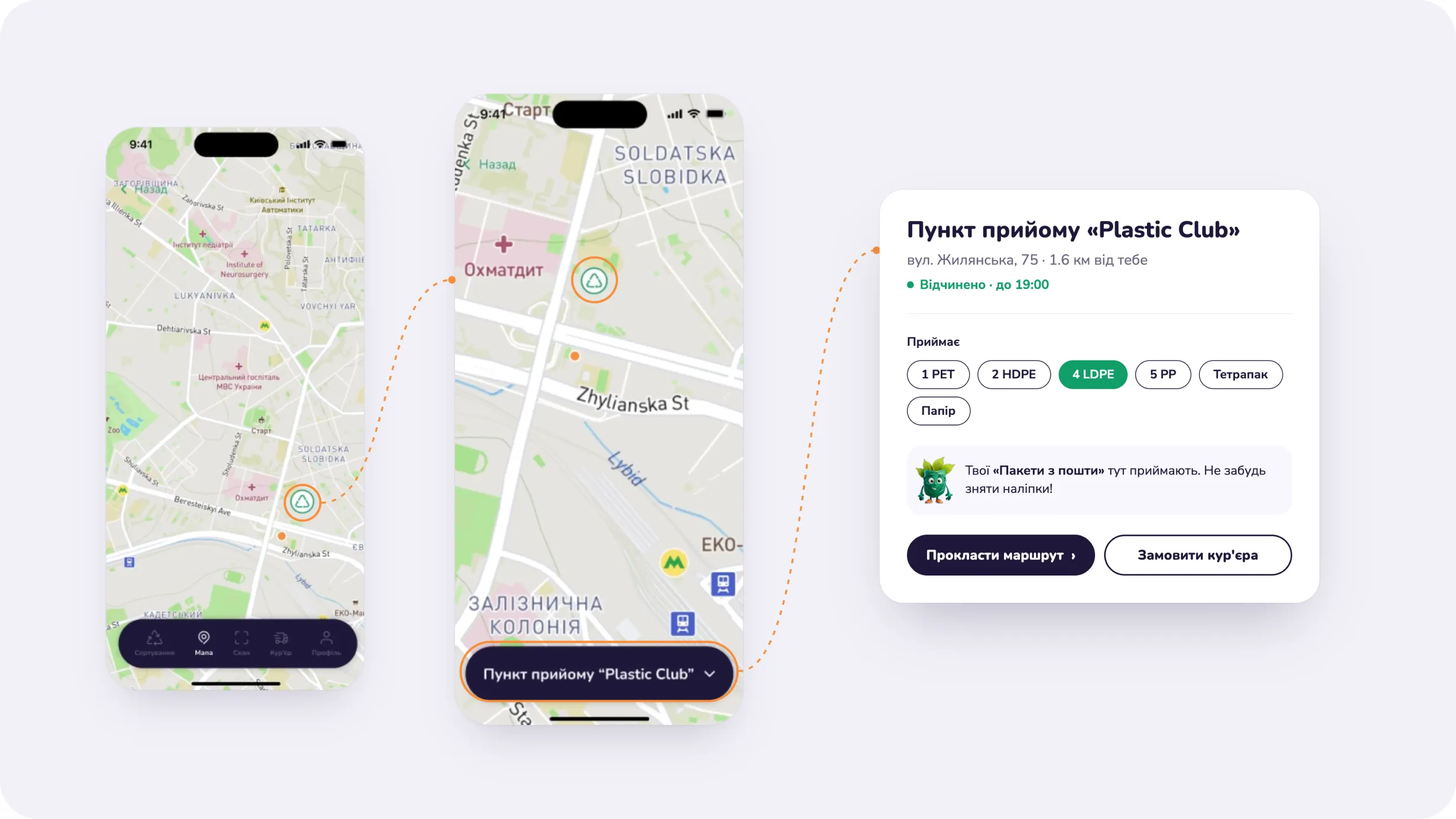
The map turns general recycling guidance into location-specific action.
Users can explore nearby collection points and open a location to understand where recyclable materials can be taken.
Instead of treating the map as a separate utility, I connected it directly to the sorting experience so users can move from a specific material to a relevant disposal option.
This reduces the gap between knowing what to do and knowing where to do it.
Supporting both drop-off and pickup scenarios
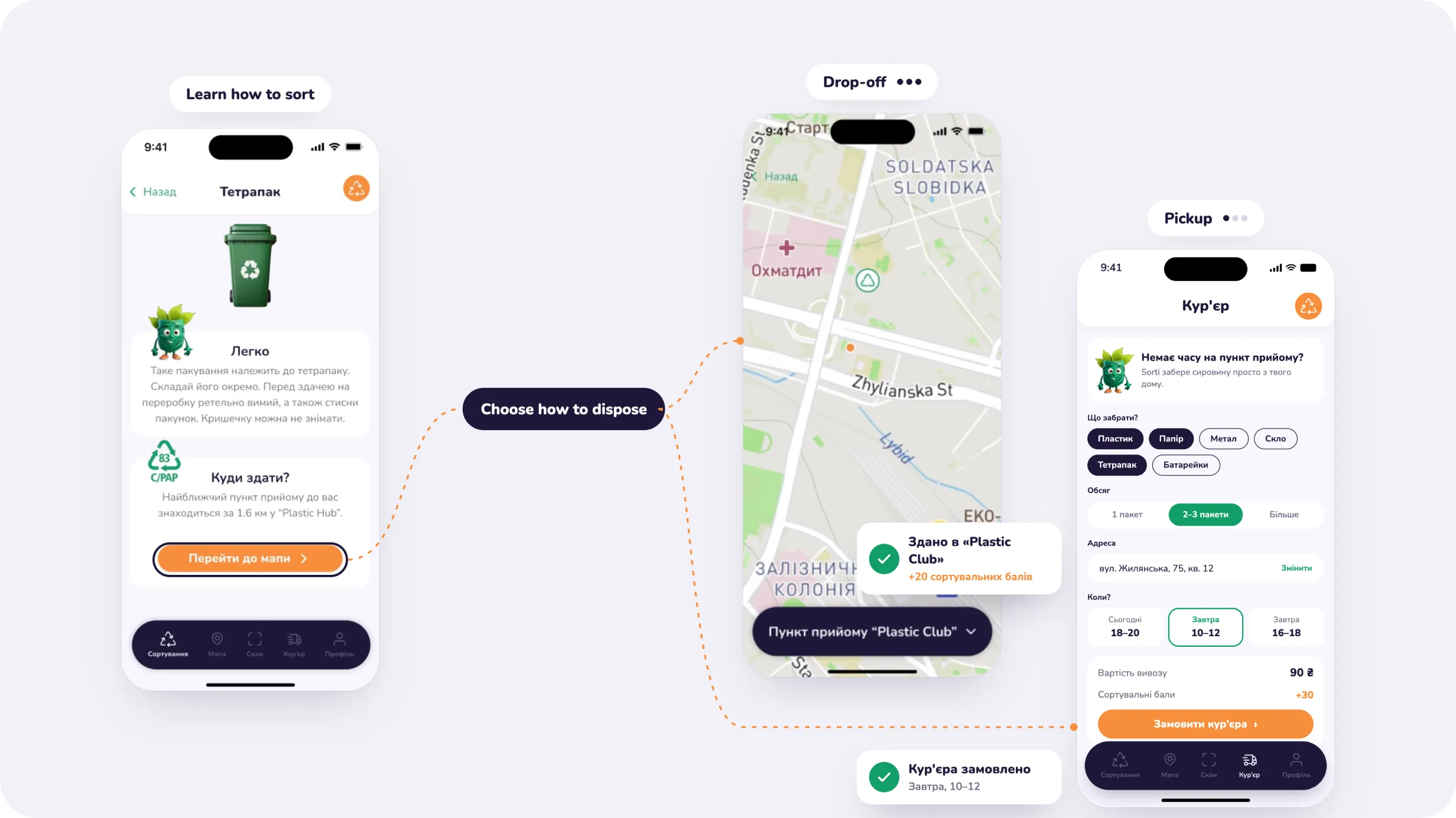
Not every user can conveniently travel to a collection point, so the product also considers alternative disposal scenarios.
Alongside self-service drop-off, Sorti includes a courier experience for users who prefer recyclable materials to be collected.
This extends the product beyond education and creates a more flexible recycling journey:
learn how to sort → choose how to dispose → complete the task
By supporting different levels of effort, the experience can adapt to users rather than assuming one recycling behavior works for everyone.
Making sustainability feel approachable rather than instructional
I wanted the product to feel encouraging and accessible rather than institutional.
The visual direction combines a soft neutral foundation with green, orange, and deep purple accents, creating clear hierarchy while maintaining a recognizable environmental character.
A friendly mascot and expressive 3D objects add personality to educational moments and make material categories easier to recognize.
The interface itself remains intentionally simple, allowing the visual elements to support the content without competing with the primary actions.
Creating a consistent foundation for the mobile experience
I created a reusable UI kit covering the core interface patterns used throughout the app, including:
Reusable components helped keep repeated interactions consistent across onboarding, sorting, map, courier, and account flows.
The system was designed to support the playful visual identity while keeping the functional interface predictable and easy to navigate.
A clearer path from recycling uncertainty to action
The final concept brings education, identification, local infrastructure, and disposal options into one mobile experience.
Rather than expecting users to already understand recycling rules, Sorti guides them through the process and connects information directly with the action they need to take next.
The product establishes three core outcomes:
Clearer decisions
Material guidance helps users understand what can be recycled and how to prepare it.
Actionable local context
The map connects recycling knowledge with nearby collection options.
Lower effort
Alternative flows such as scanning and pickup reduce the amount of work required to complete the recycling journey.
This project showed me that simplifying a service is often less about reducing information and more about presenting the right information at the moment it becomes useful. Designing Sorti helped me think about recycling not as an educational topic, but as a sequence of small decisions that a product can make easier.
A personal brand website for a stylist, designed to showcase her approach, services, and guide visitors toward booking a consultation.